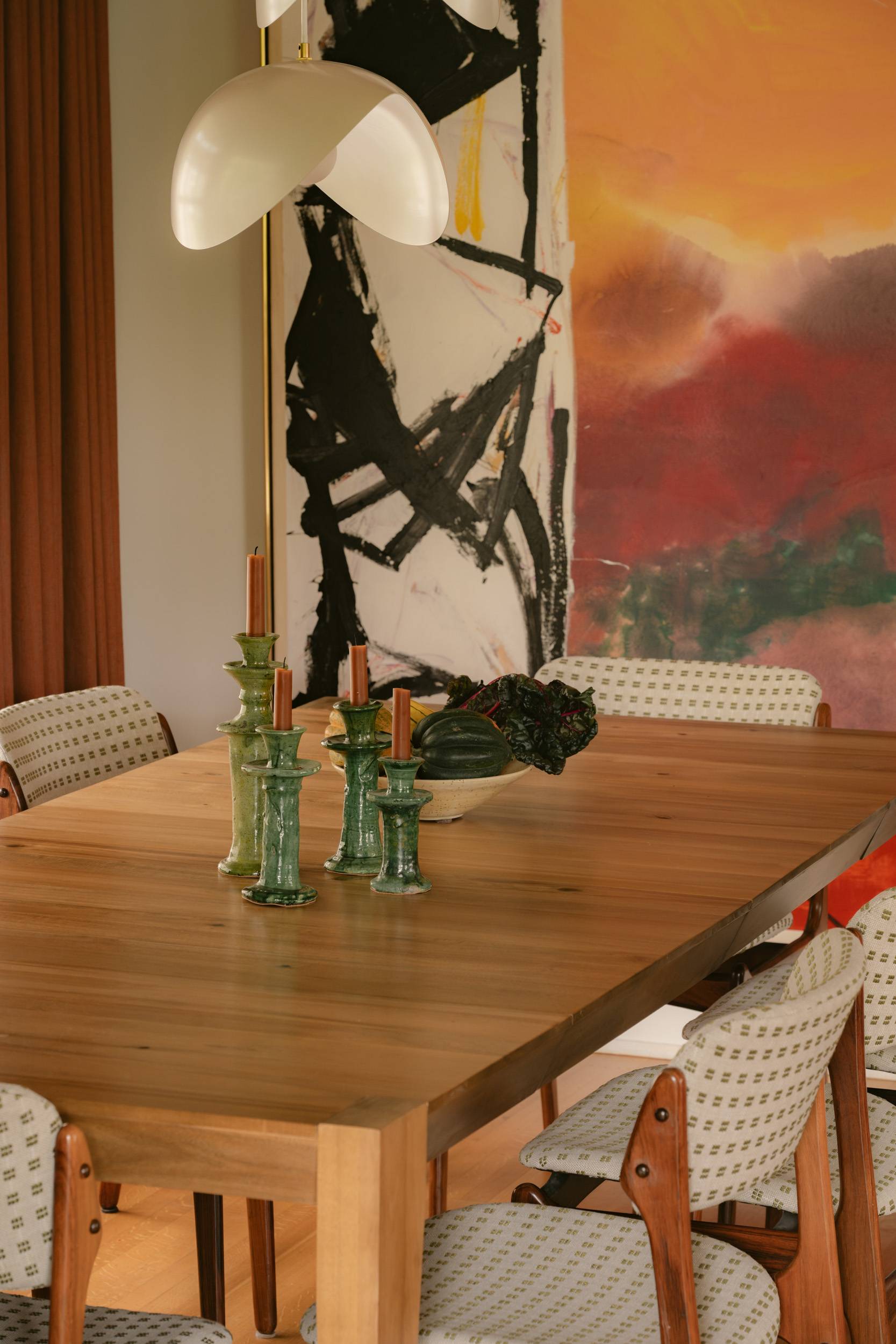
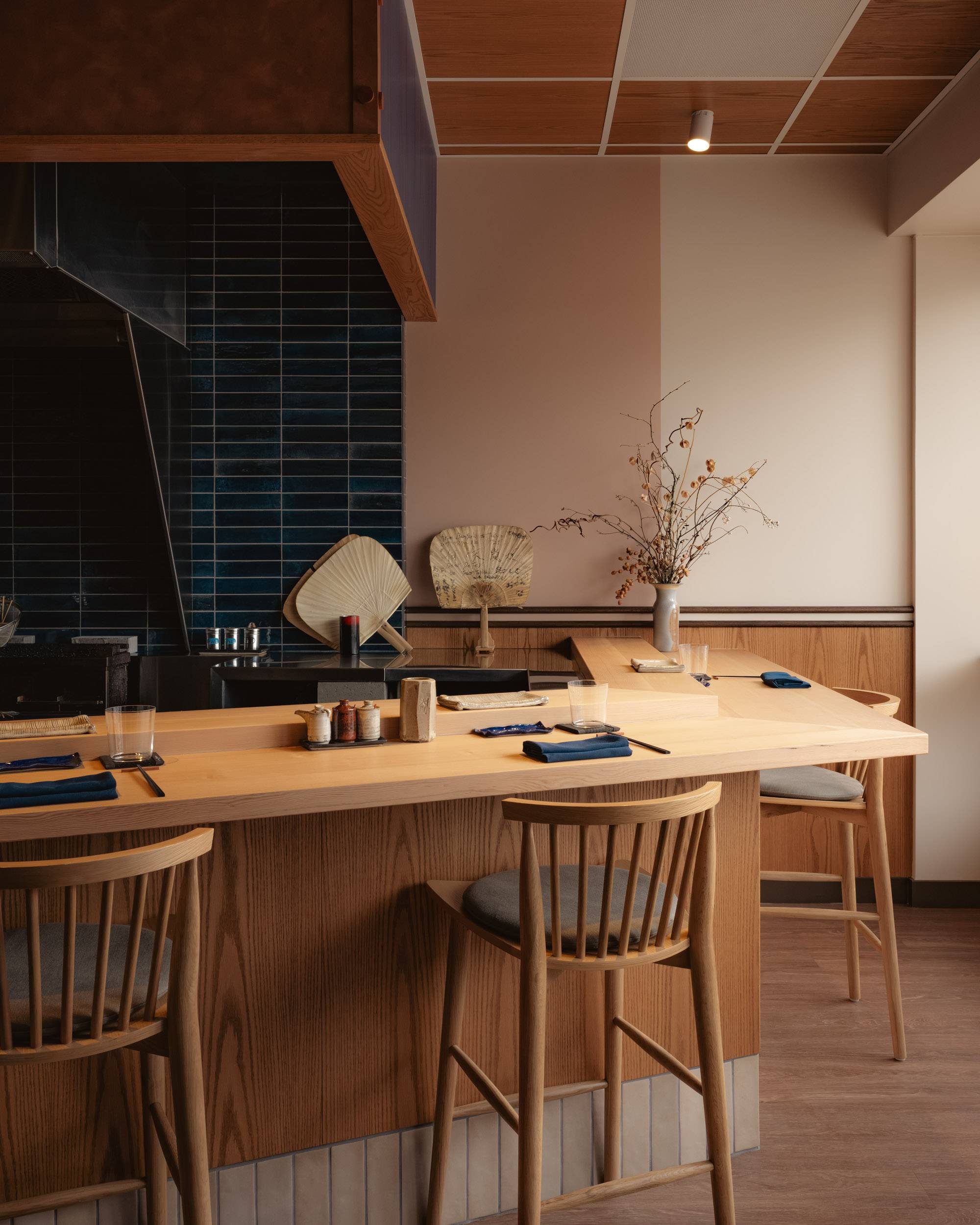
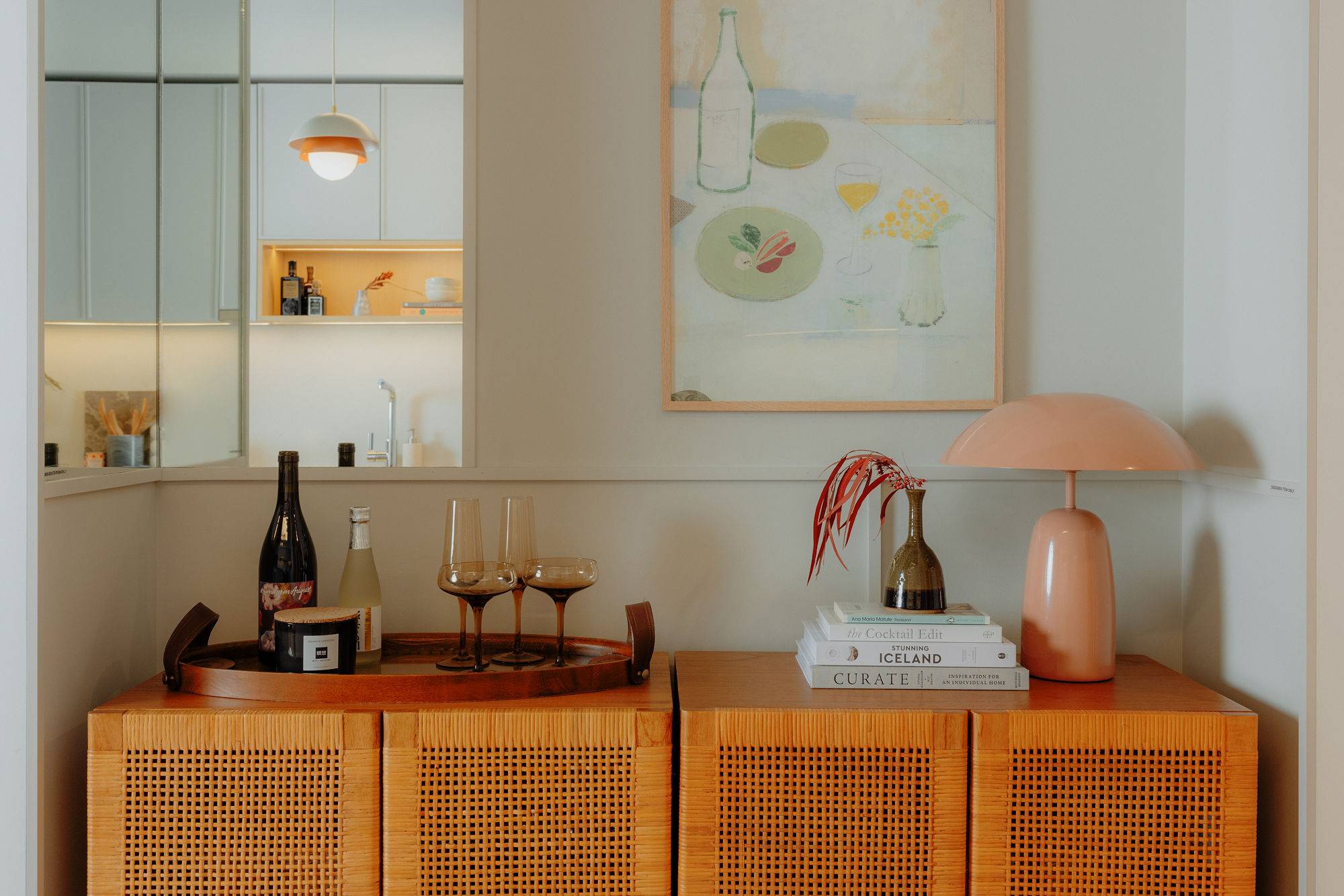
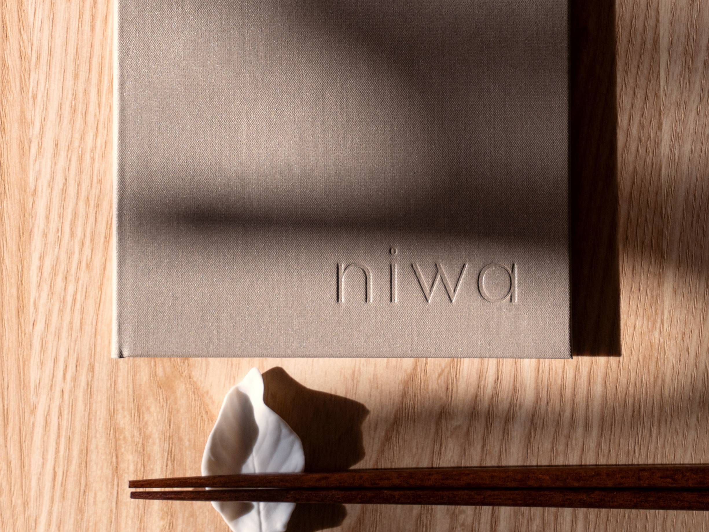
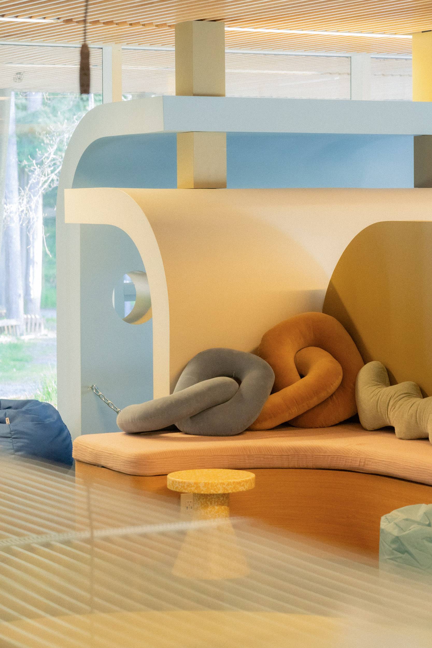
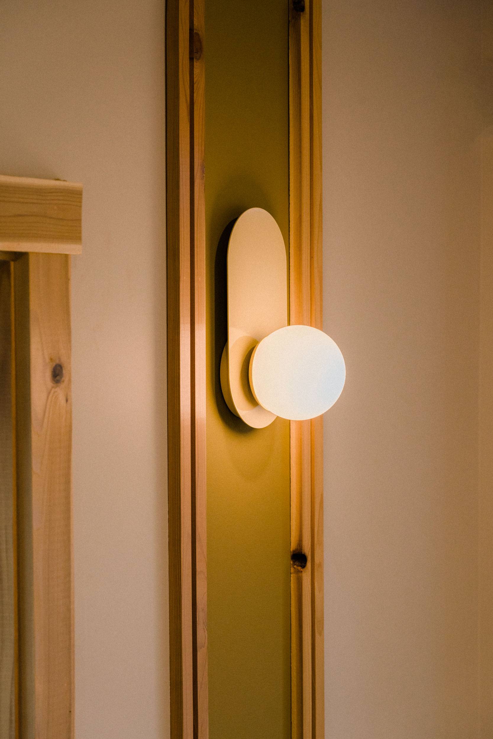
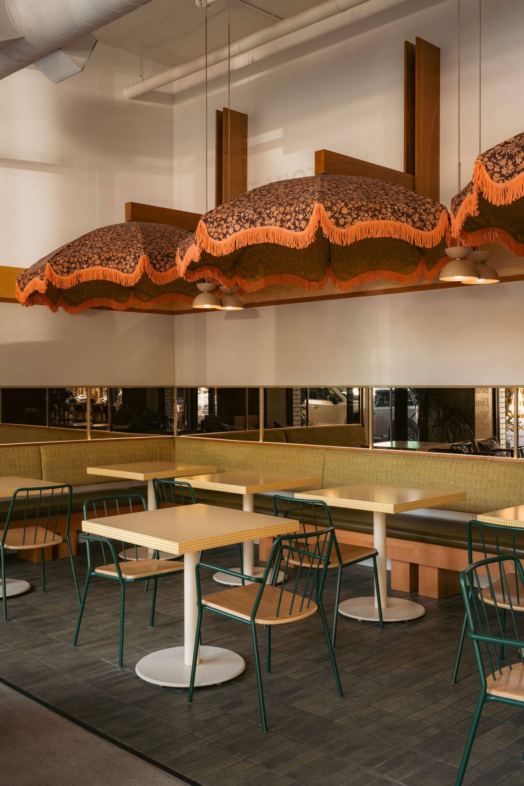
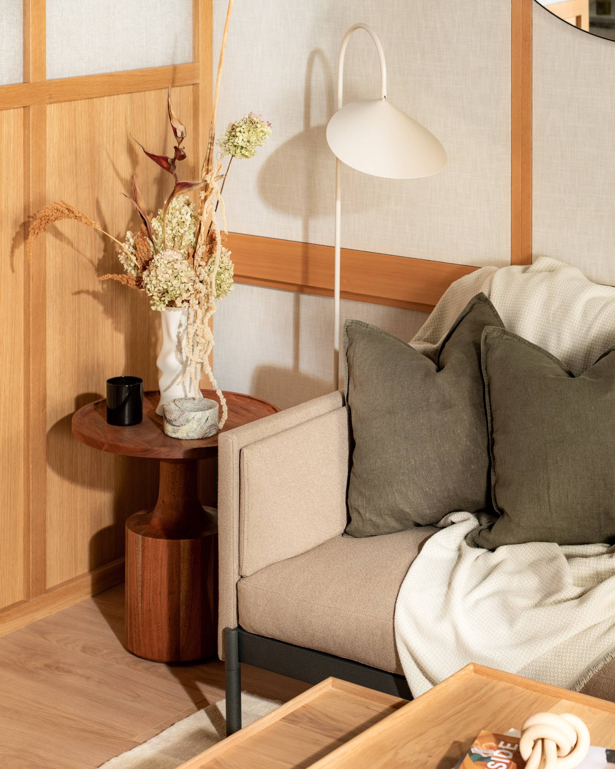
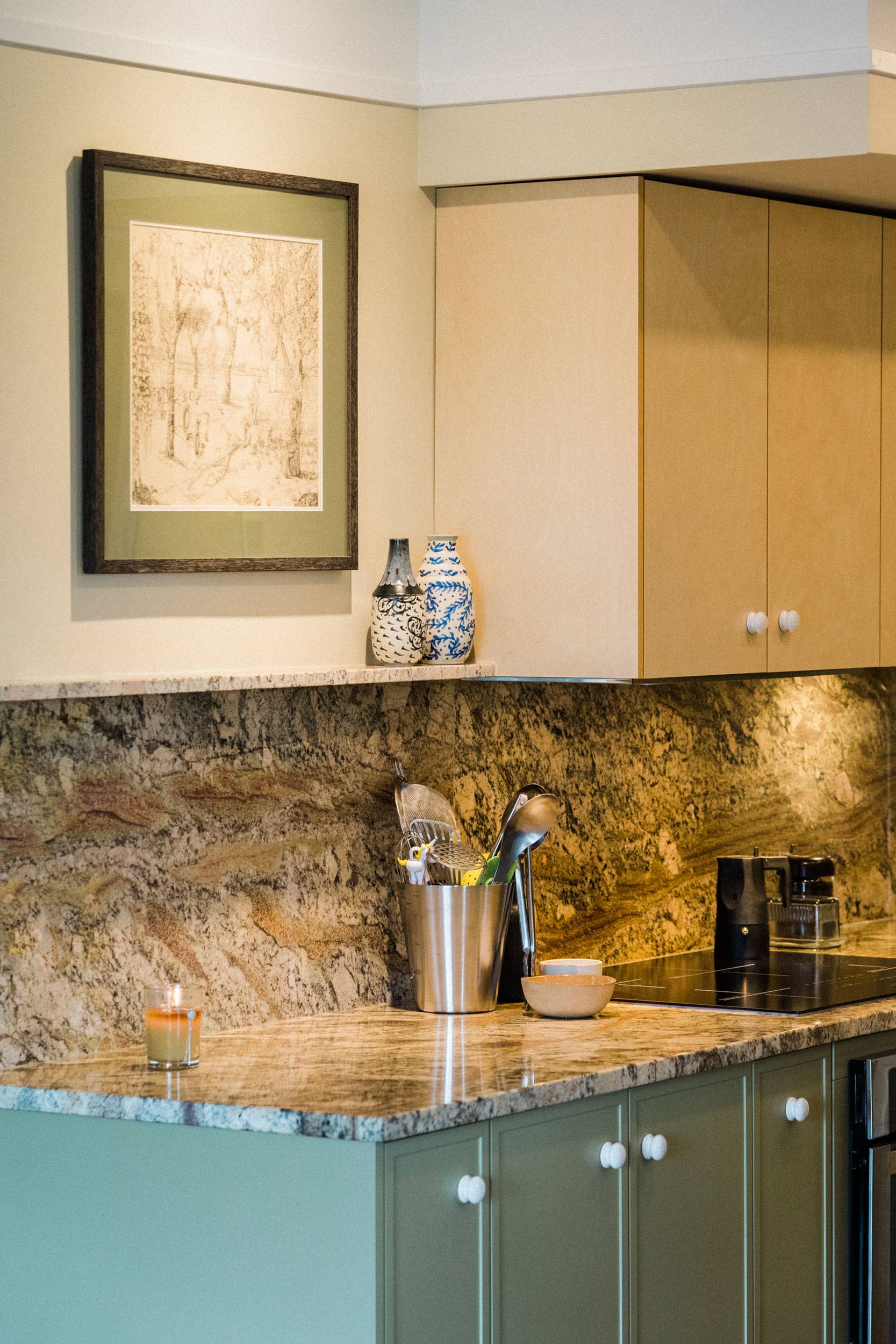
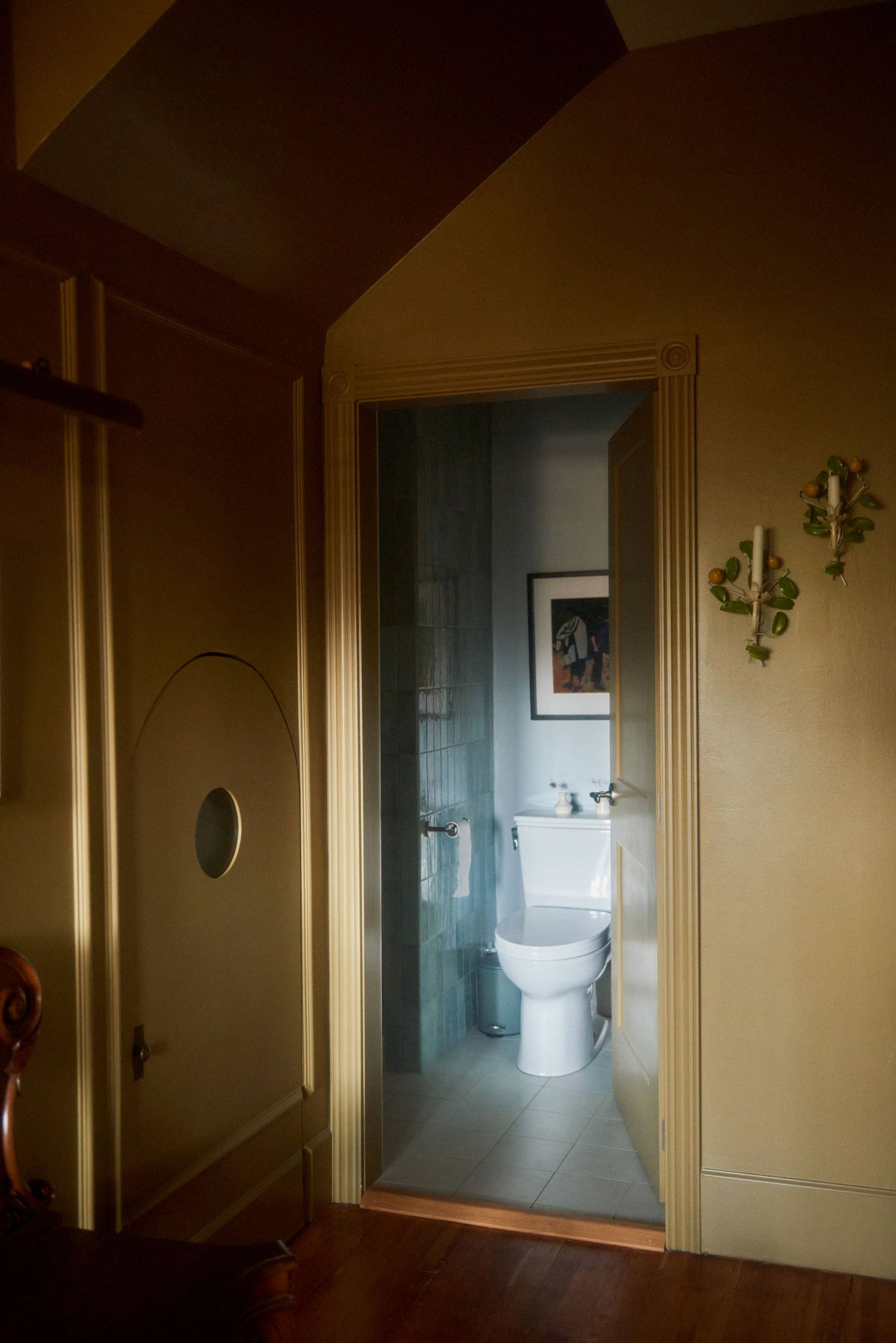
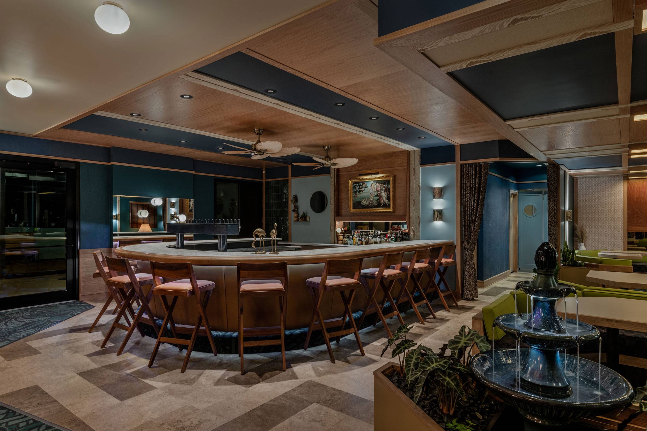
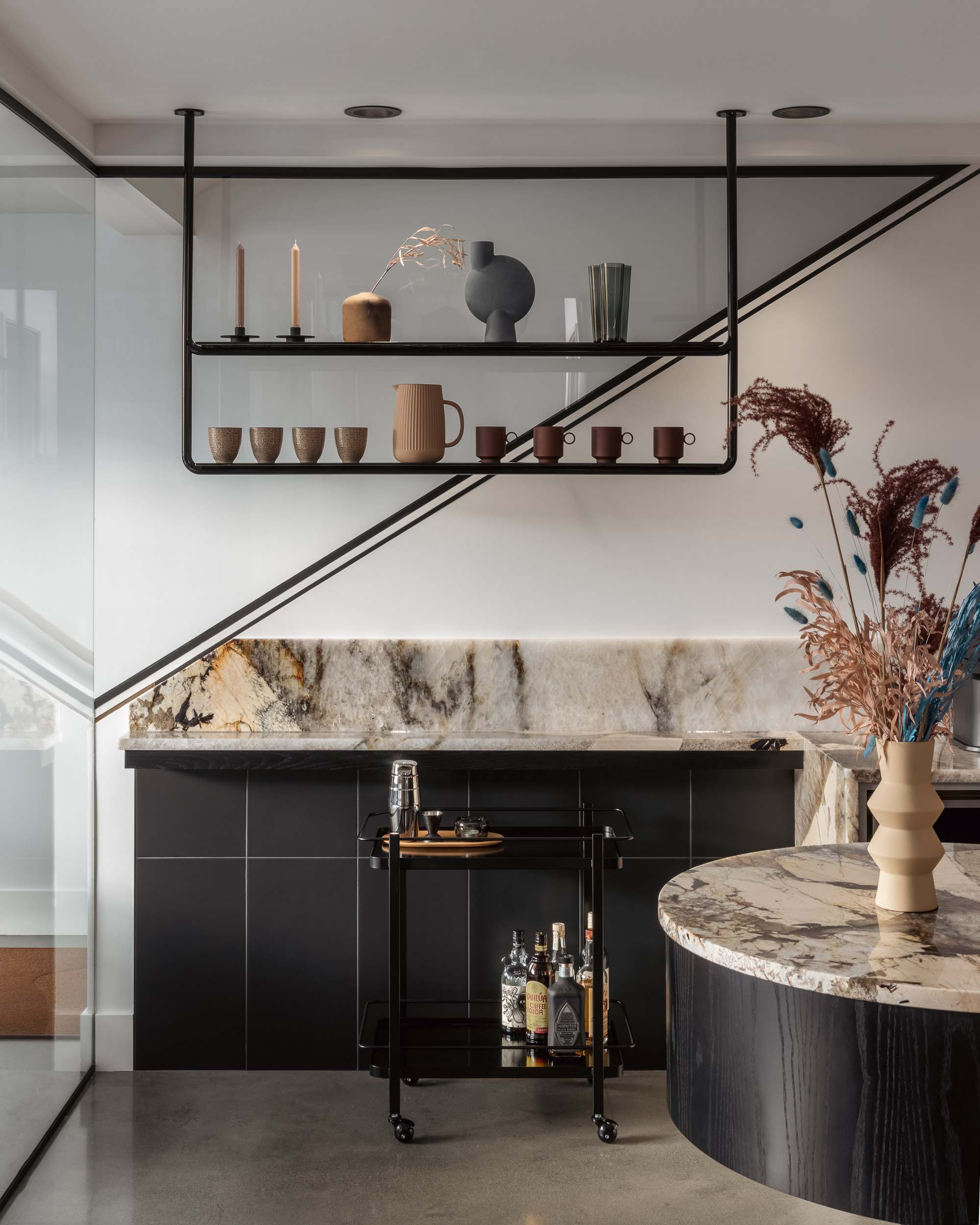
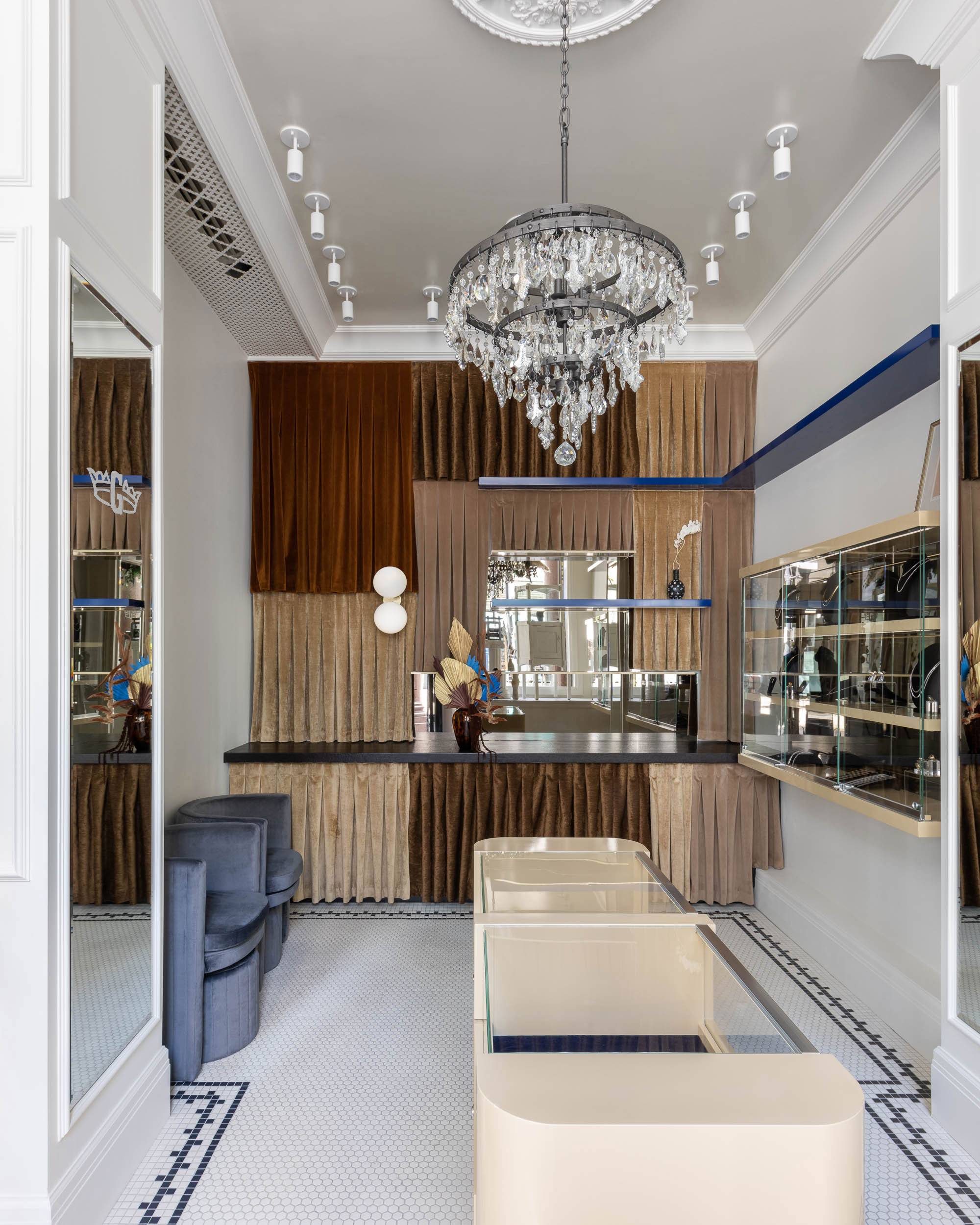
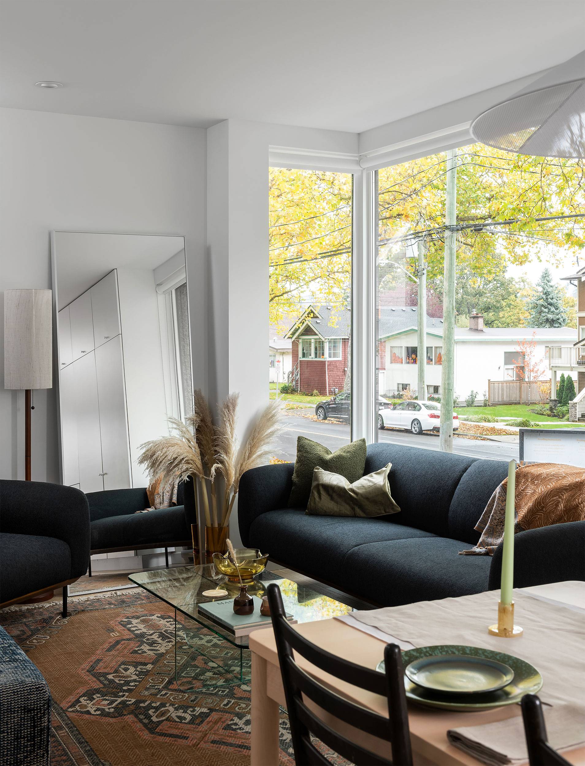
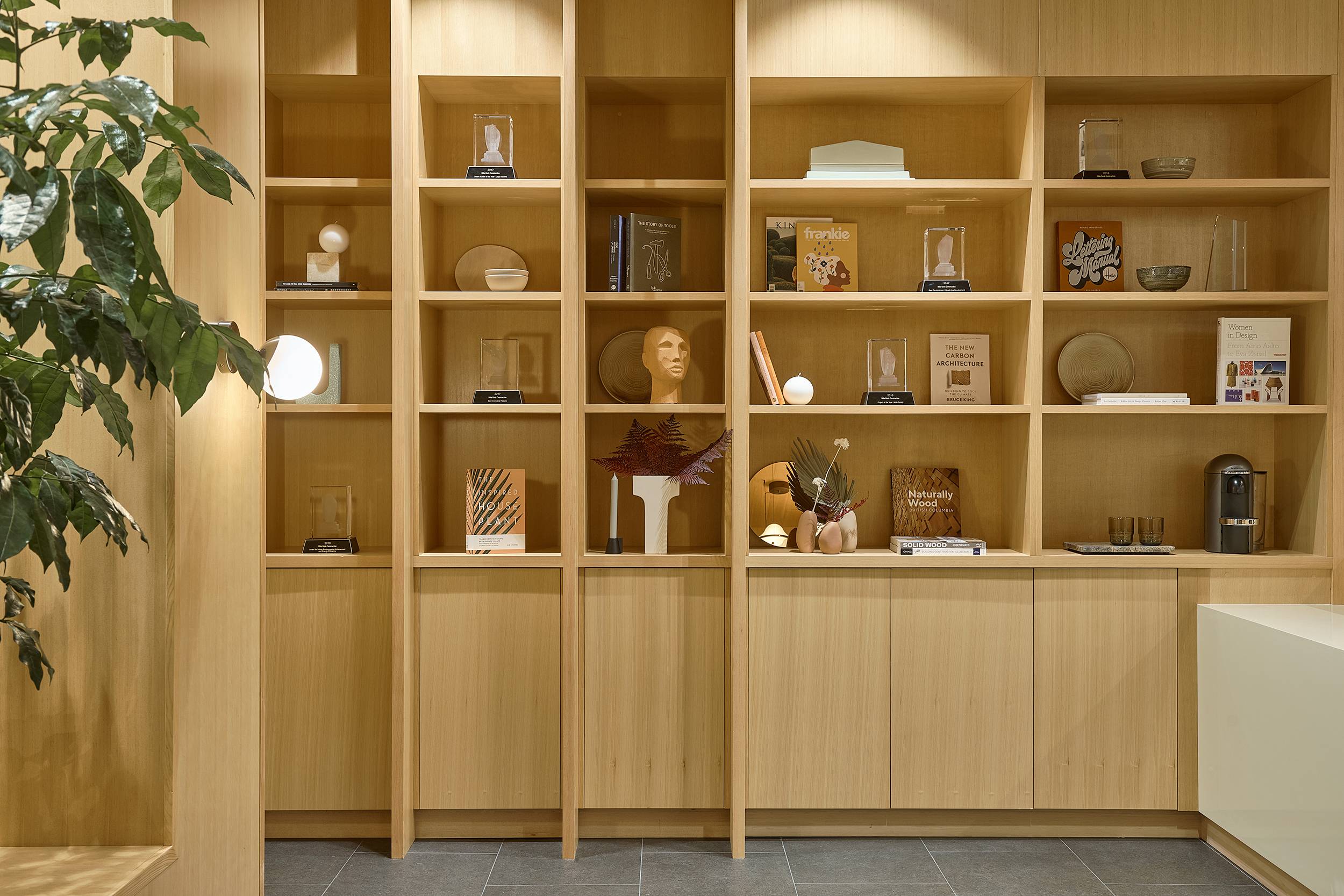
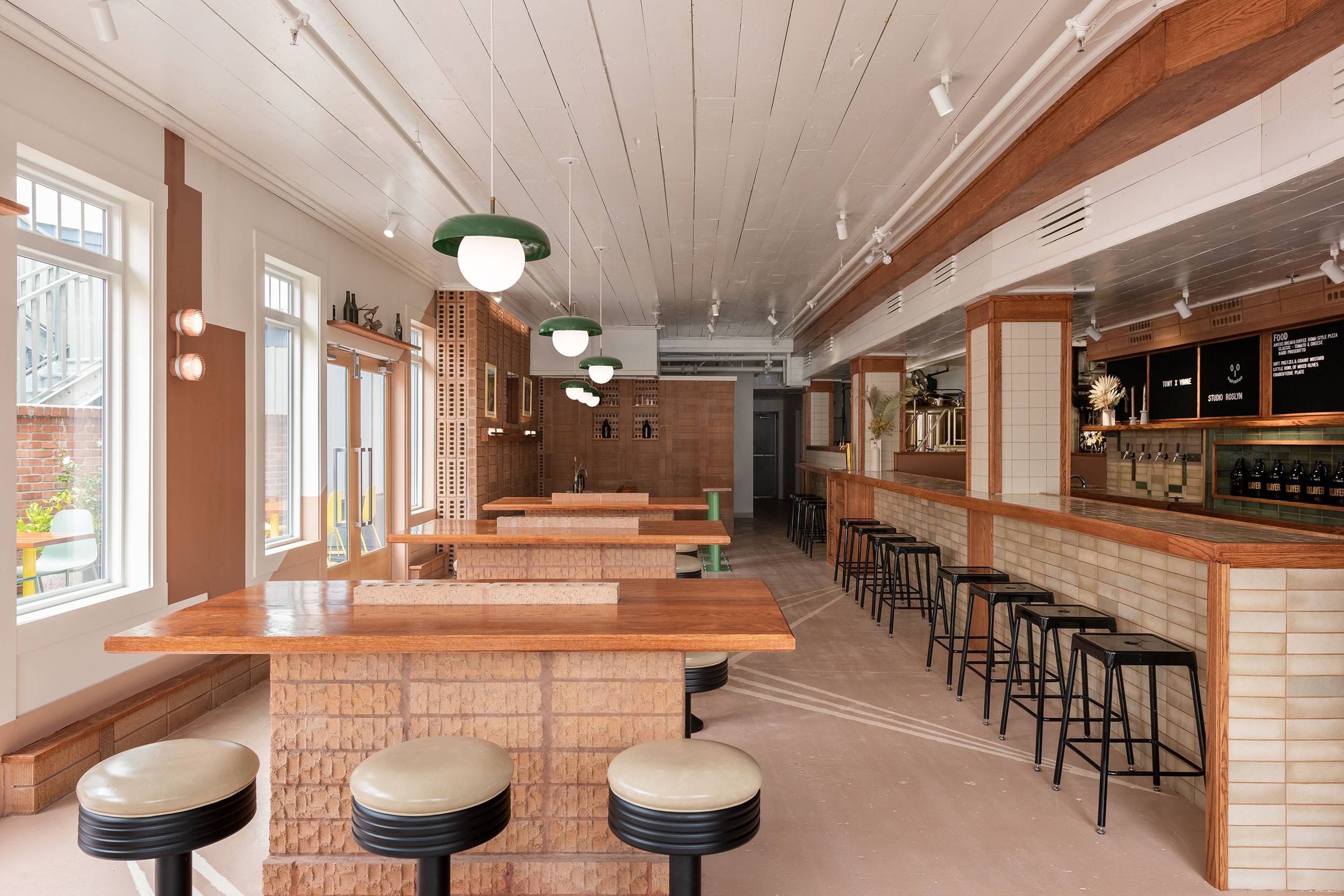
Everwell represents a new beginning for our client, who has provided wellness services to Vancouver’s Point Grey community for over a decade. With a clear vision for her growing business, we were engaged to design both a physical space and a visual identity for Everwell, creating a cohesive and immersive wellness experience for visitors.
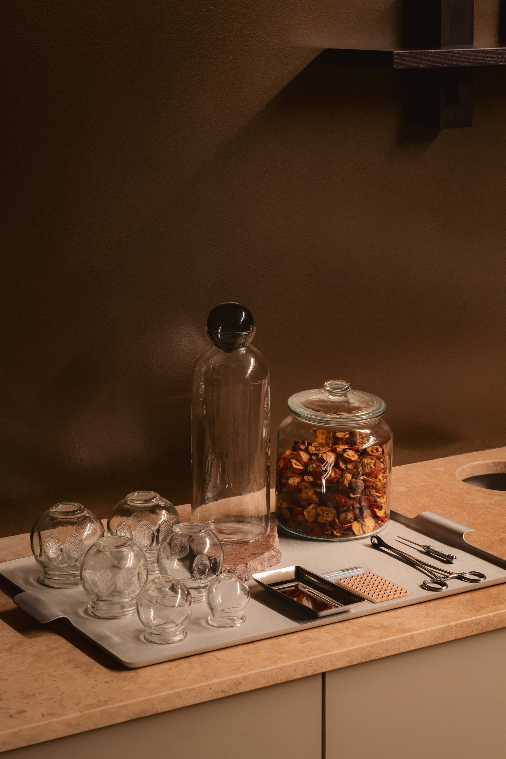
At the heart of Everwell’s practice is the harmonious balance they’ve found between ancient remedies and modern technology. Combining the two is intentional and acknowledges that wellness spaces can, and should, encompass both hands-on healing and cutting edge treatments. The Everwell team, composed of experts in naturopathic and traditional Chinese medicine (TCM), as well as aesthetics stand as a testament to this ethos.
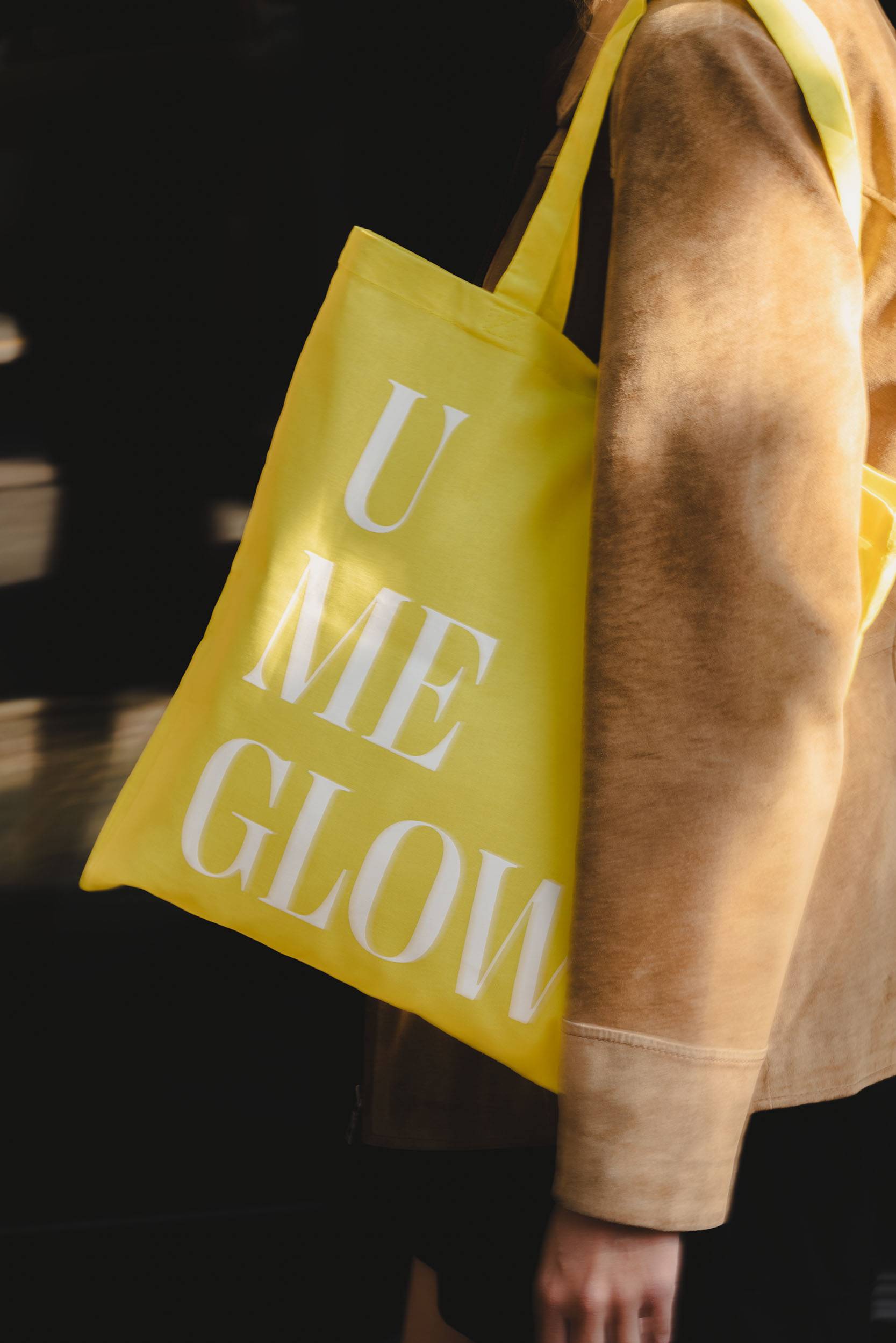
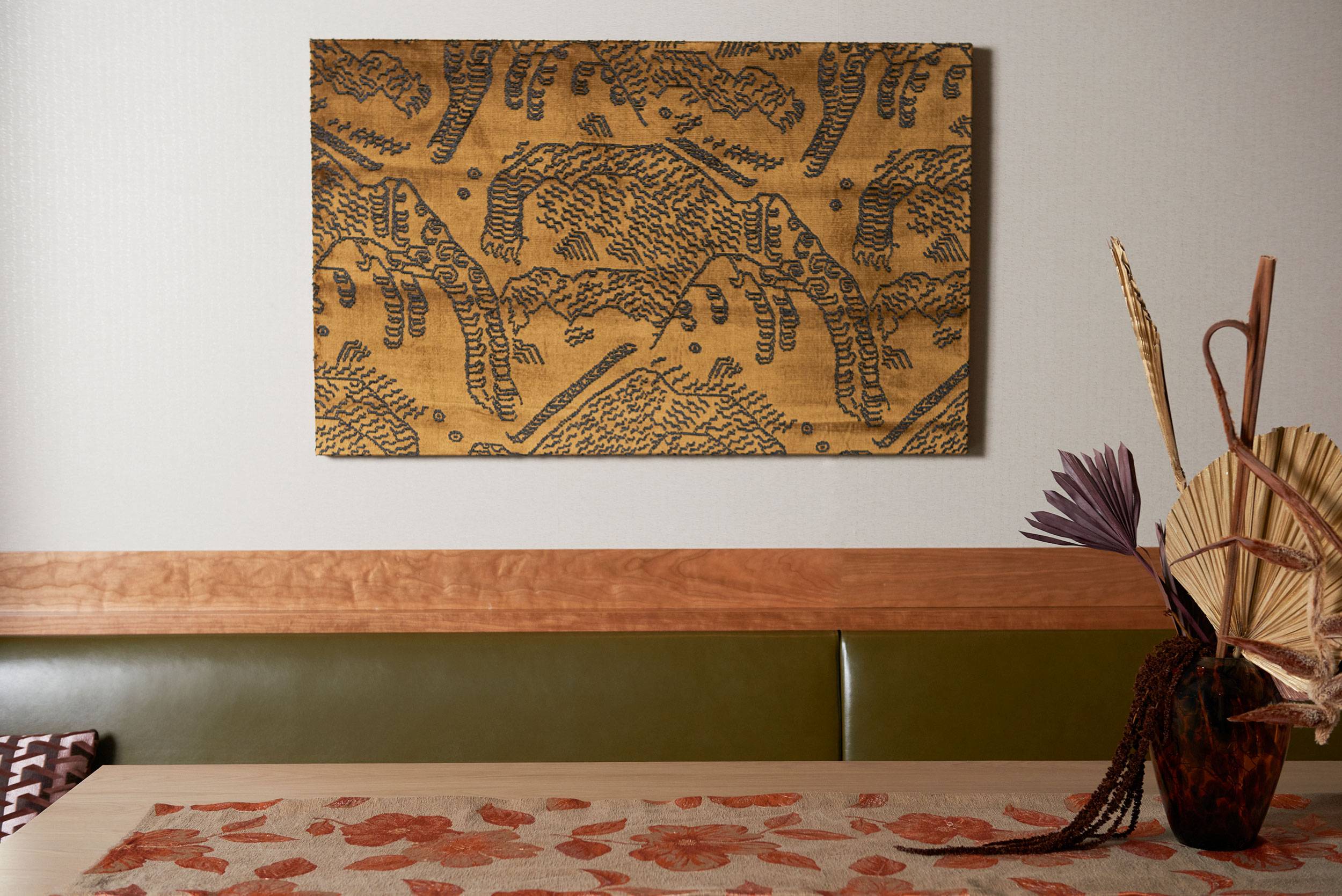
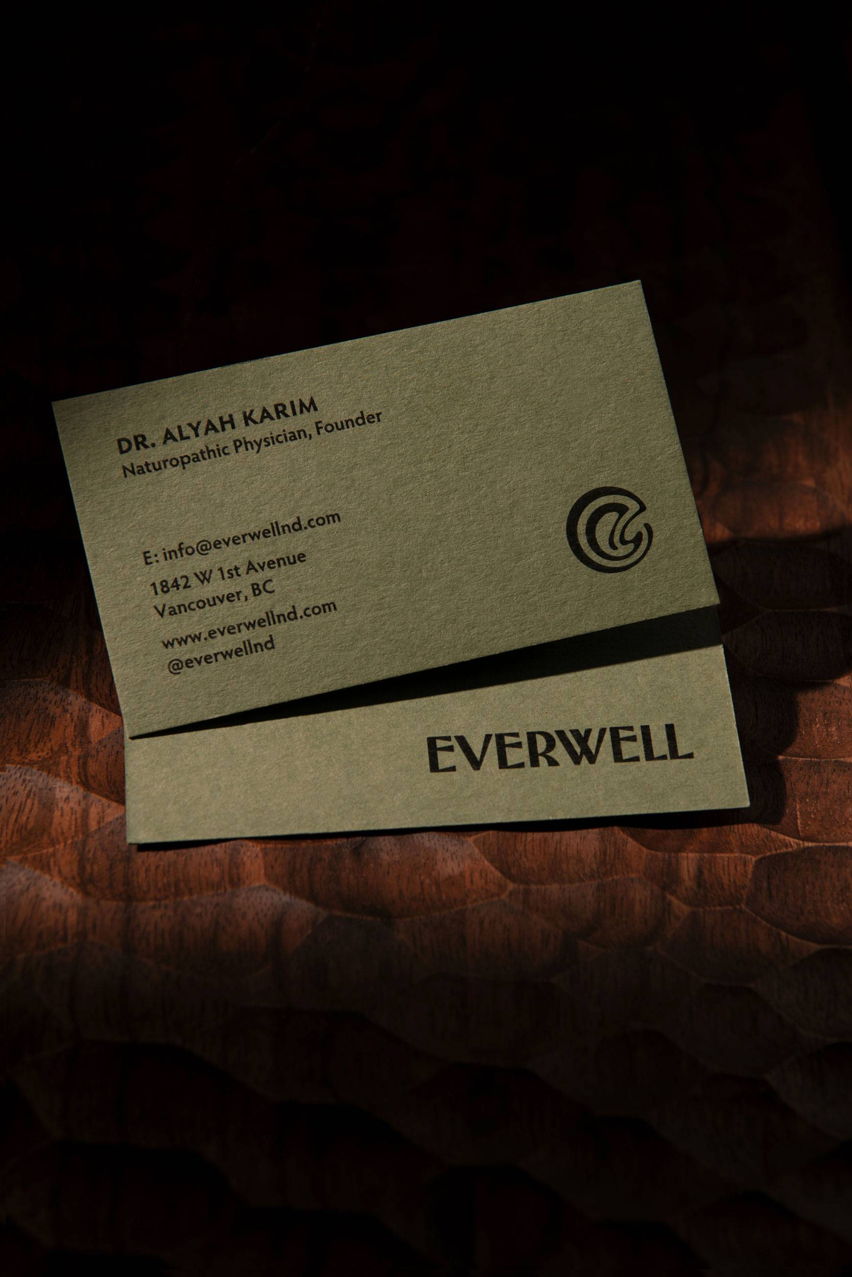
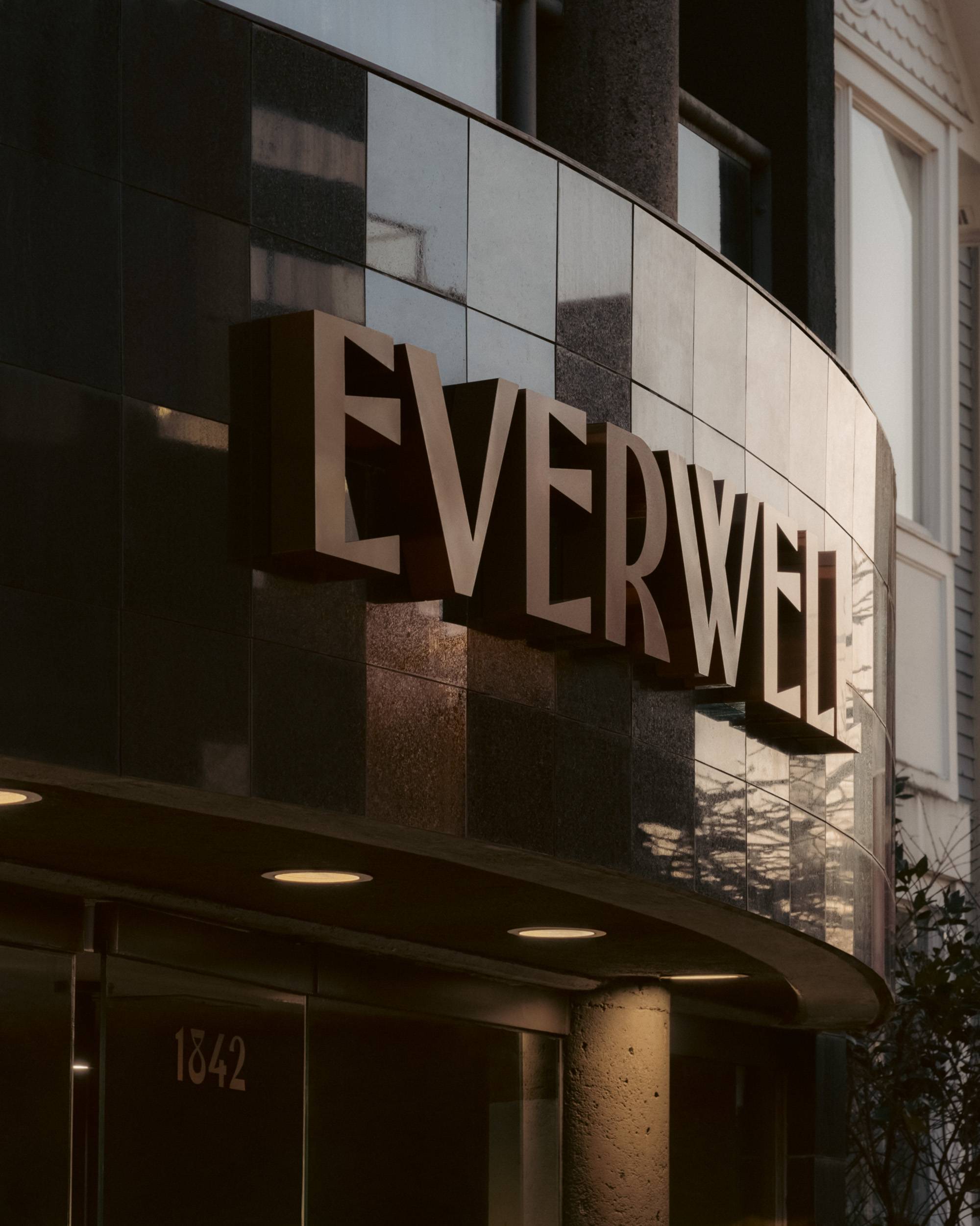
Our design approach was guided by Everwell’s seamless integration of the past and present. Drawing from the hues and patterns found in nature, alongside the avant-garde works of The Wiener Werkstätte, we crafted a visual identity that mirrors Everwell’s commitment to health and vitality. The logo, an abstract depiction of a wellspring, symbolizes rejuvenation and vitality, while a custom font, inspired by historic letterforms, ensures a timeless brand aesthetic. These elements extend throughout the space, from grand bronze facade signs to practitioner business cards.
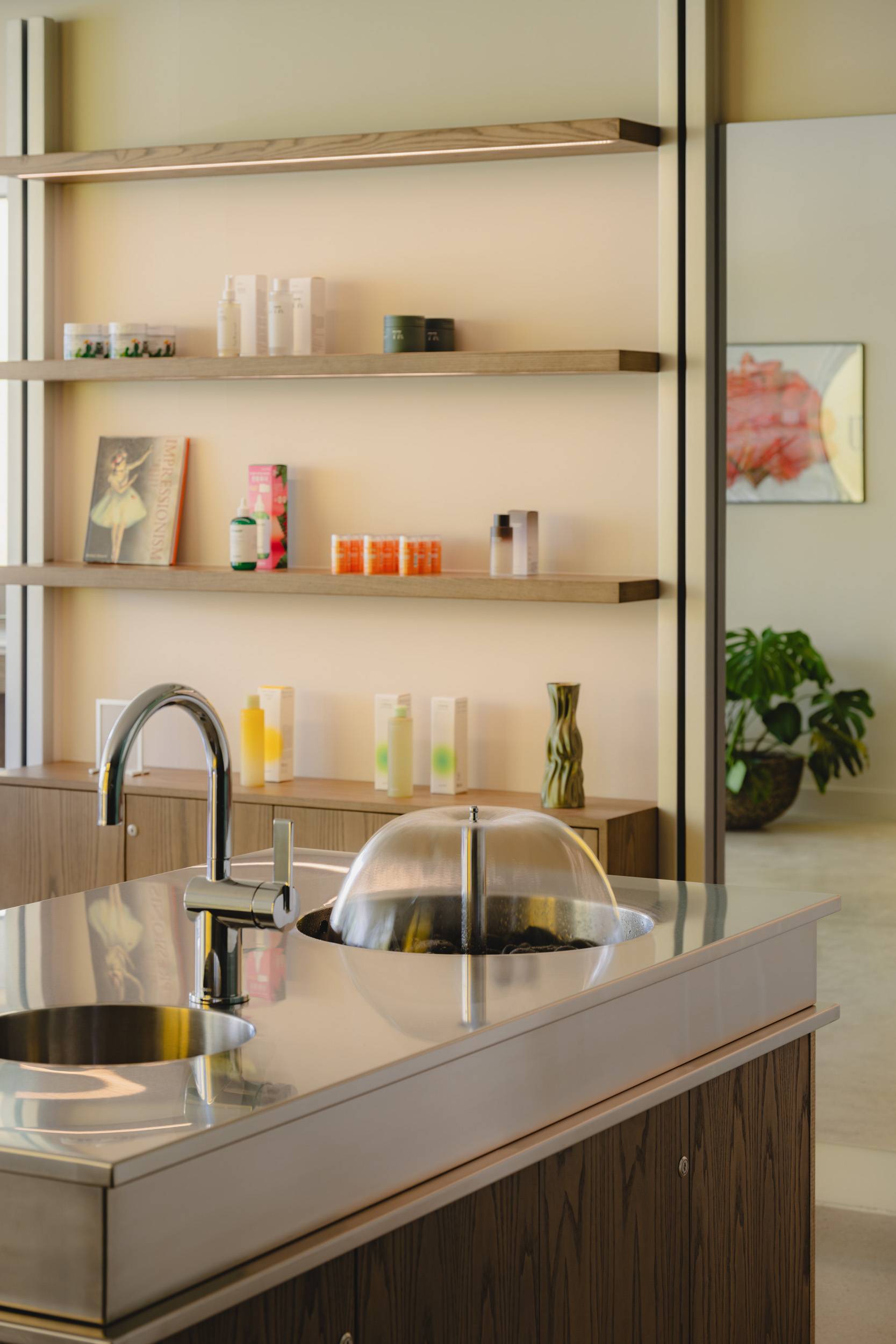
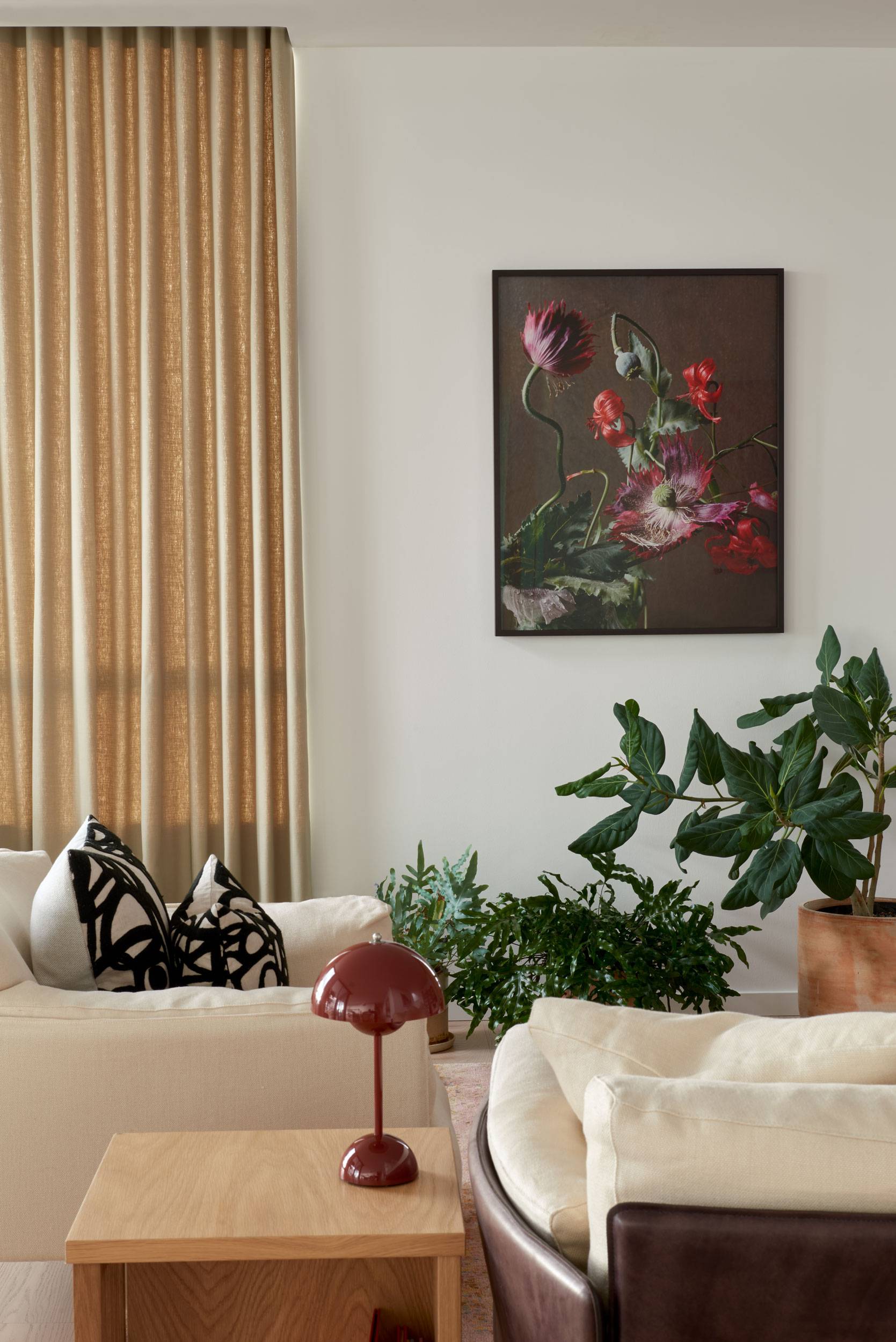
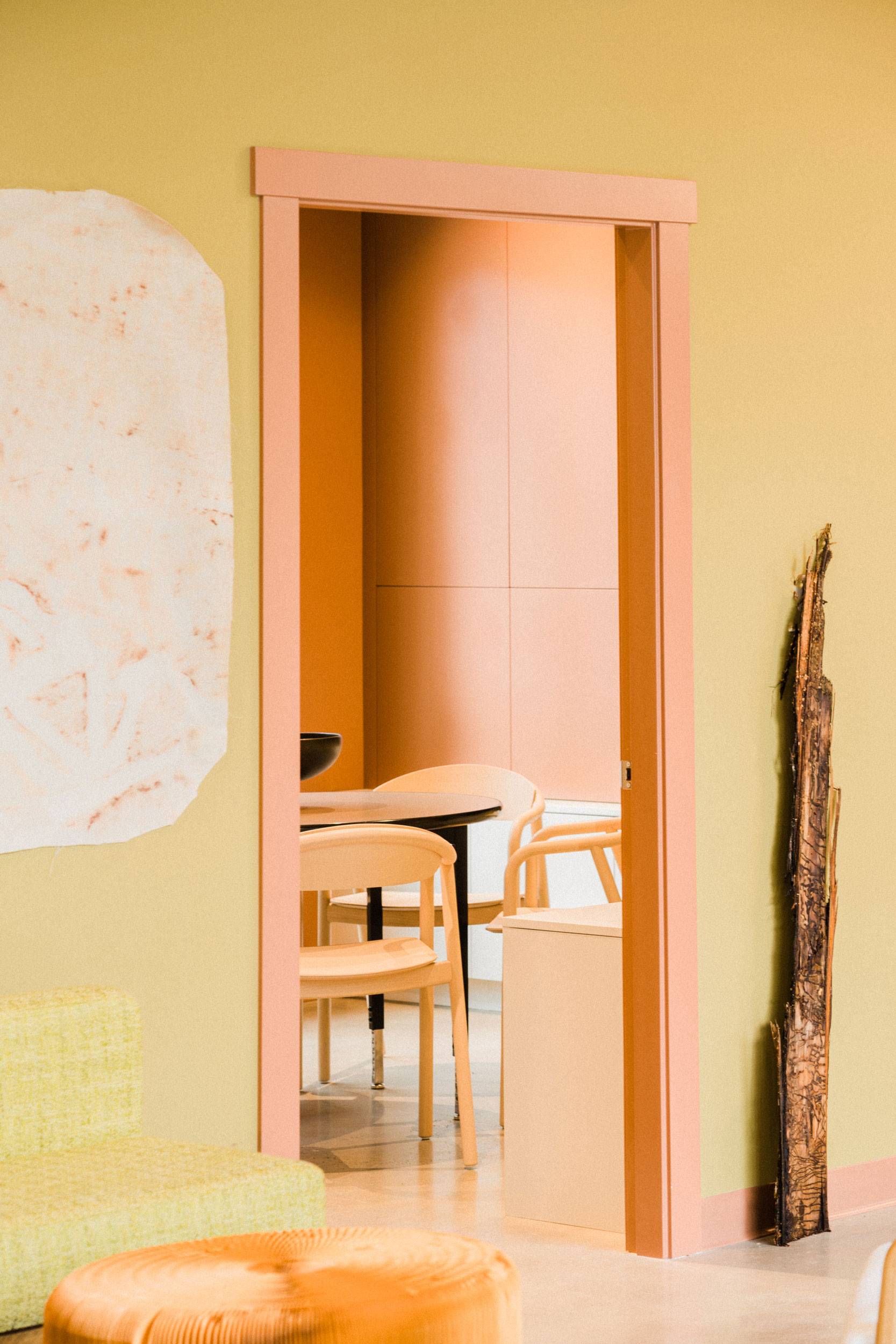
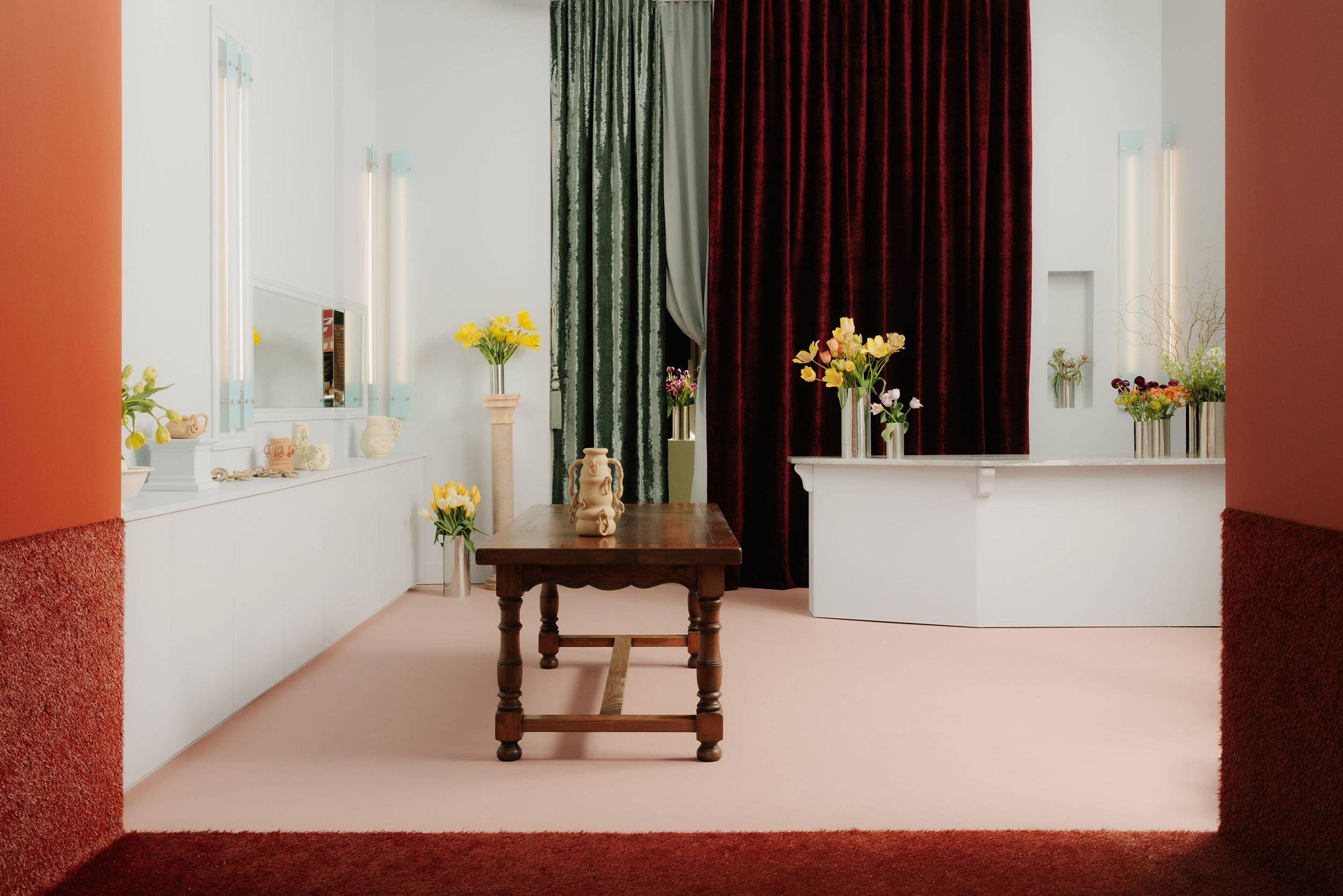
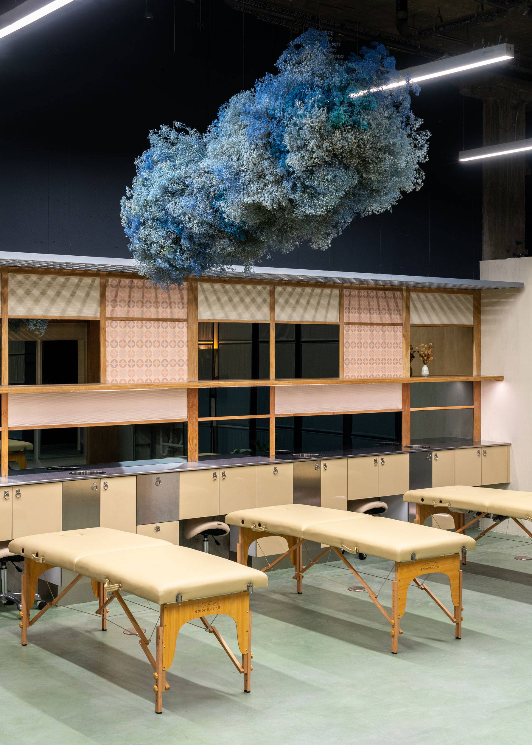
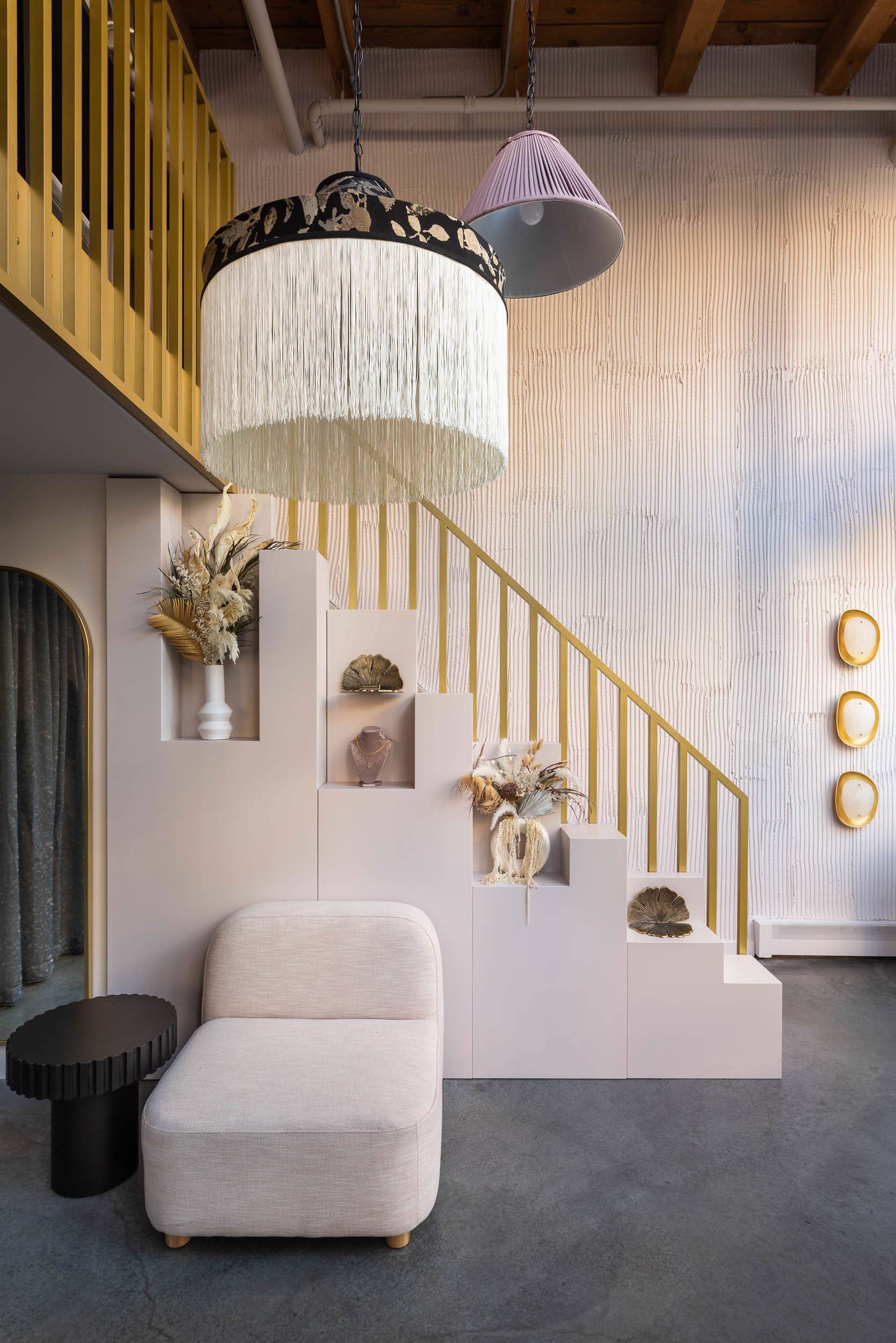
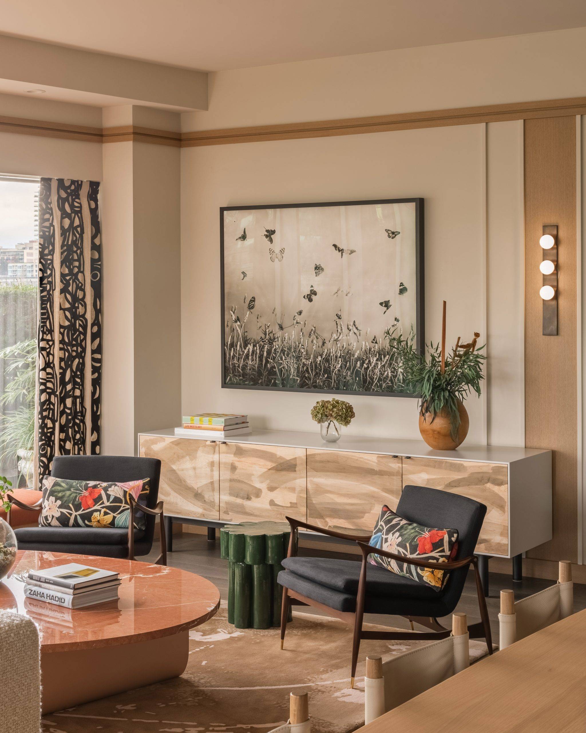
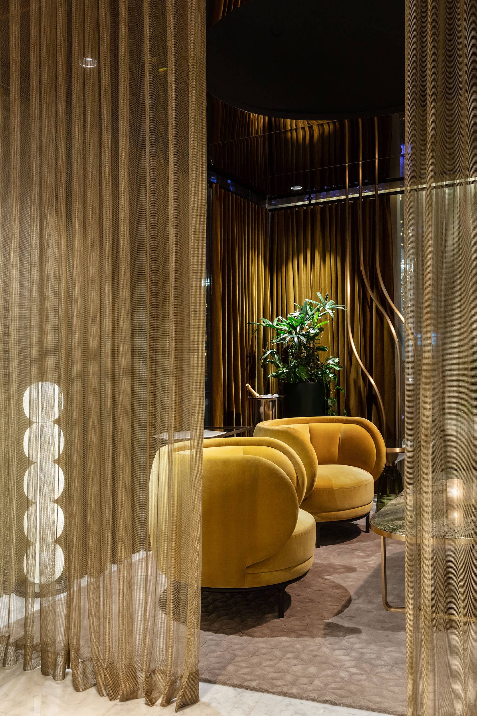
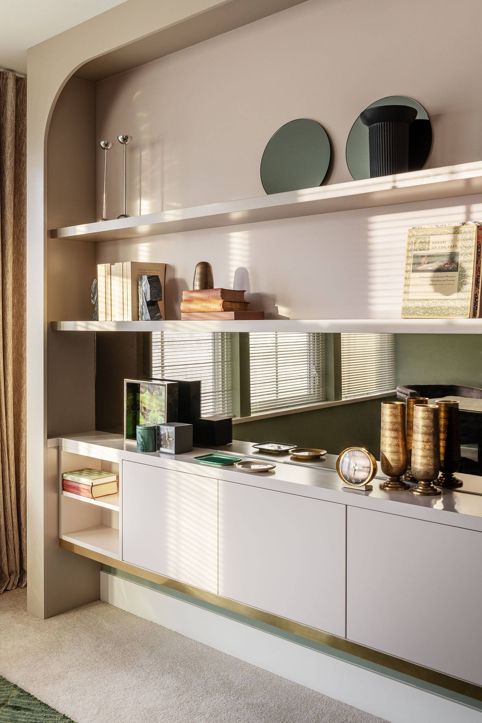
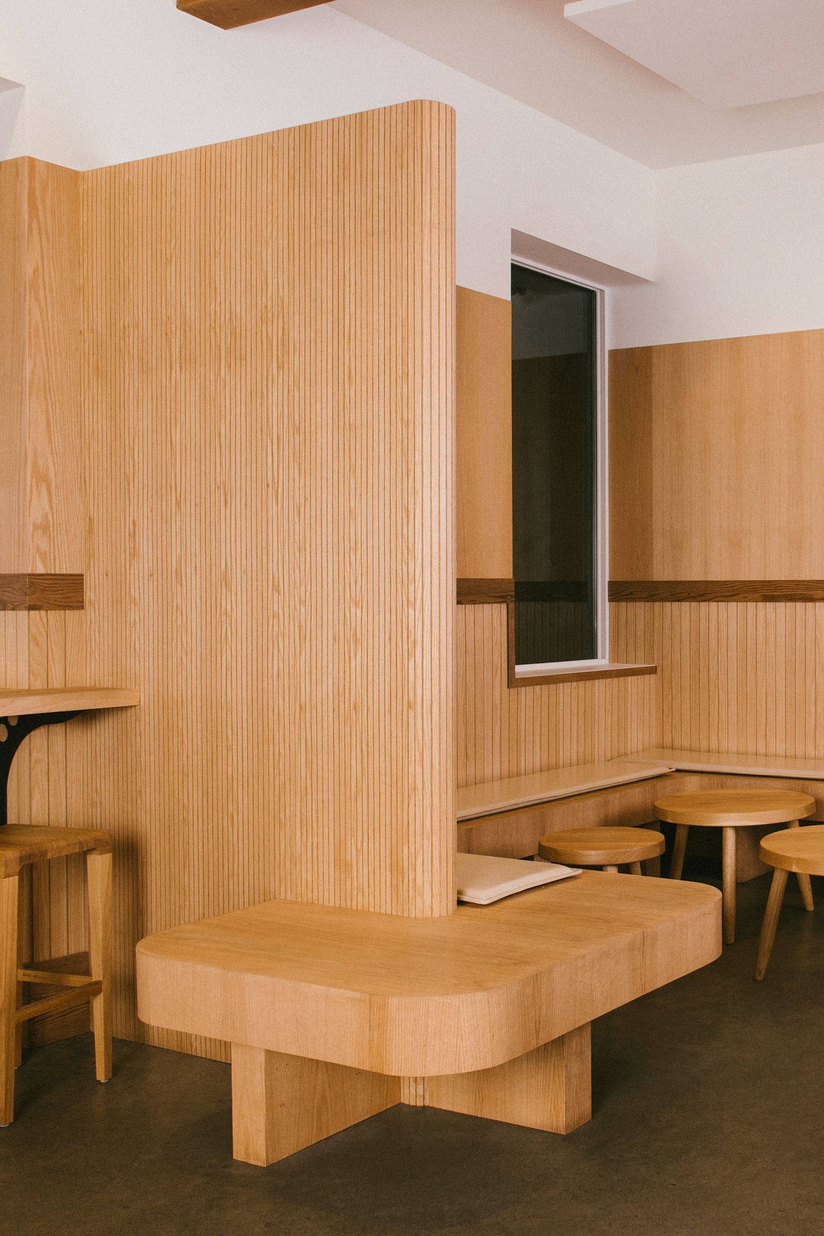
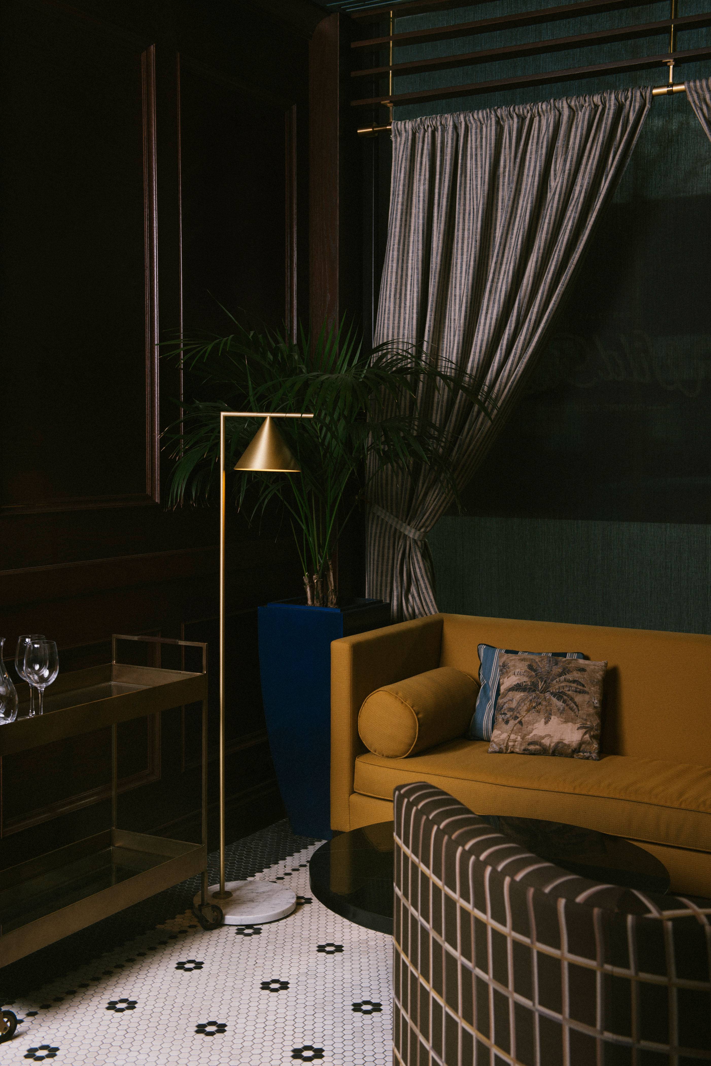
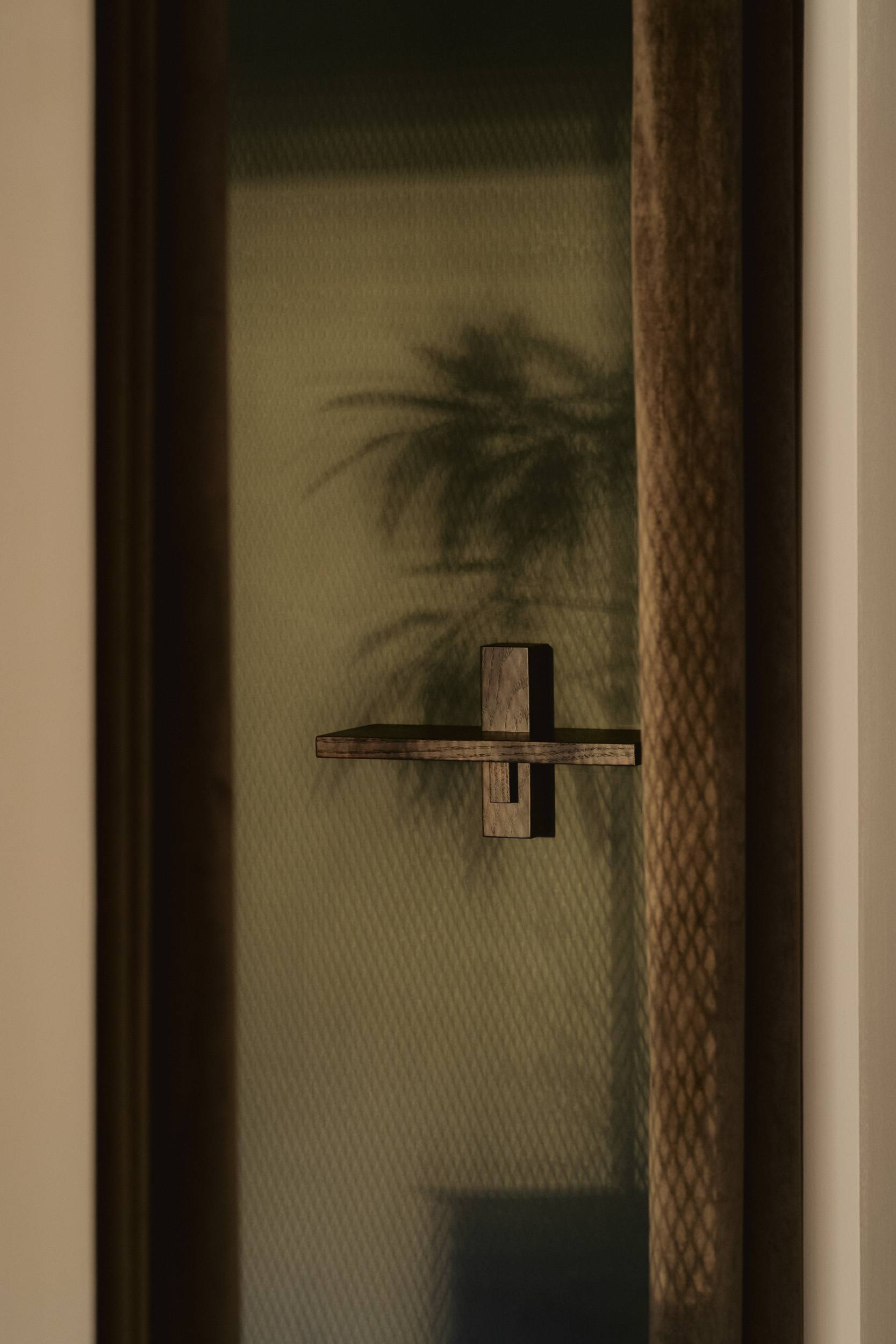
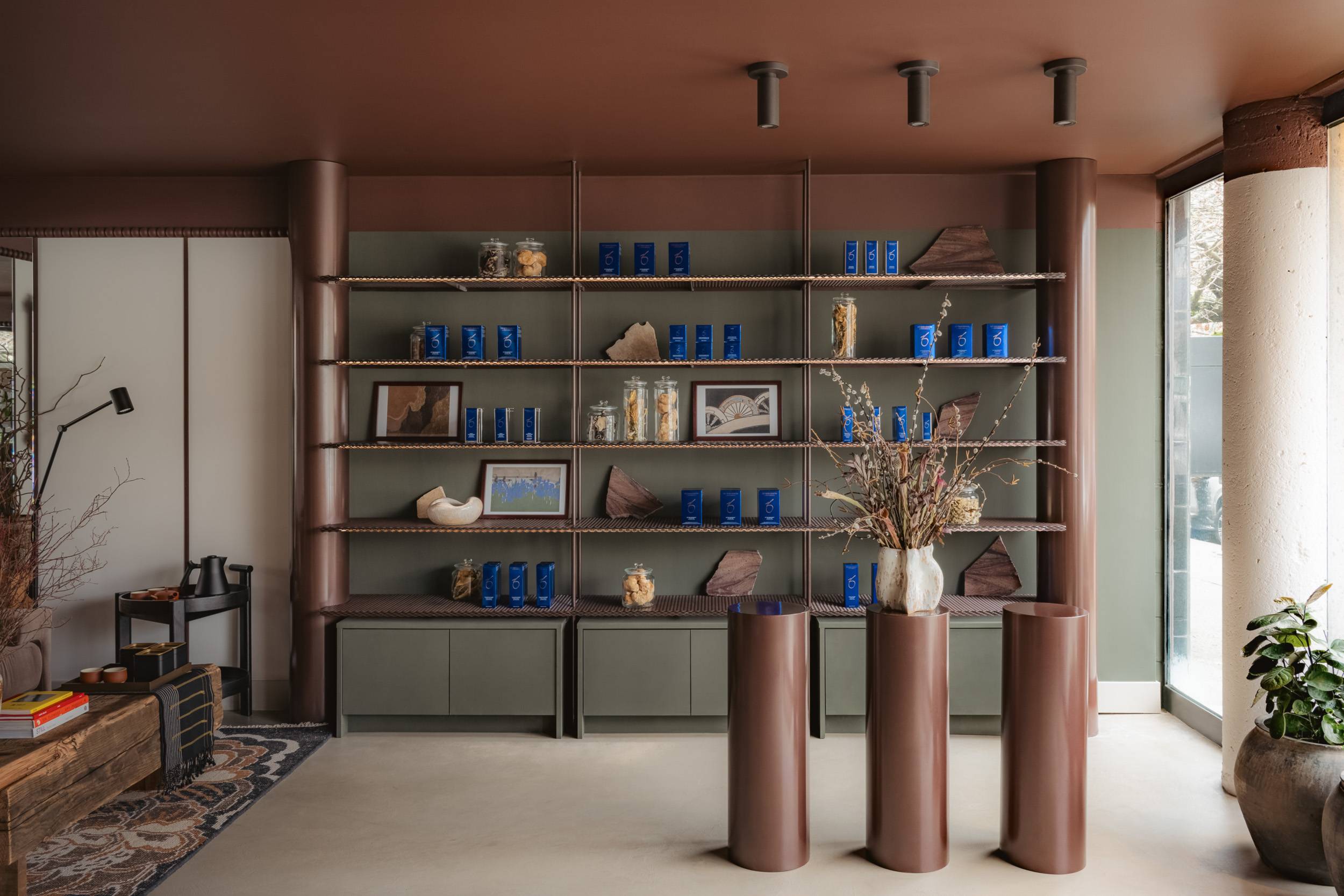
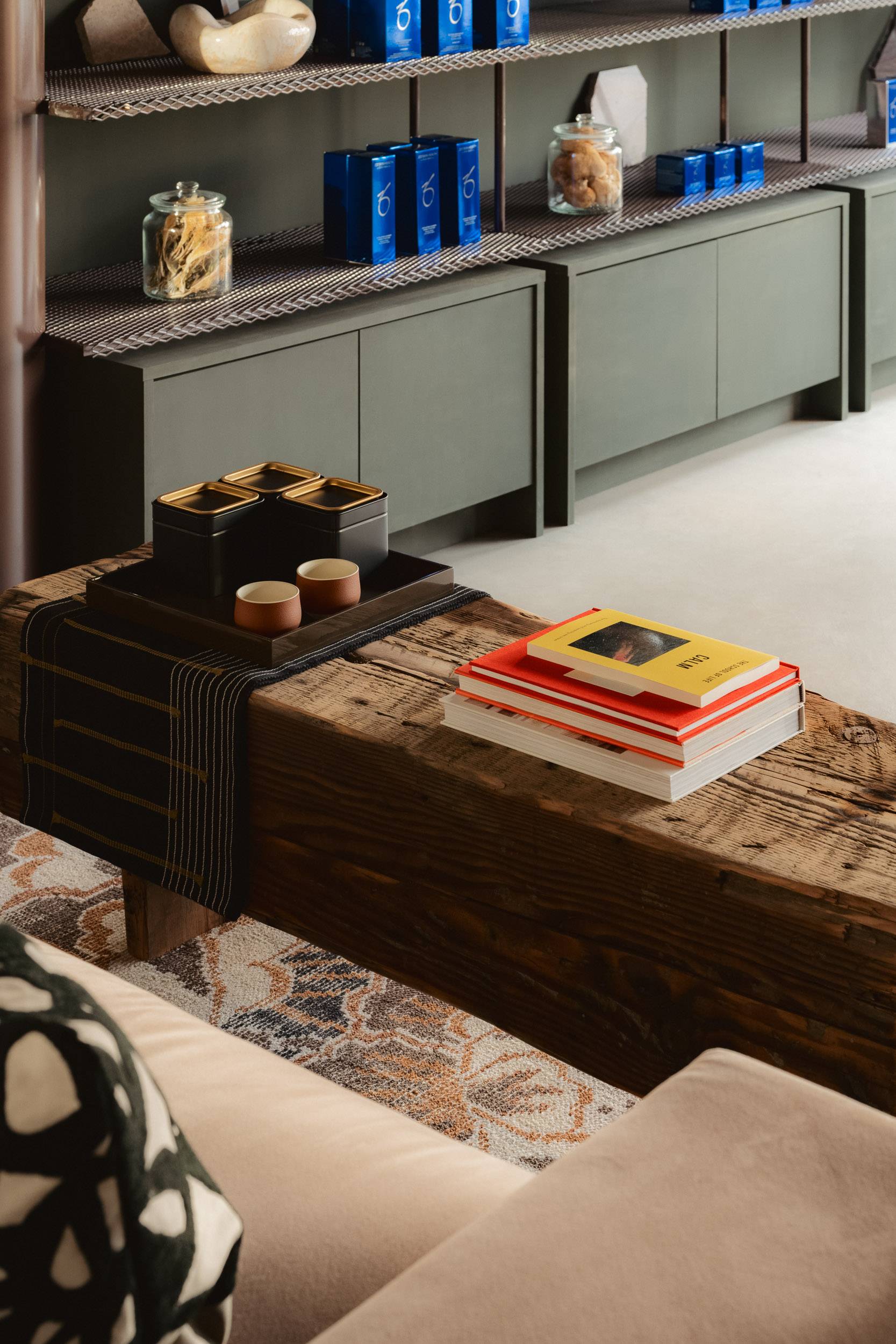
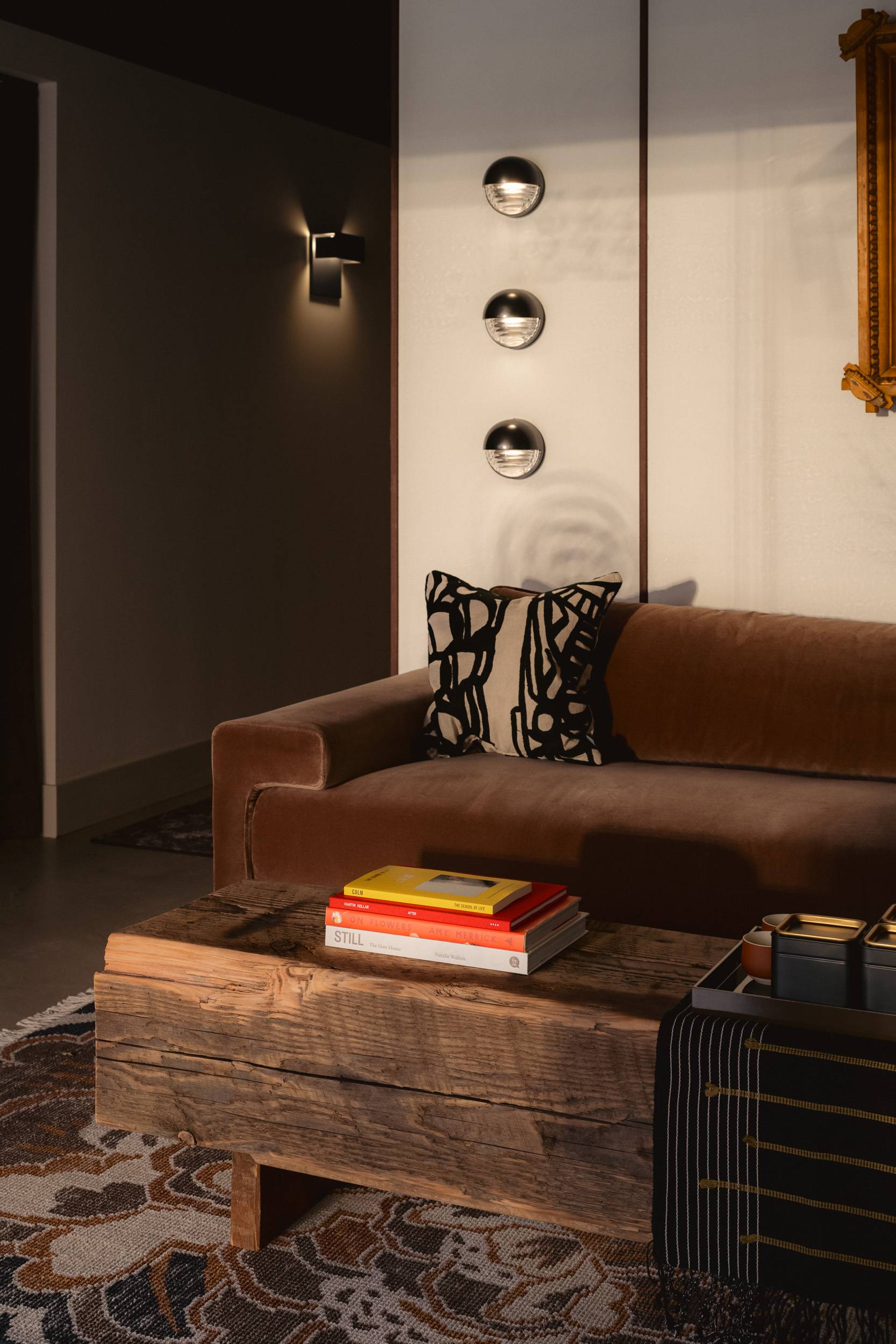
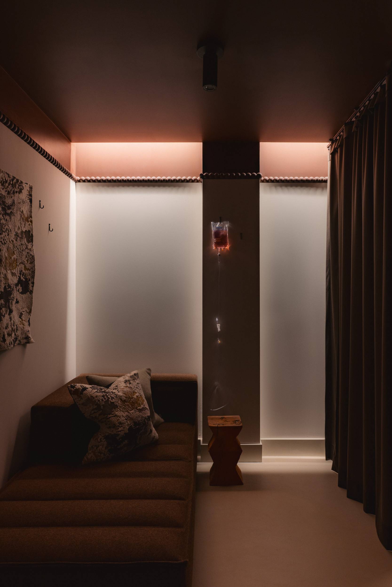
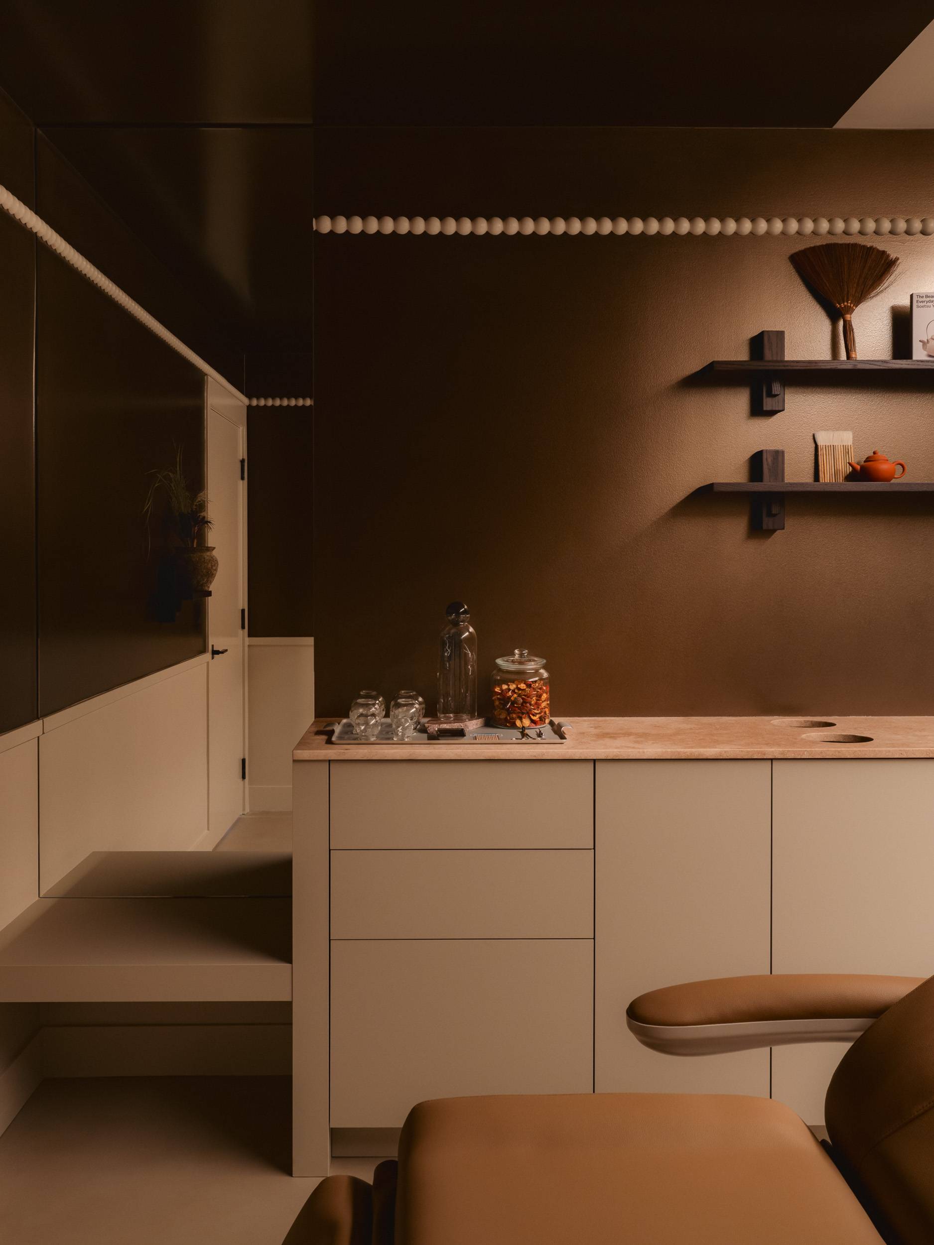
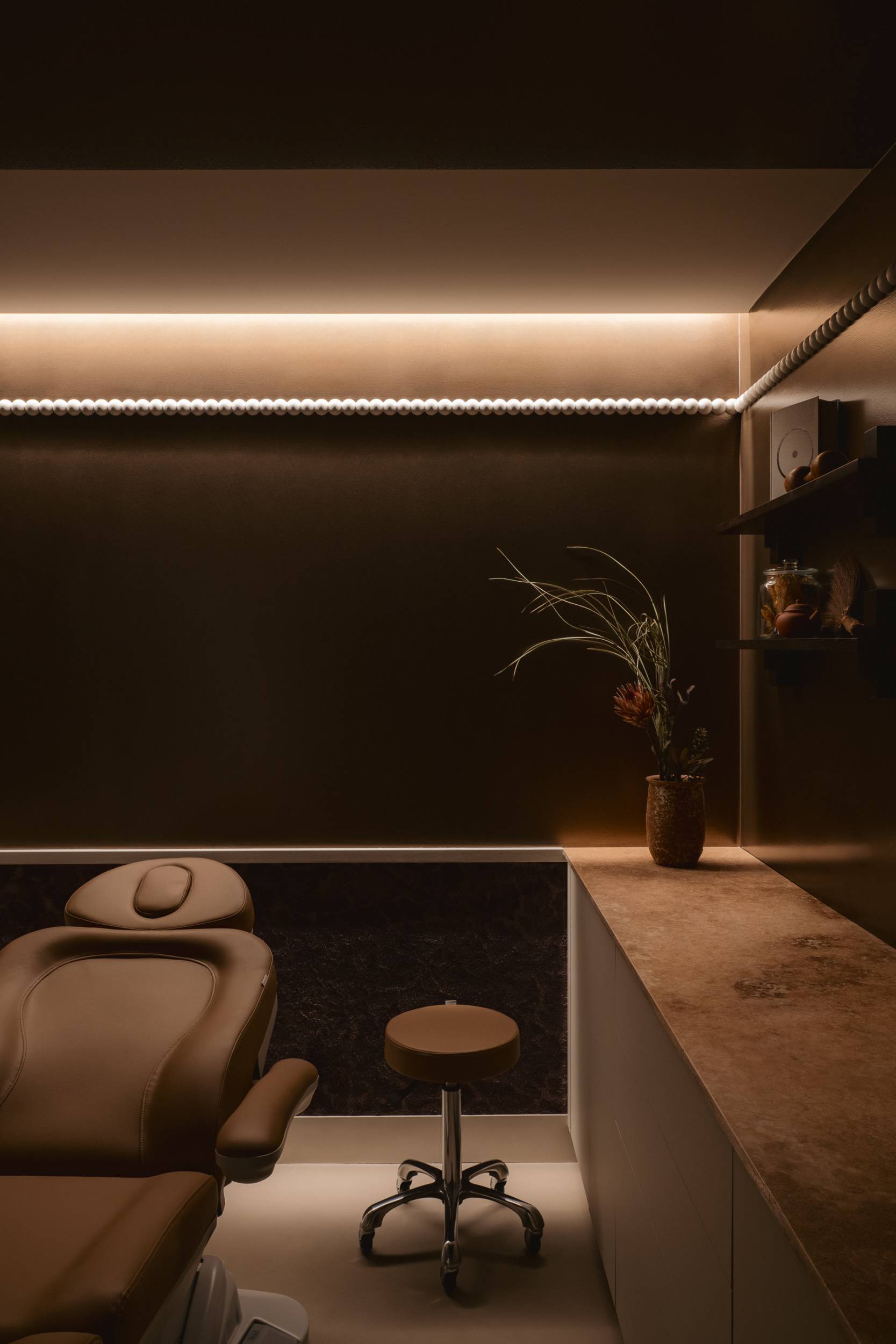
In the physical space, we created a layout with five distinct zones—commencement, engagement, transition, treatment, and facilities—each serving a specific purpose in the client’s journey towards well-being. In each of these dedicated areas we incorporated the elements of TCM and ayurveda; metal/air, wood/ether, water, earth, and fire. To ensure clients felt grounded, warm, and comfortable, we departed from the stark white walls of most clinical/personal service environments, opting instead for residential details, rich textures, and a palette of earthy tones.
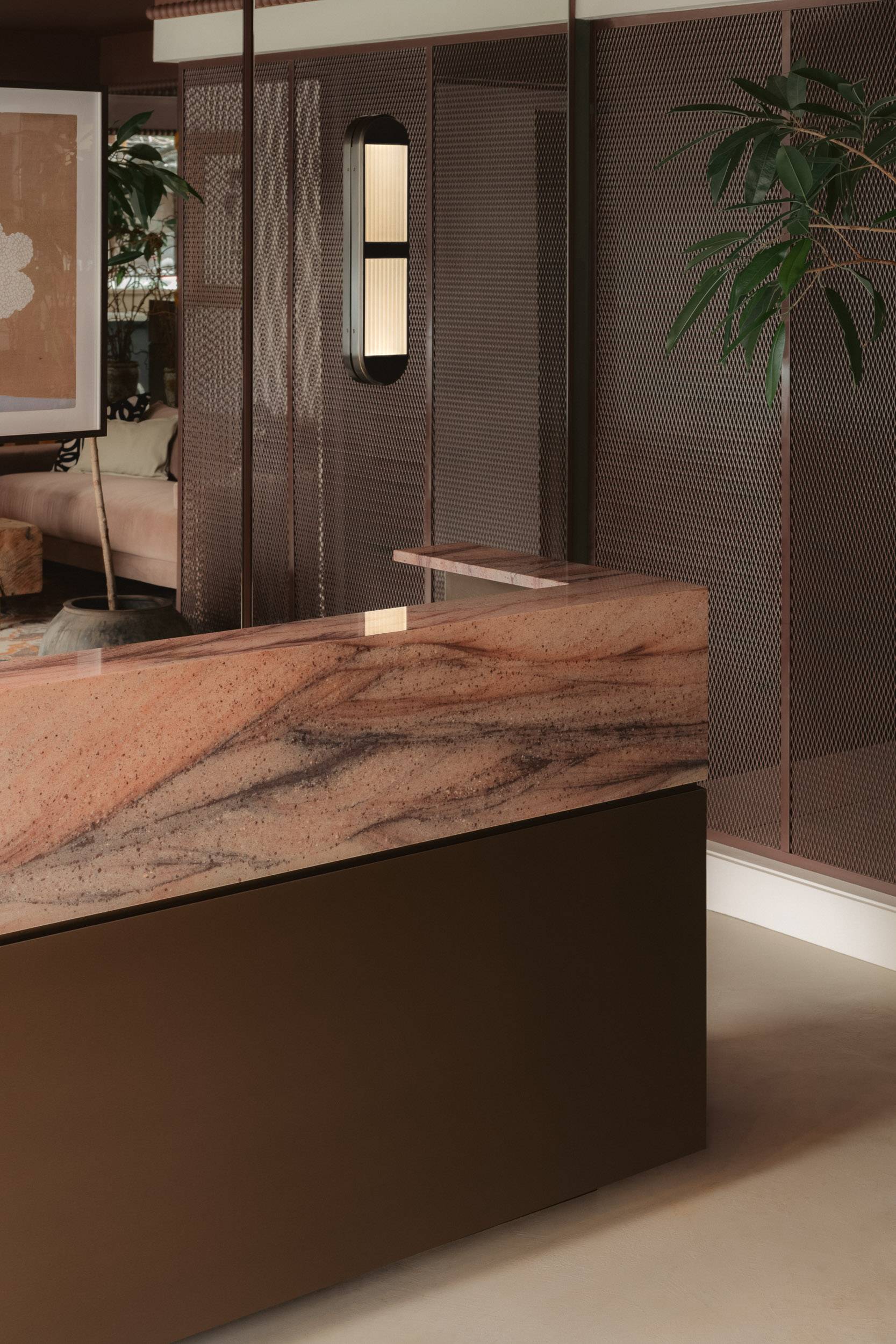
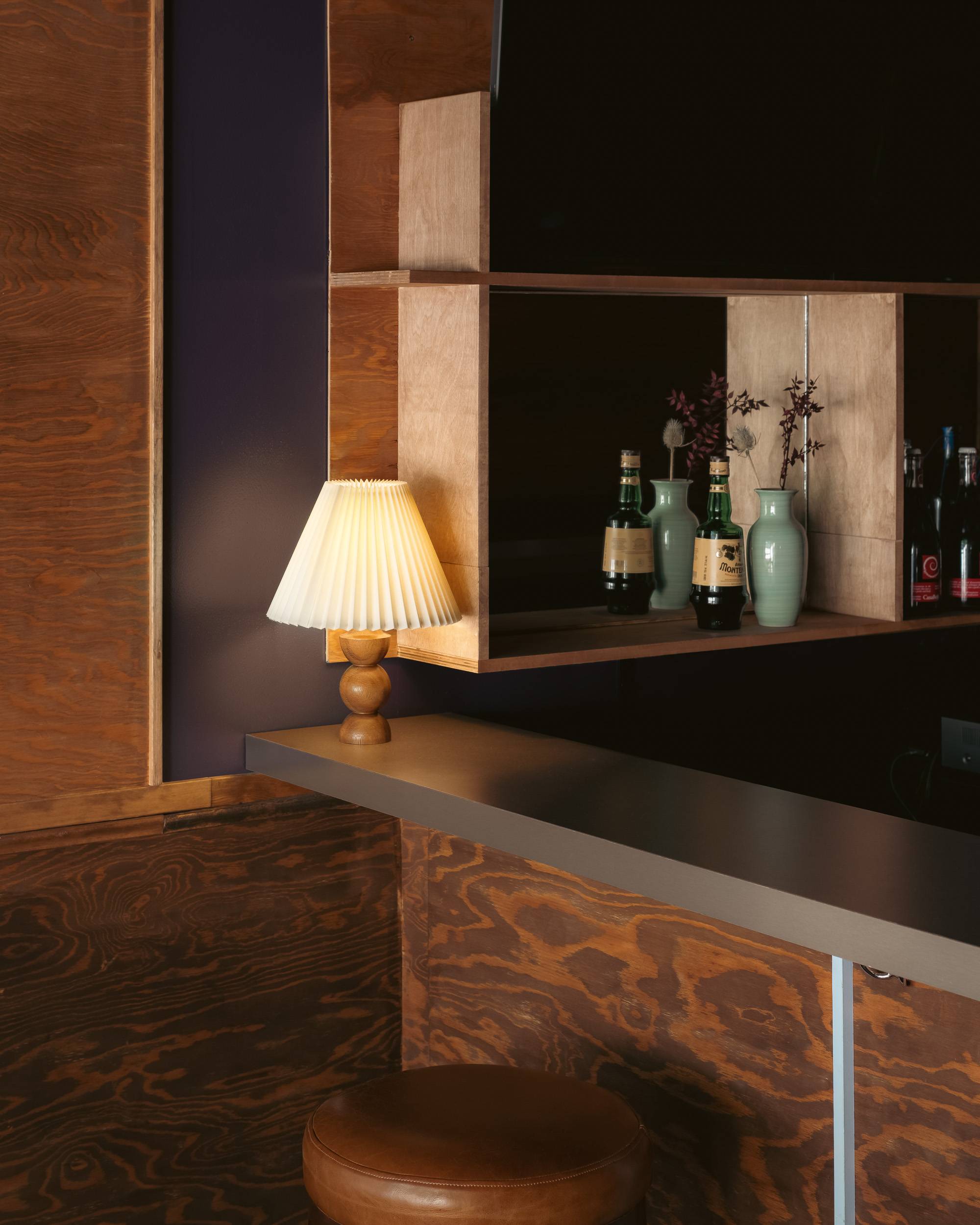
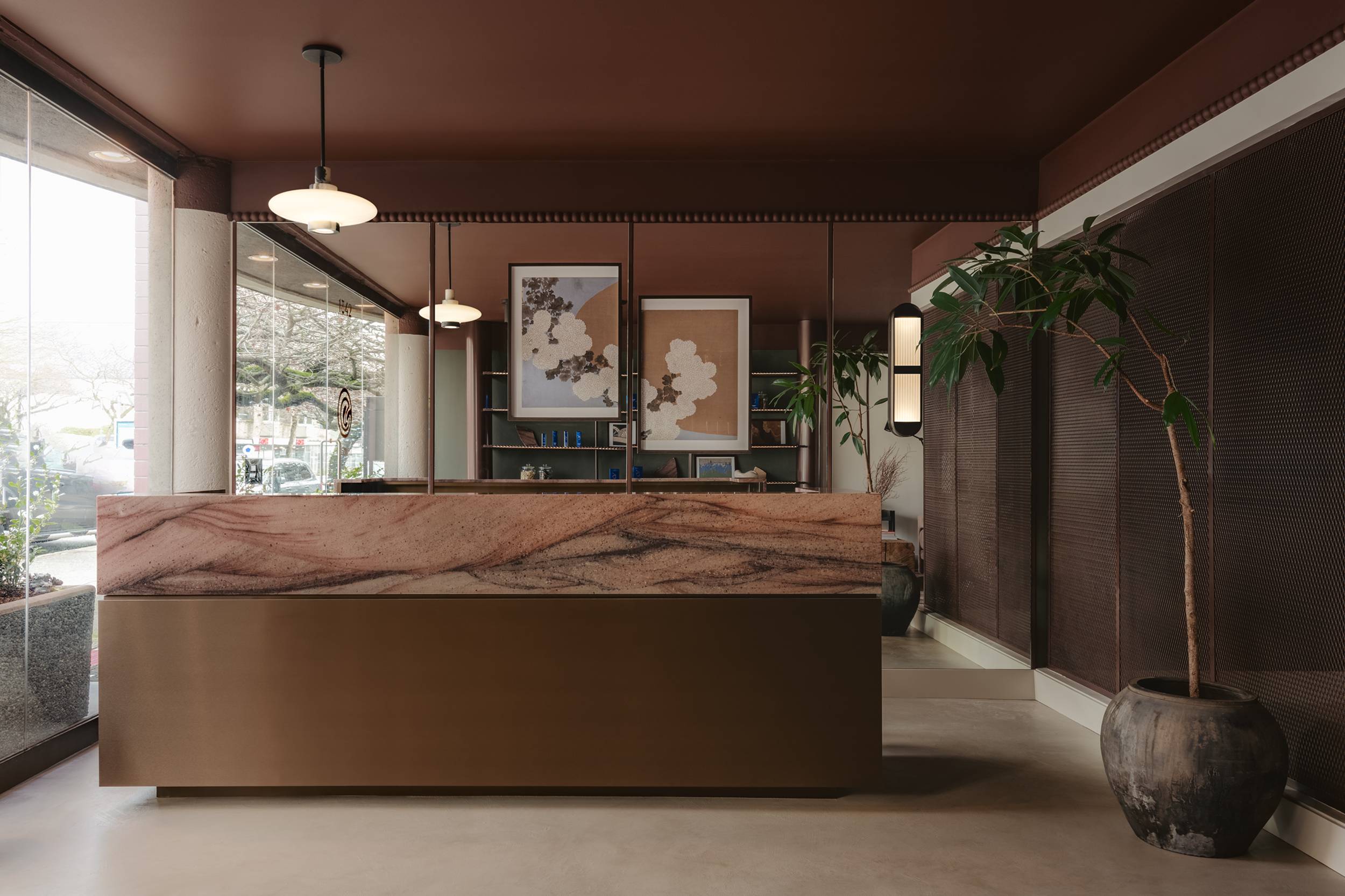
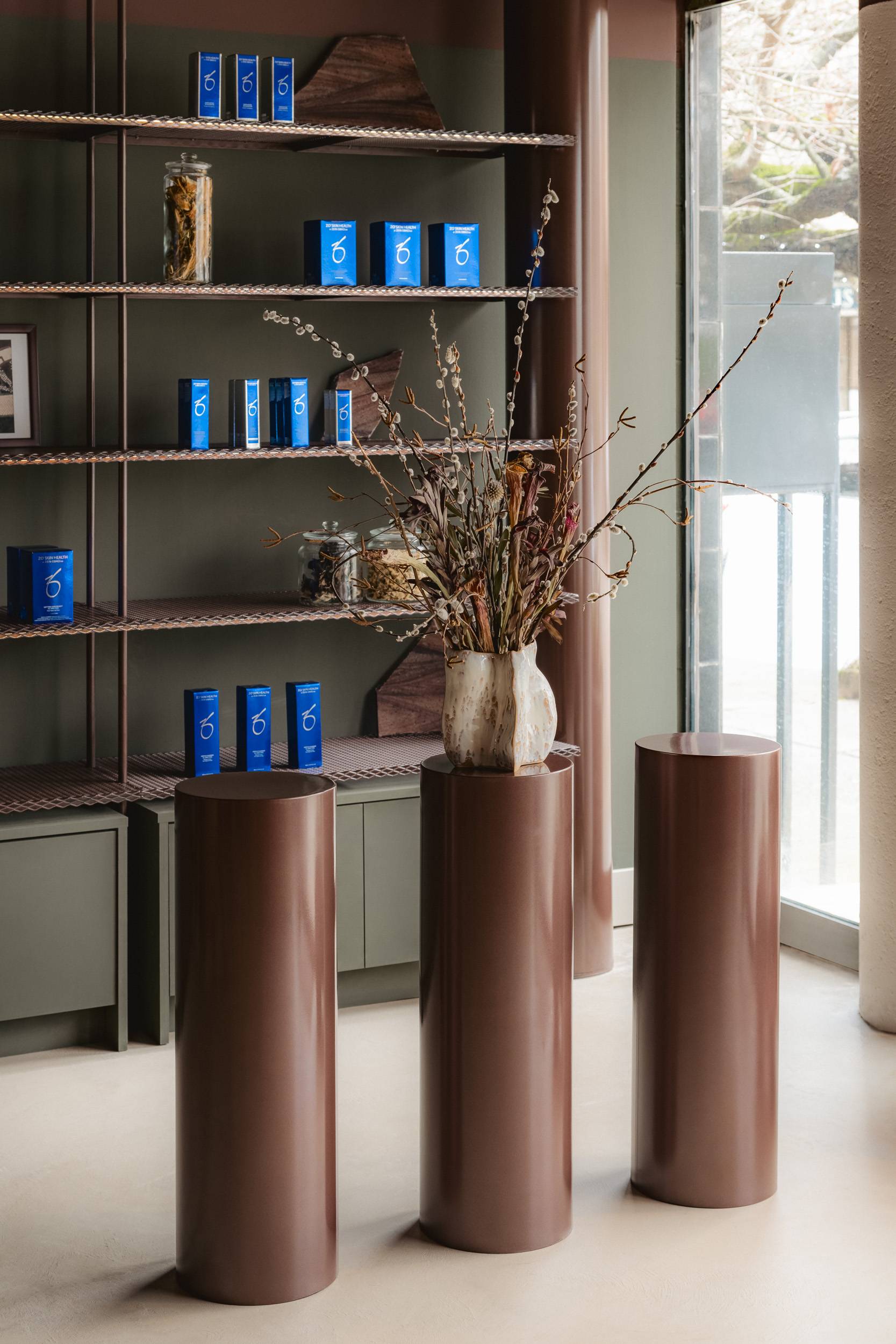
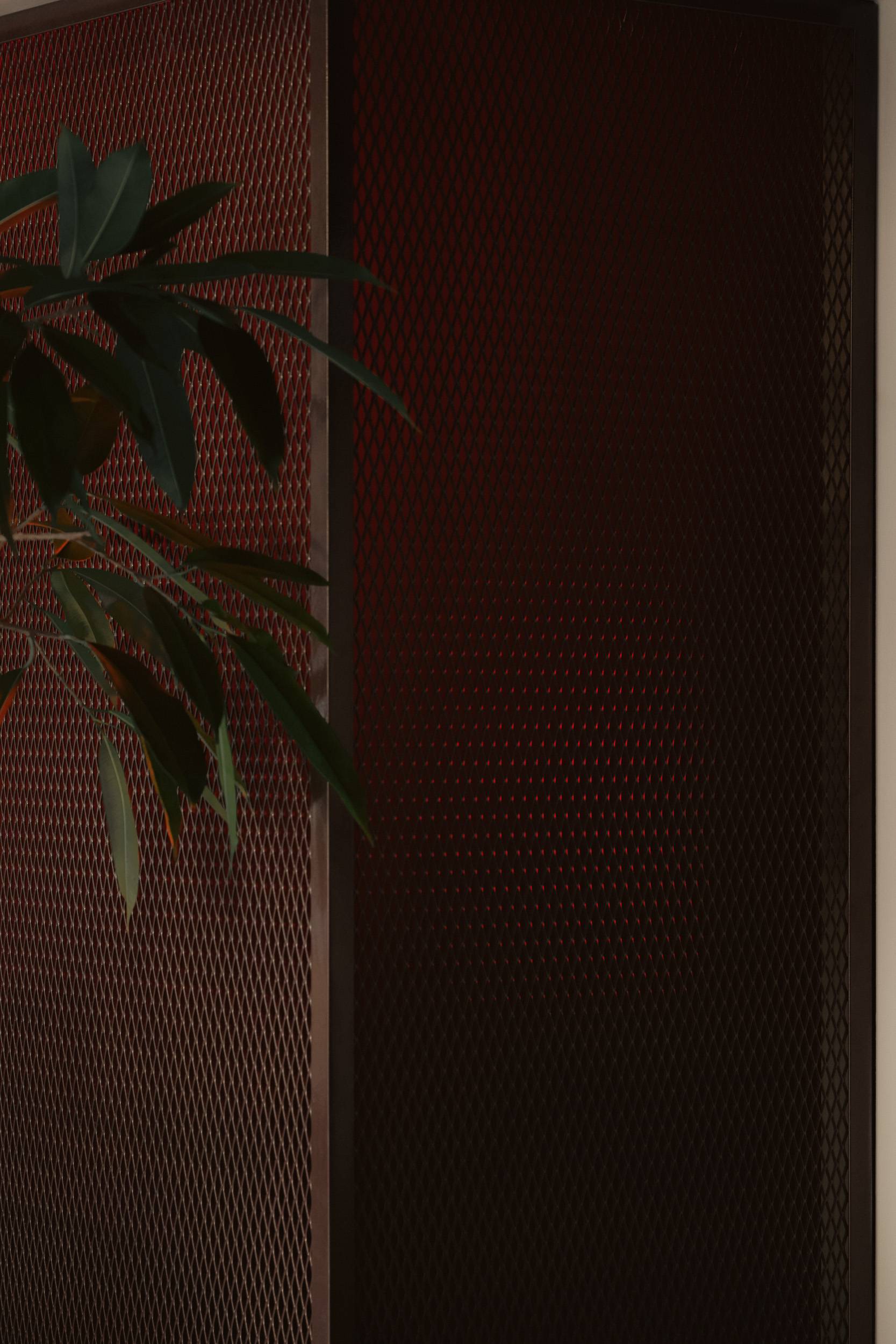
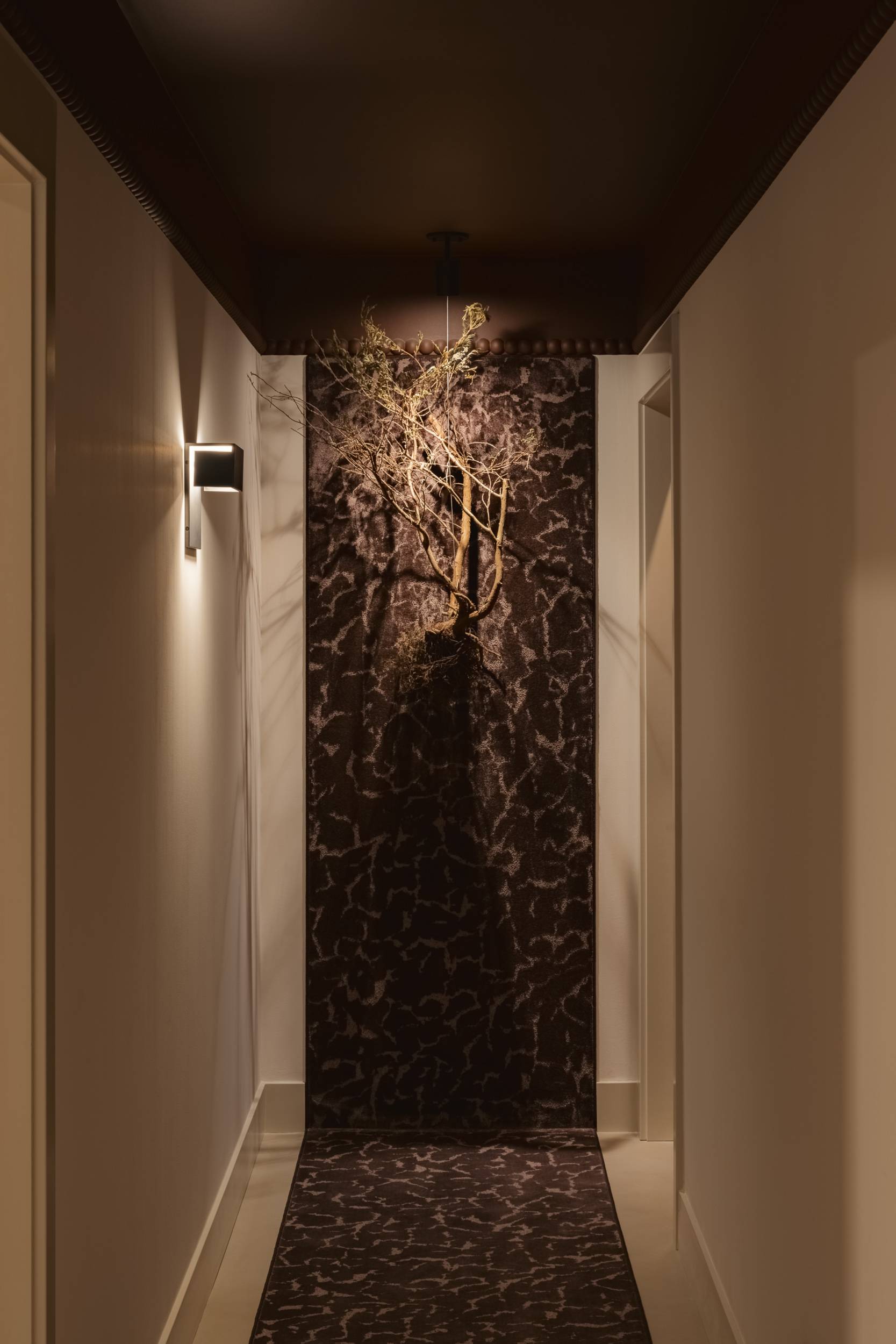
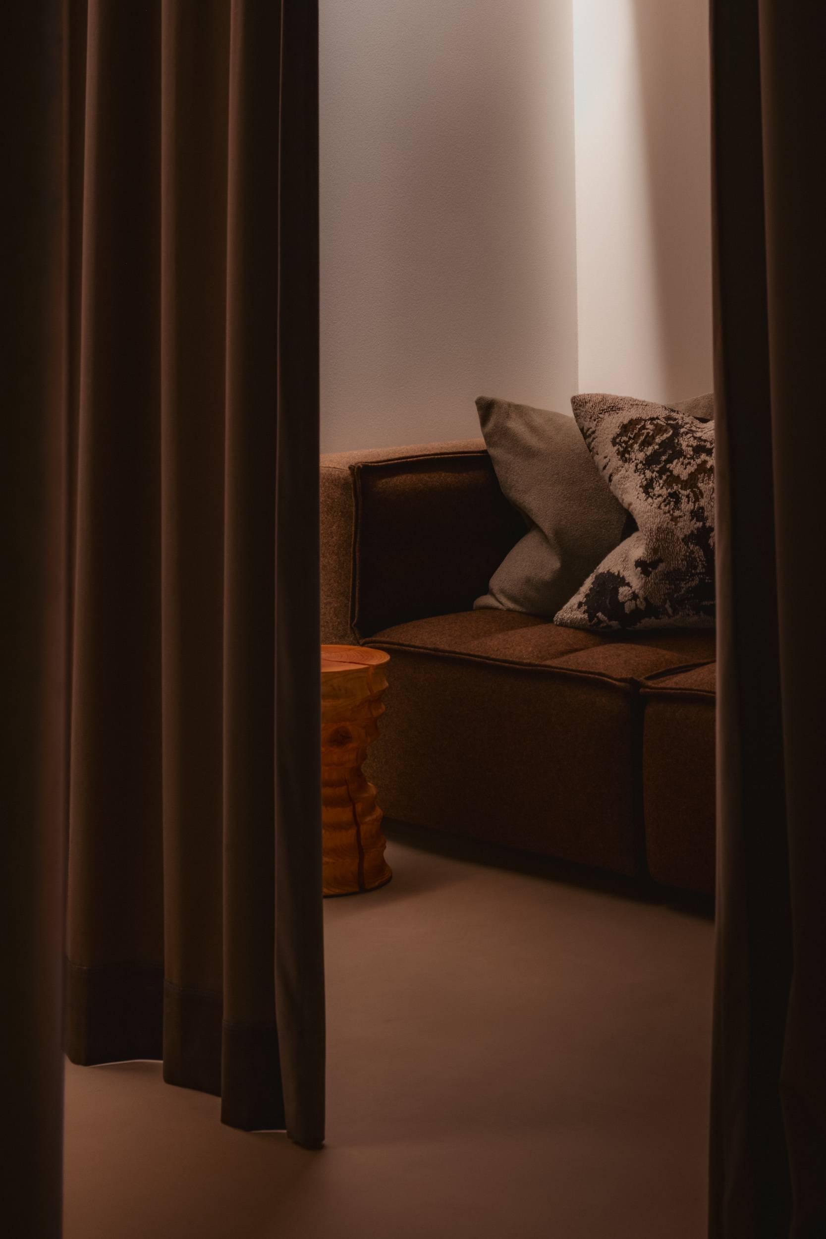
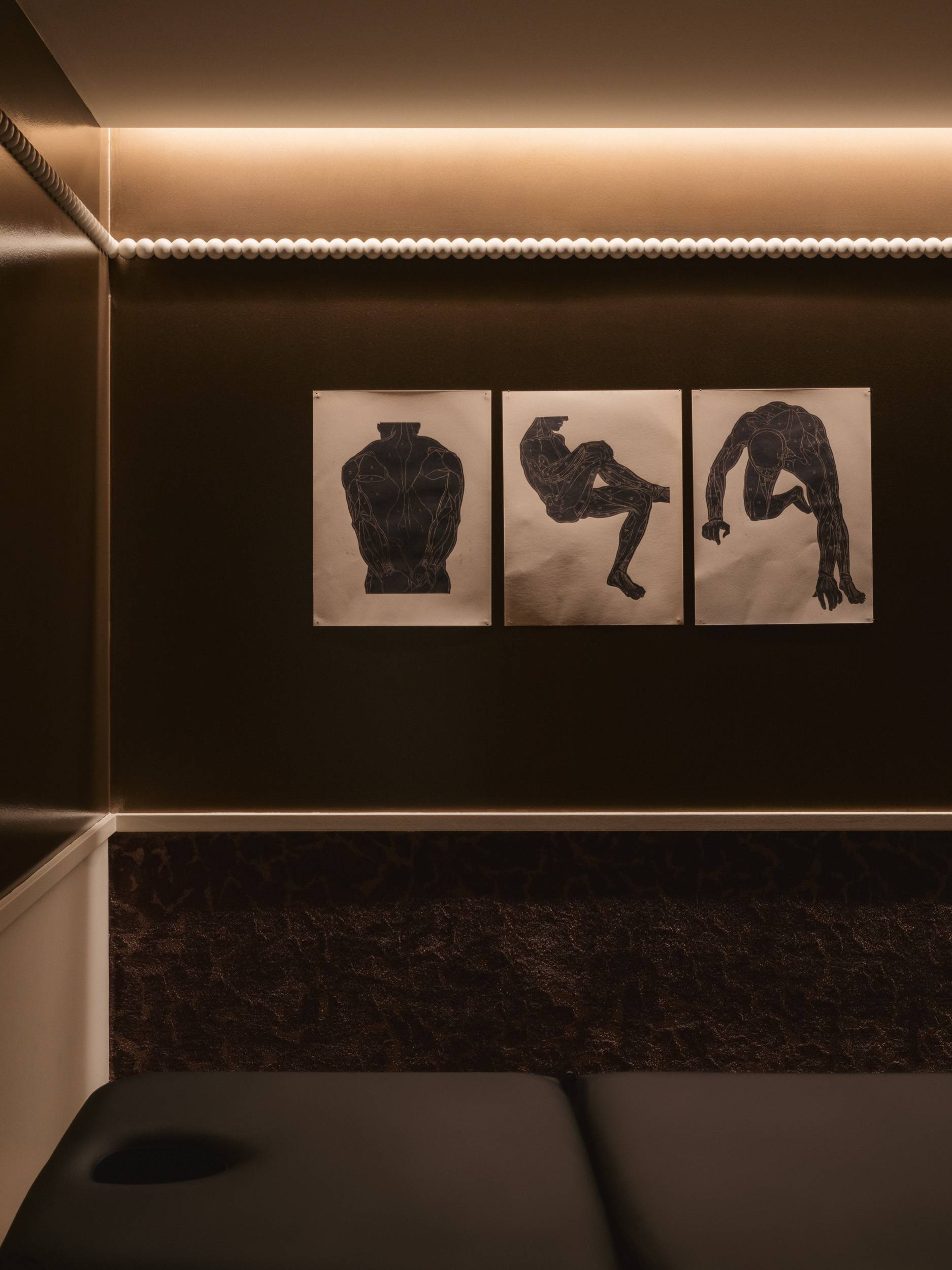
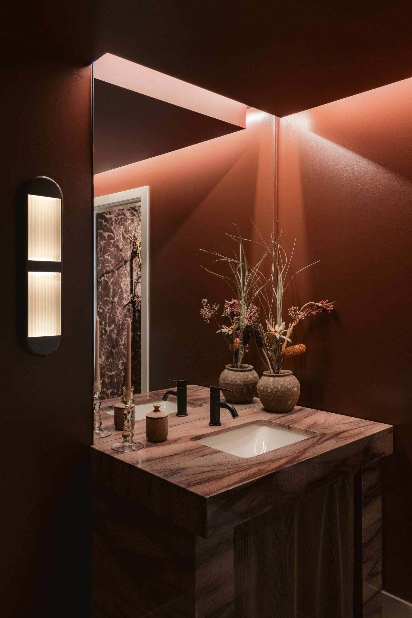
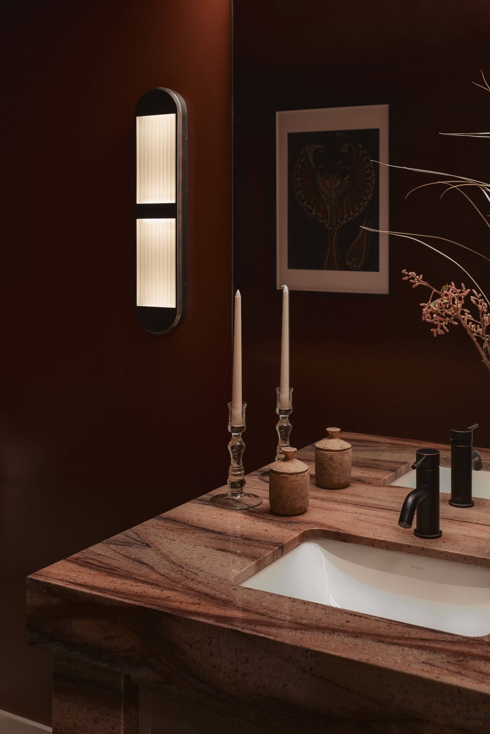
When you enter the space you’re met with a warm welcome from reception, wellness products to browse, and a seating area to relax before your appointment. We used forest green, deep brown, and lime wash paint shades to define these areas within the open-plan space and create clear pathways for visitors. Bobbin moulding wraps around the space and down the corridor towards the treatment rooms, which are somewhat uniform in their design with a palette of deep, rich browns and textured wallcoverings. The warm lighting in the treatment rooms provides a safe, calm space for healing, while details such as bronze metallic paint and lush carpet on the walls add depth. The washroom leans into fire as an important element in both ayurveda and TCM, evoking feelings of power, warmth, and joy with soft lighting, deep red walls, and a quartz sink rippled with blush and burgundy.
In every aspect of Everwell’s design, from the branding to the interiors, our goal was to create a destination wellness space that feels like a sanctuary for the soul. At Everwell, visitors can move through the space with ease, engage with their surroundings, and find moments of quiet reflection. It’s a testament to how design can play an important role in holistic healing and foster a sense of tranquility, connection, and harmony.
-
Location—
- Vancouver
-
Year—
- 2024
-
SQFT—
- 2300
-
Contractor—
- Merola Construction + Ekos Builds
-
Interior Photographer—
- Conrad Brown
-
Brand Photographer—
- Jessie Greg-Alabi
