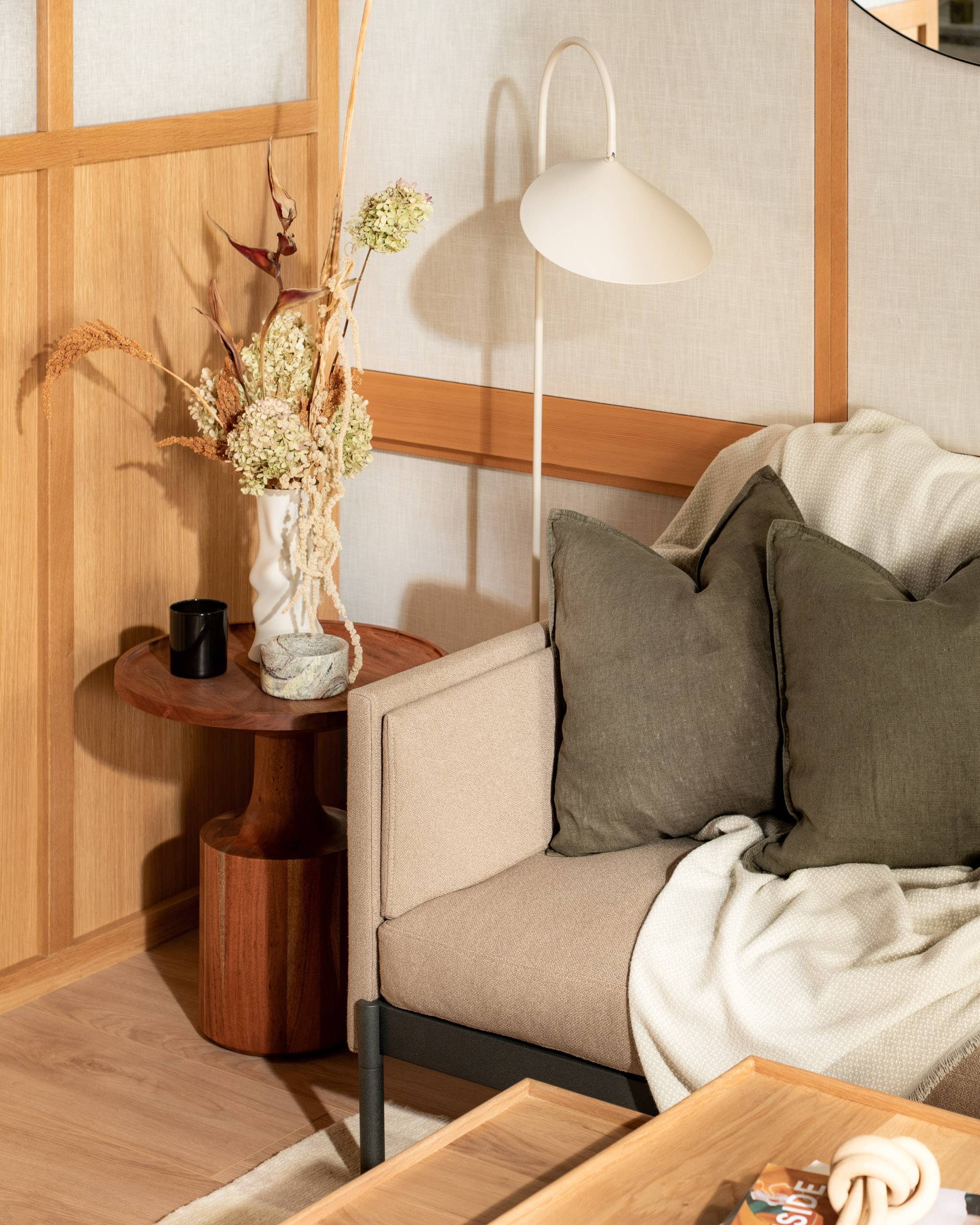
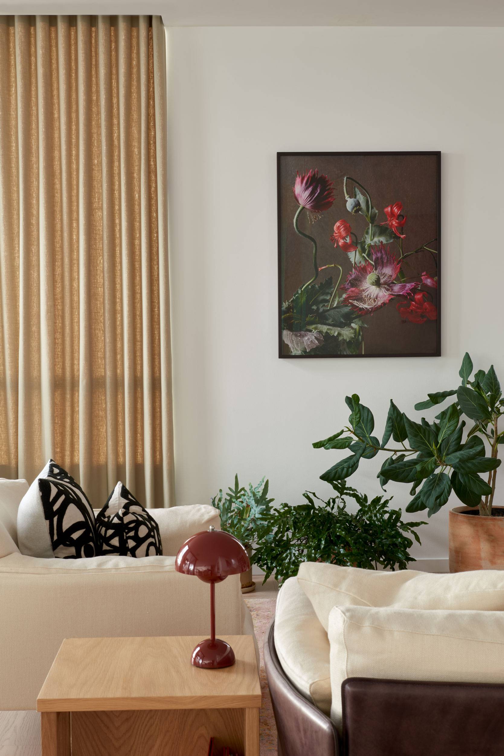
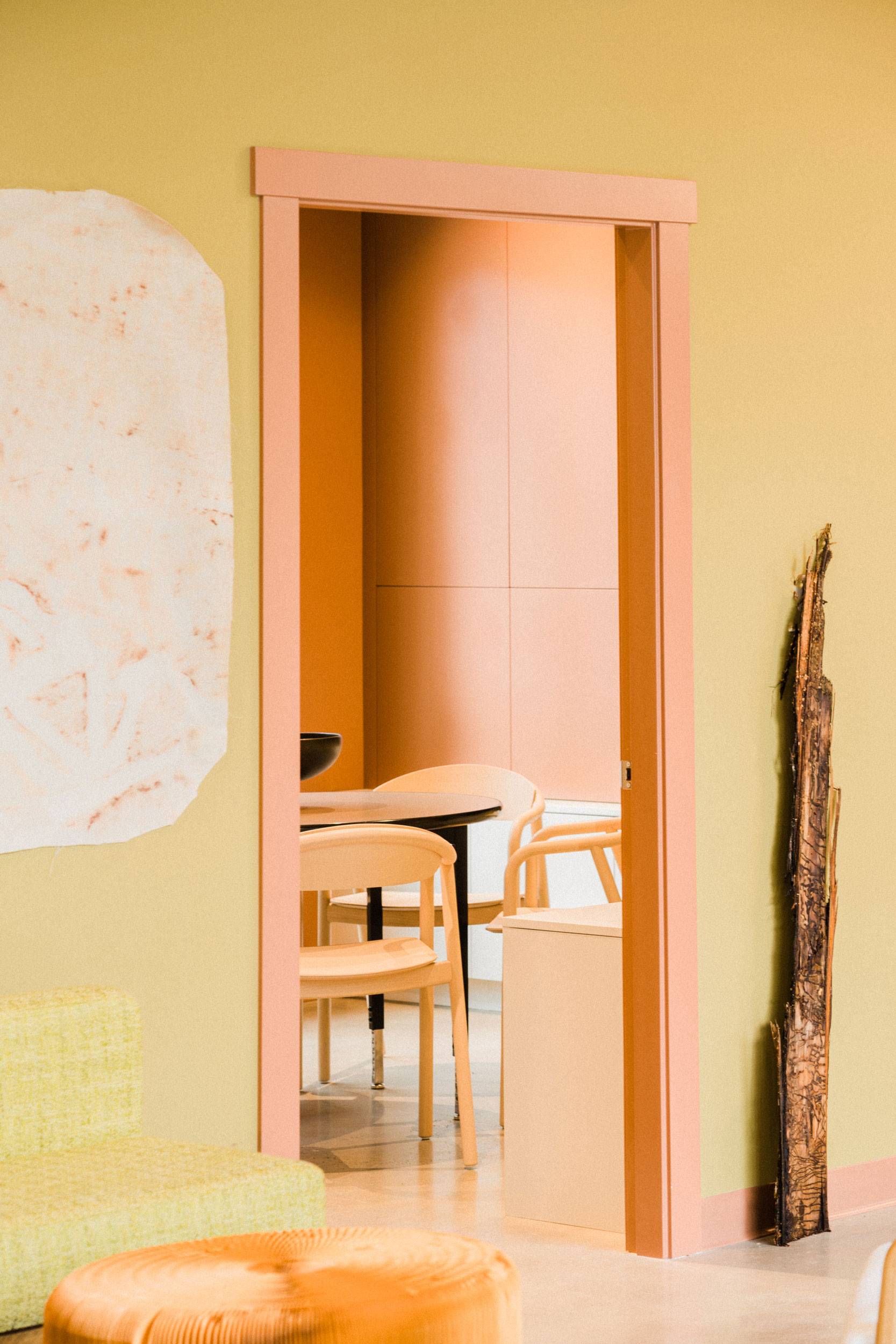
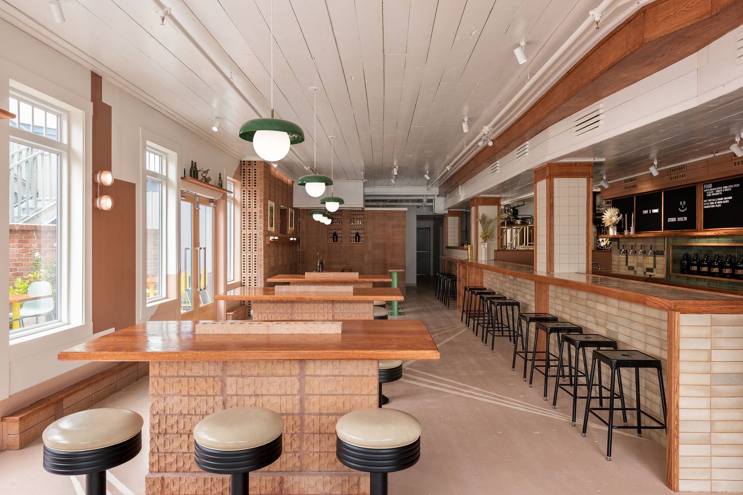
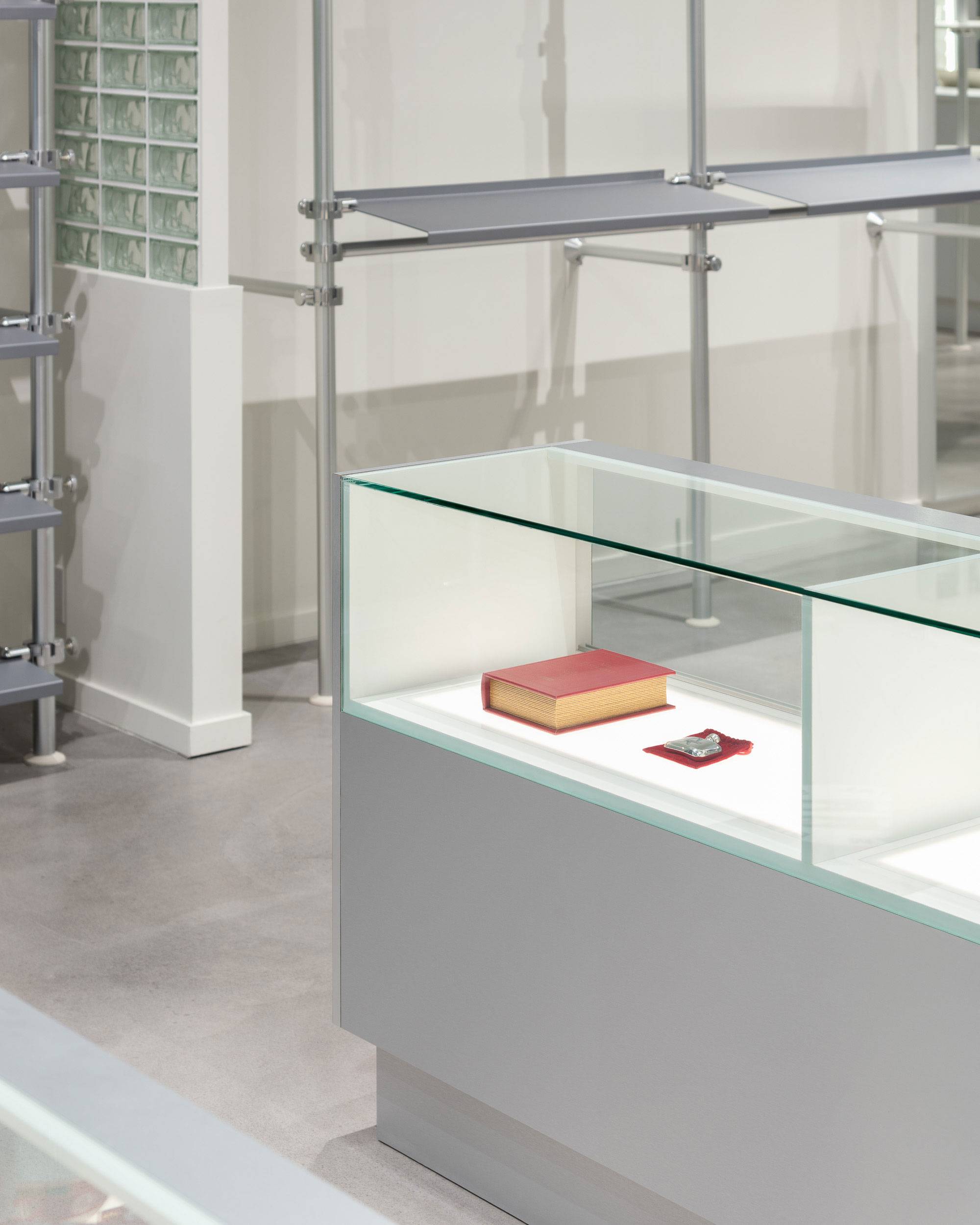
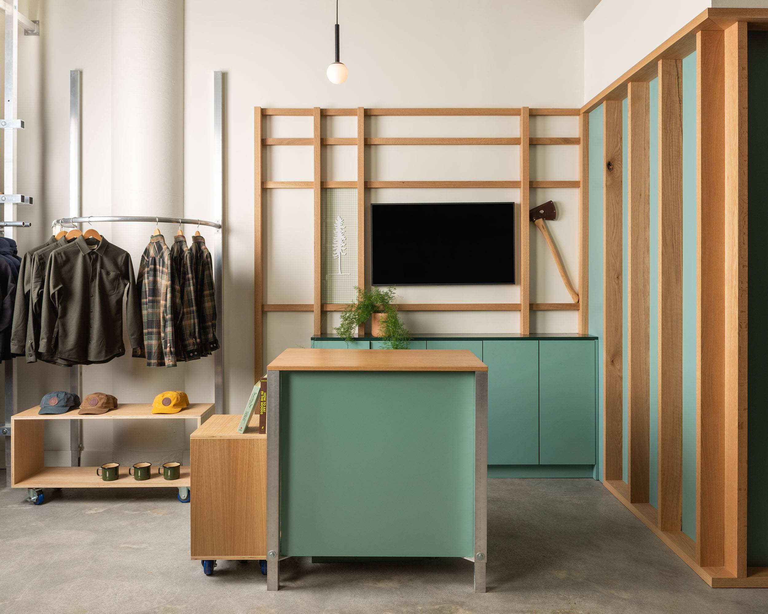
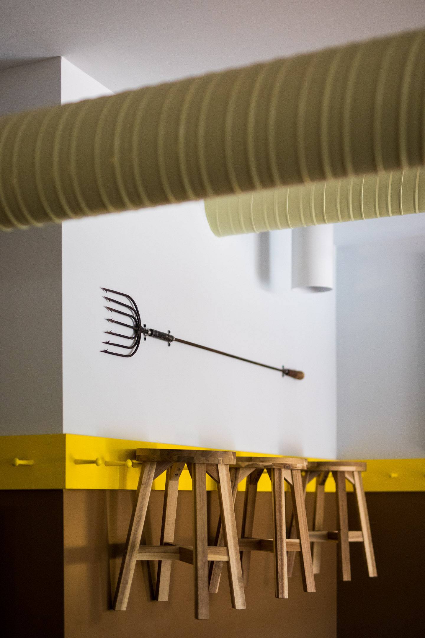
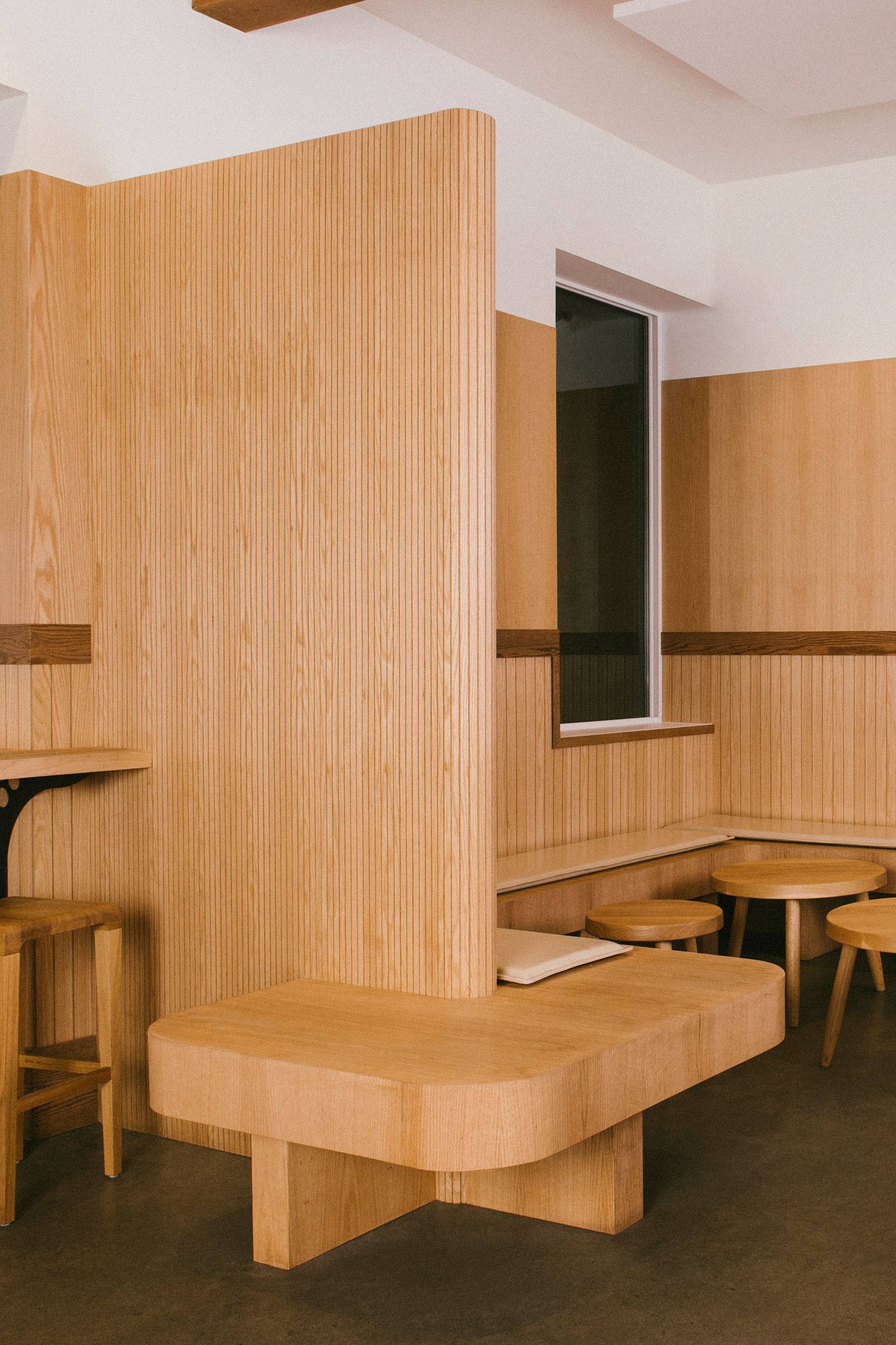
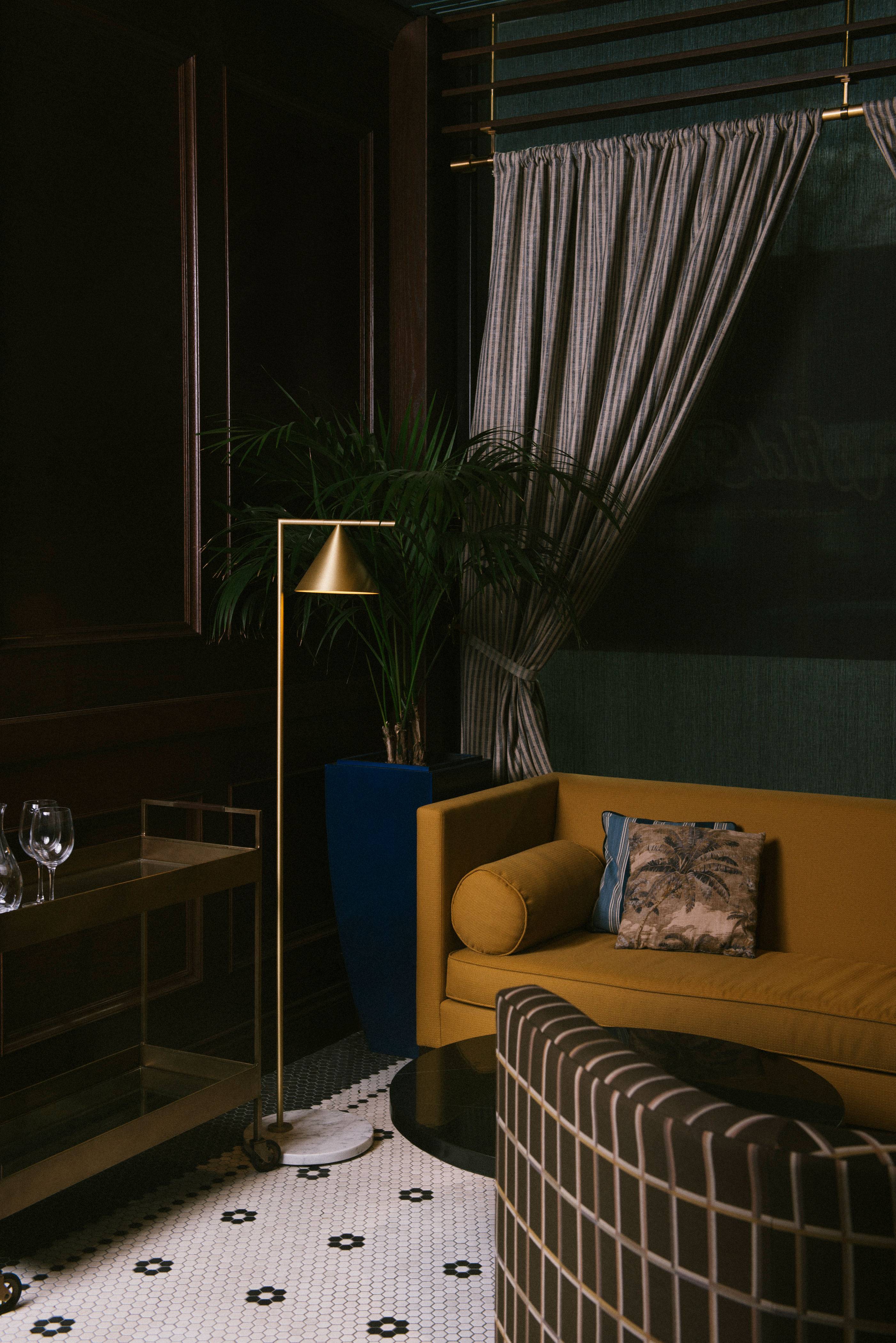
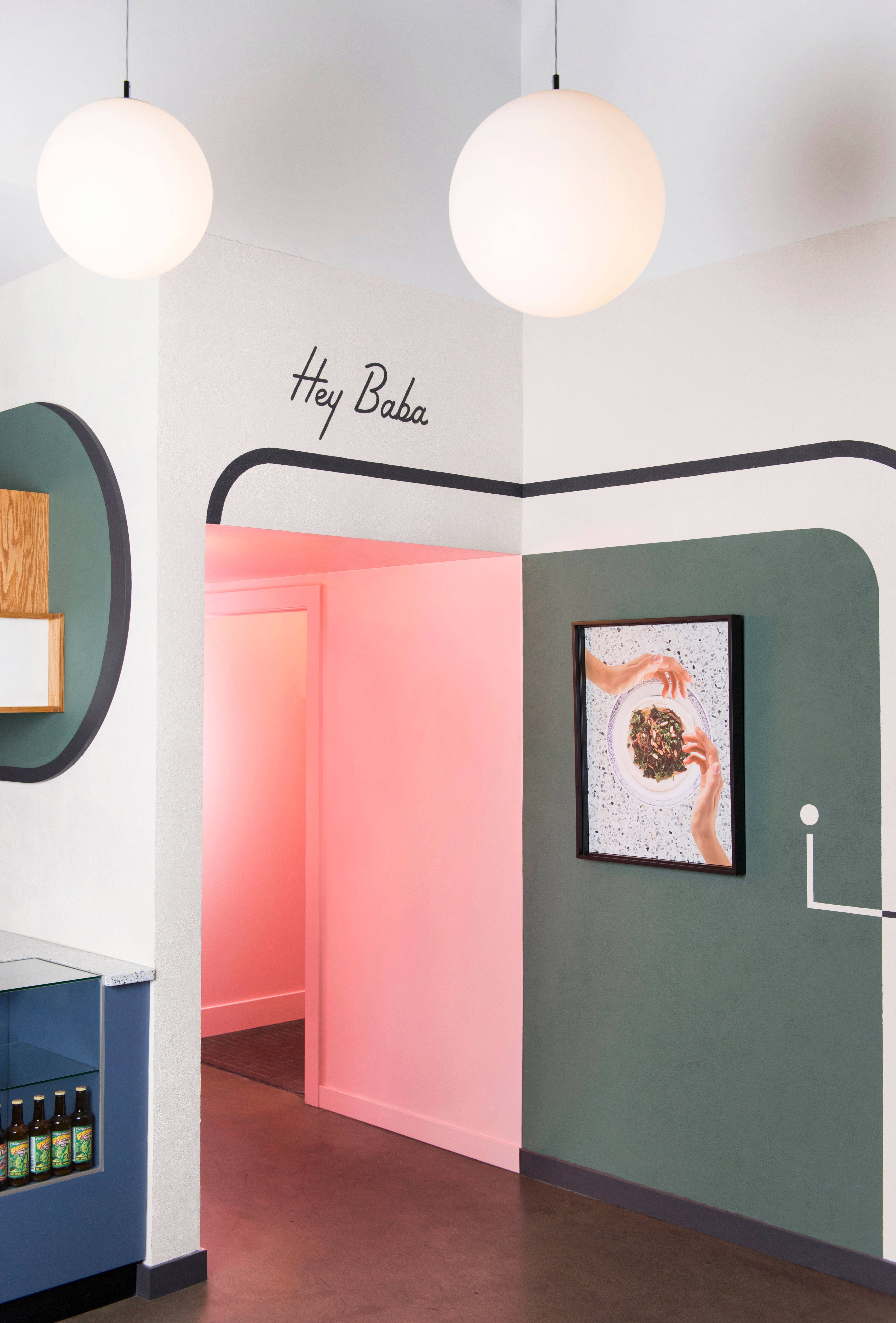
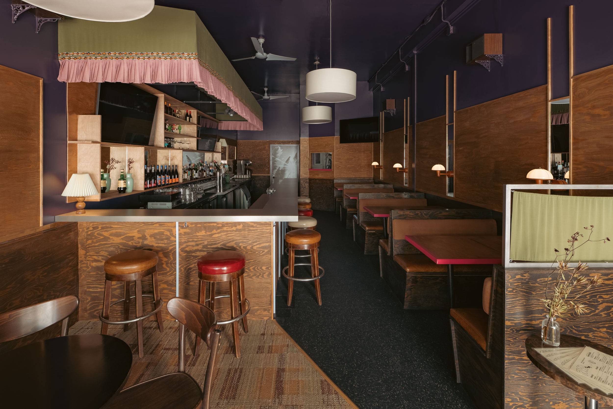
We all understand the warm, welcoming feeling we get walking into our neighbourhood bar. Greeted by familiar faces with music playing at just the right volume and lights dimmed to a warm glow. It’s Okay provides just that, an elevated space to chill, hang with friends or grab a quick, but delicious bite.
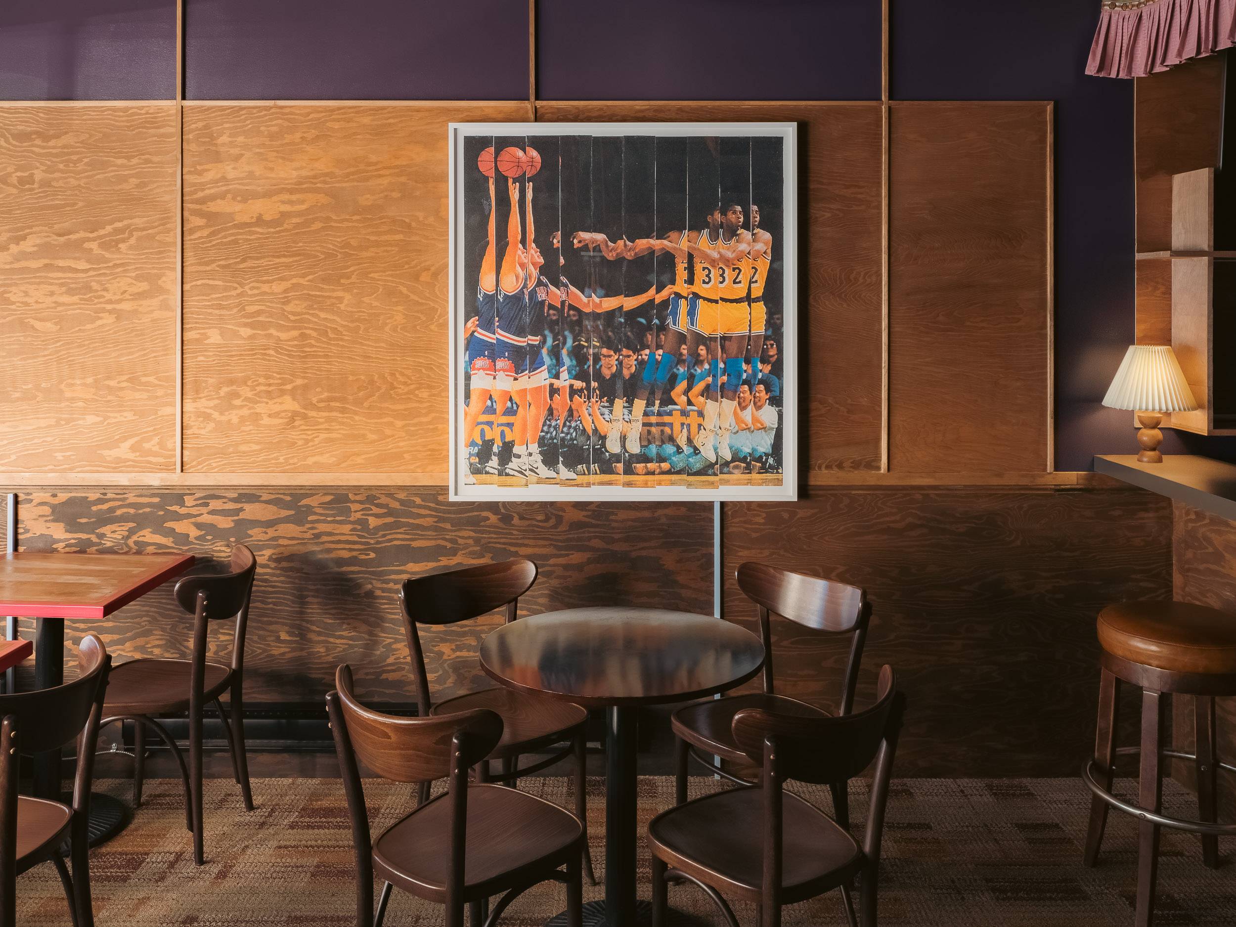
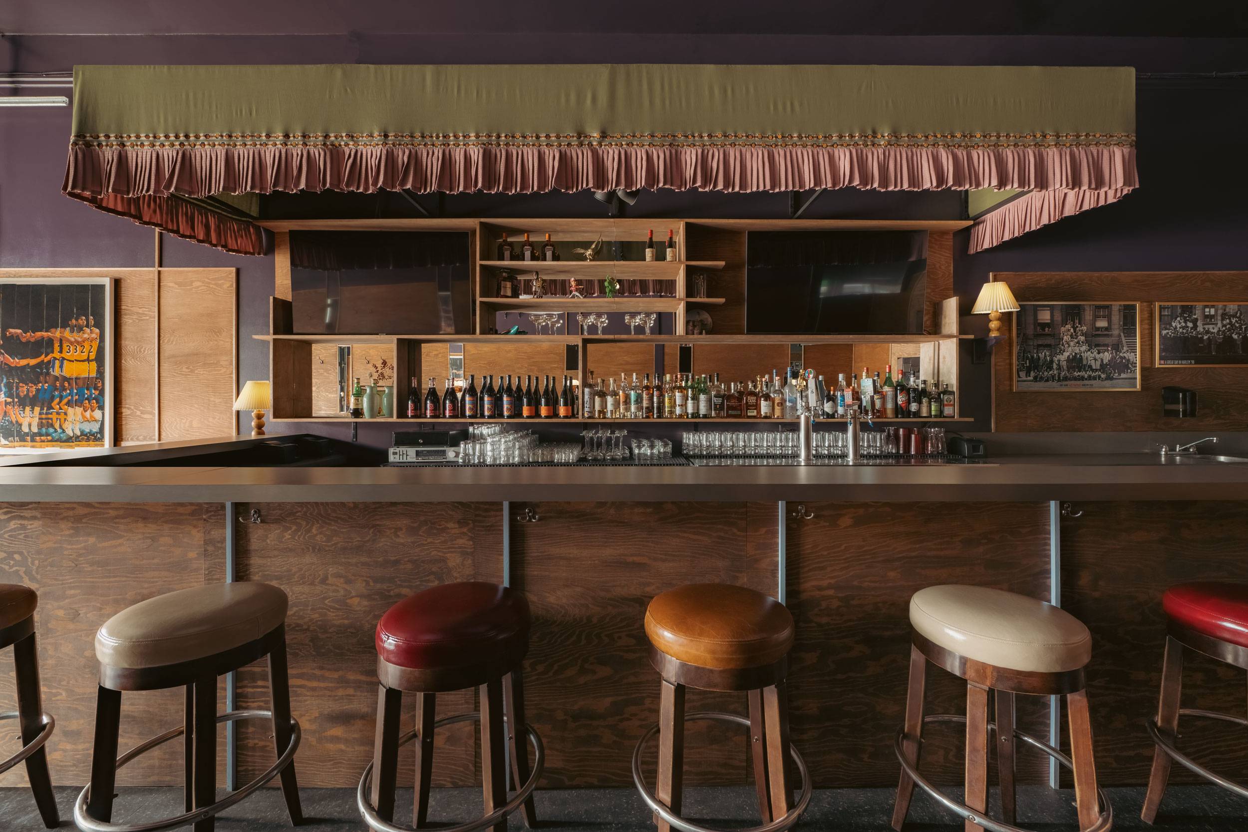
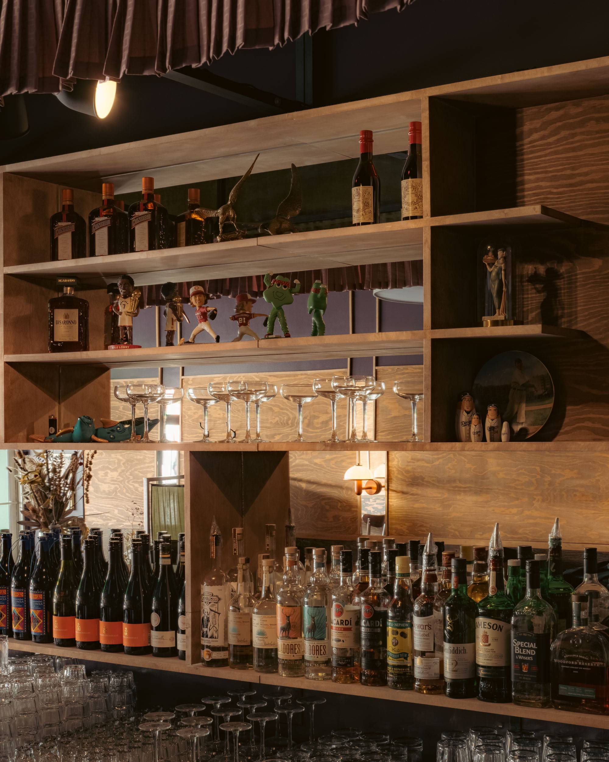
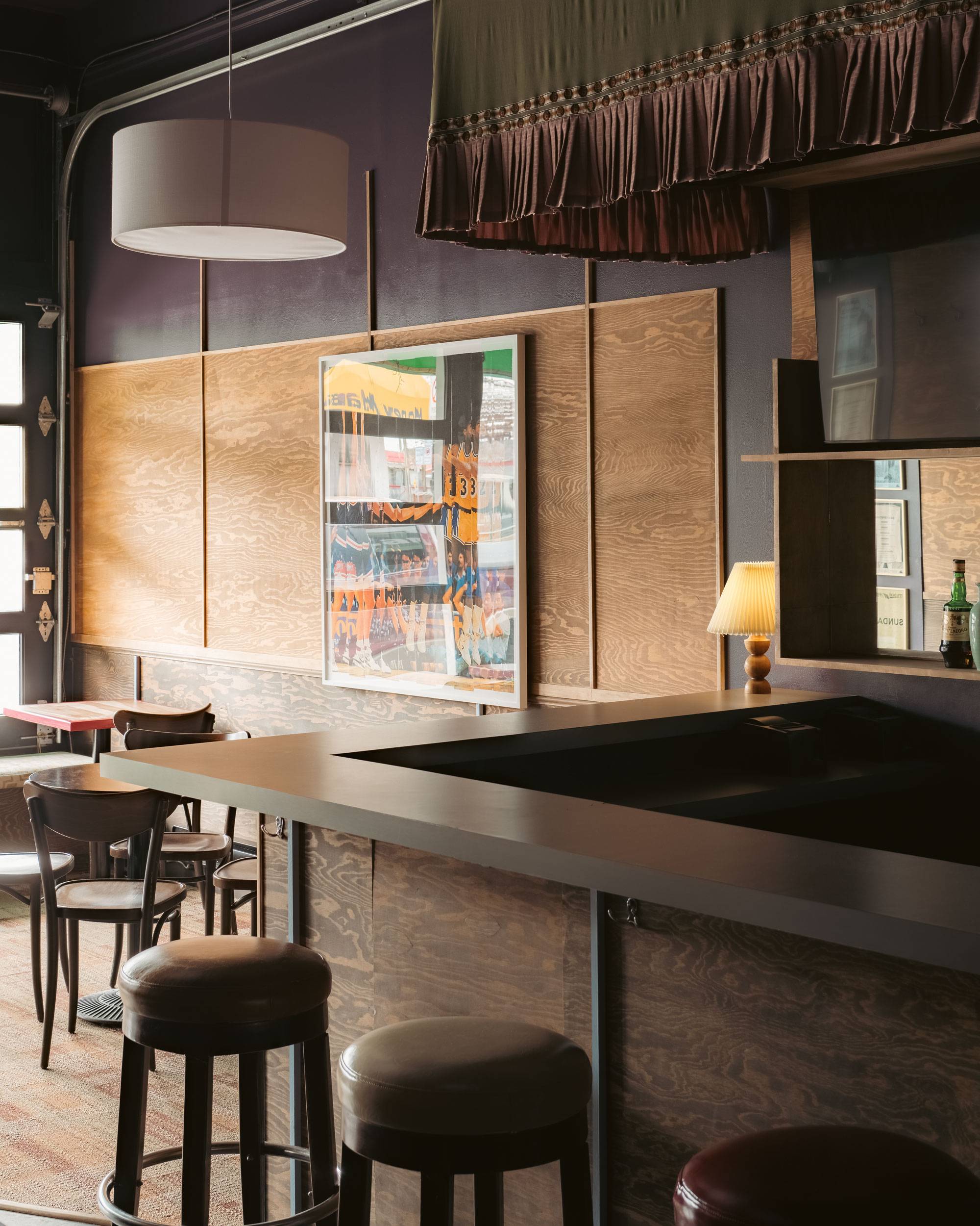
Our clients are bar connoisseurs with a love of basketball, music and streetwear. One look at the laid-back branding for It’s Okay and you’ll learn everything you need to know about their vision for the bar. With a large-format collage of Magic Johnson, a carefully curated menu and screens ready to stream sports, their personalities can be felt in every corner of the space.
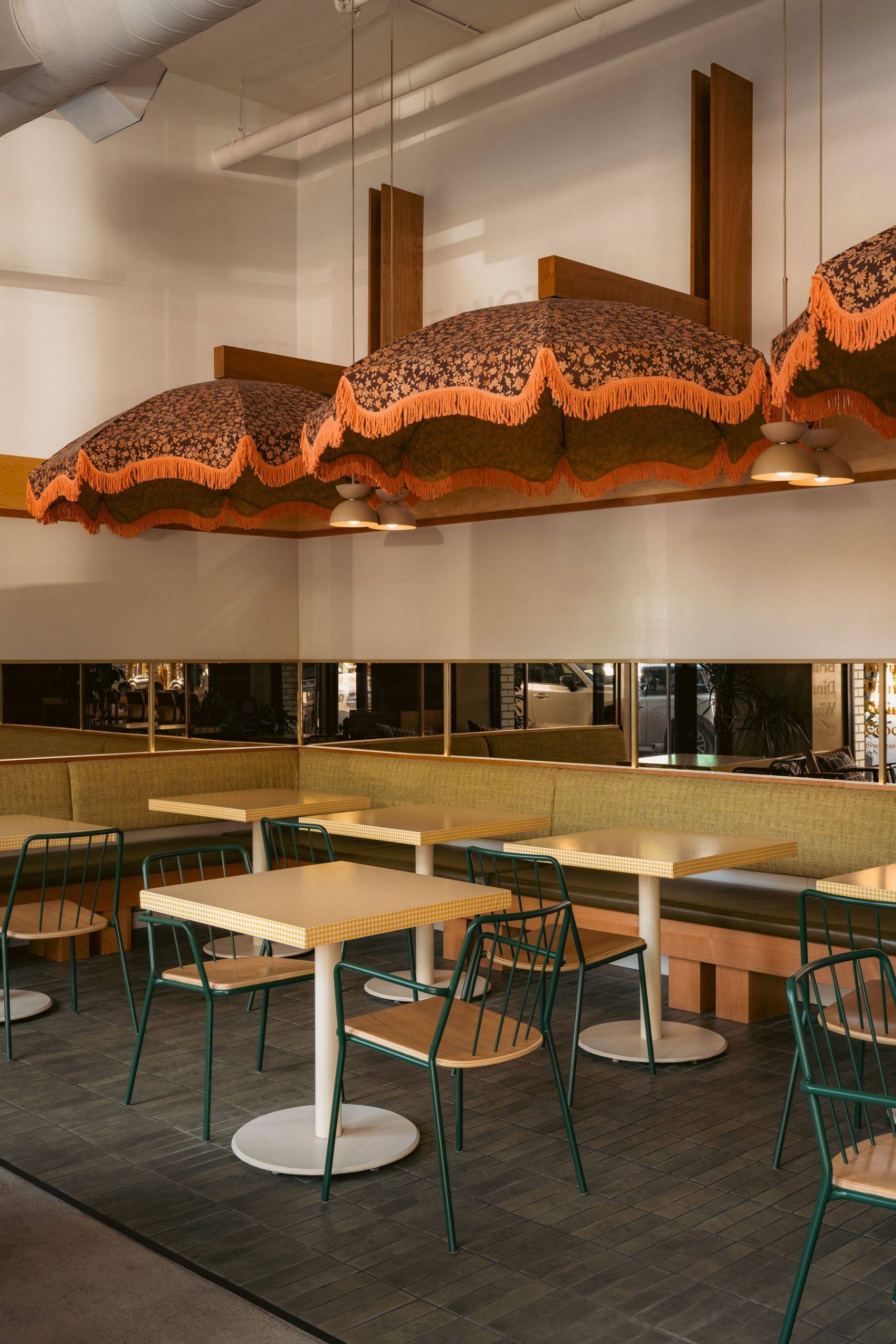
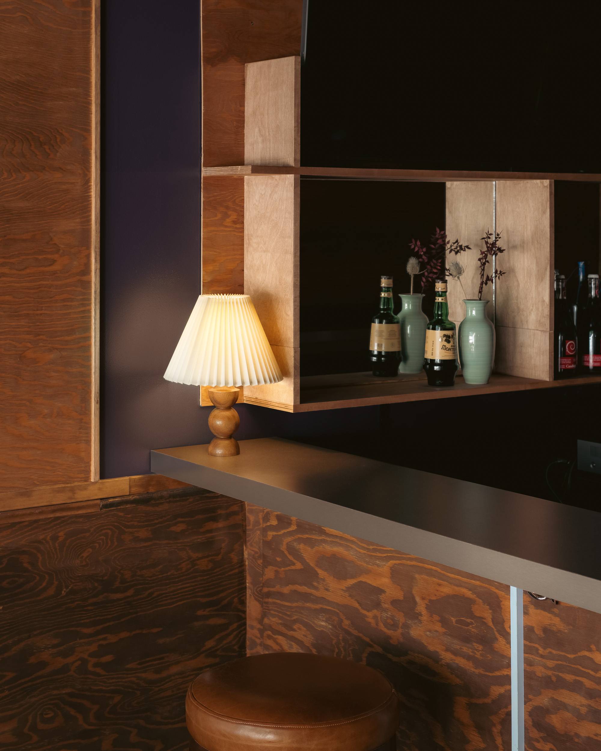
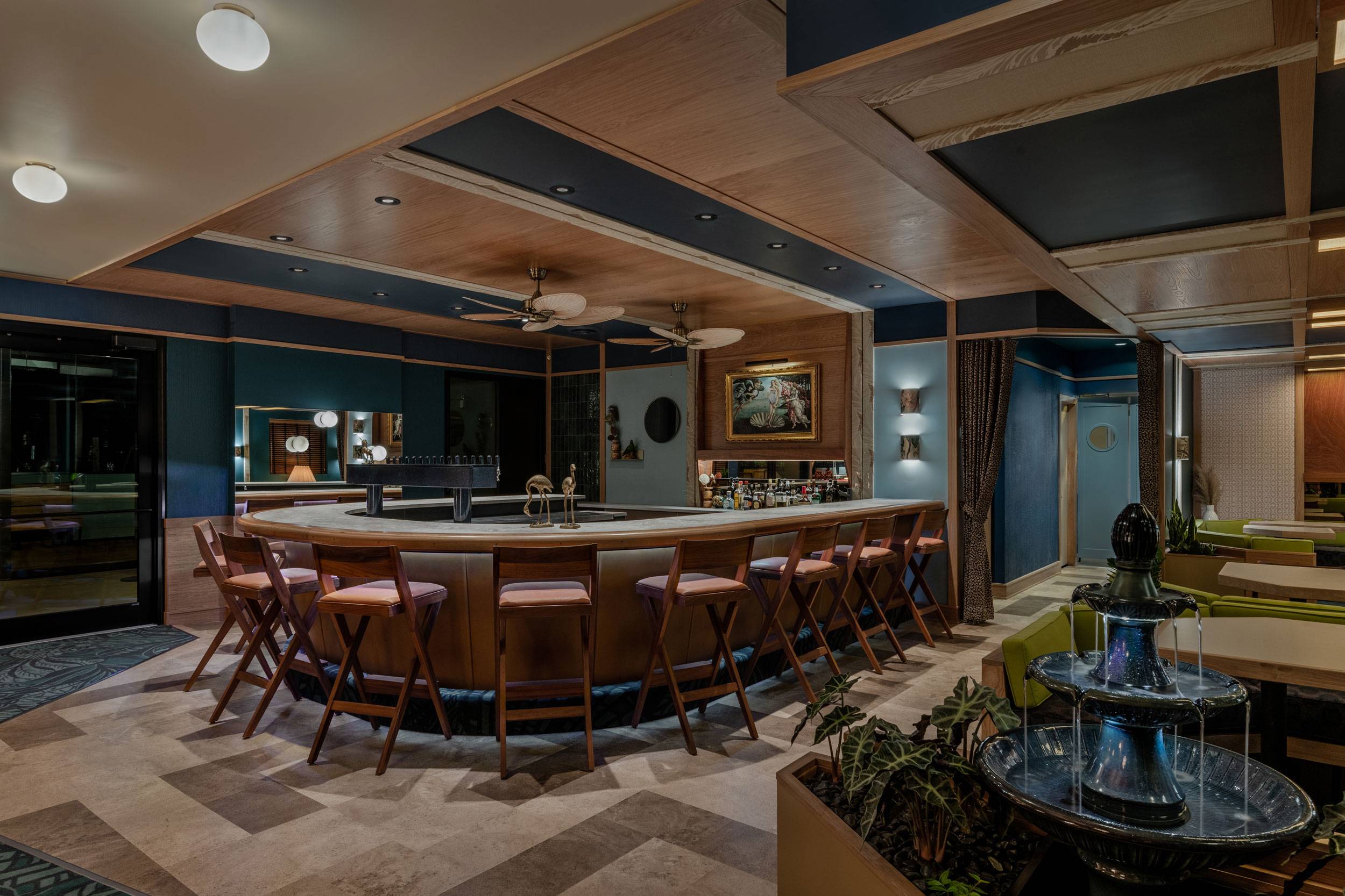
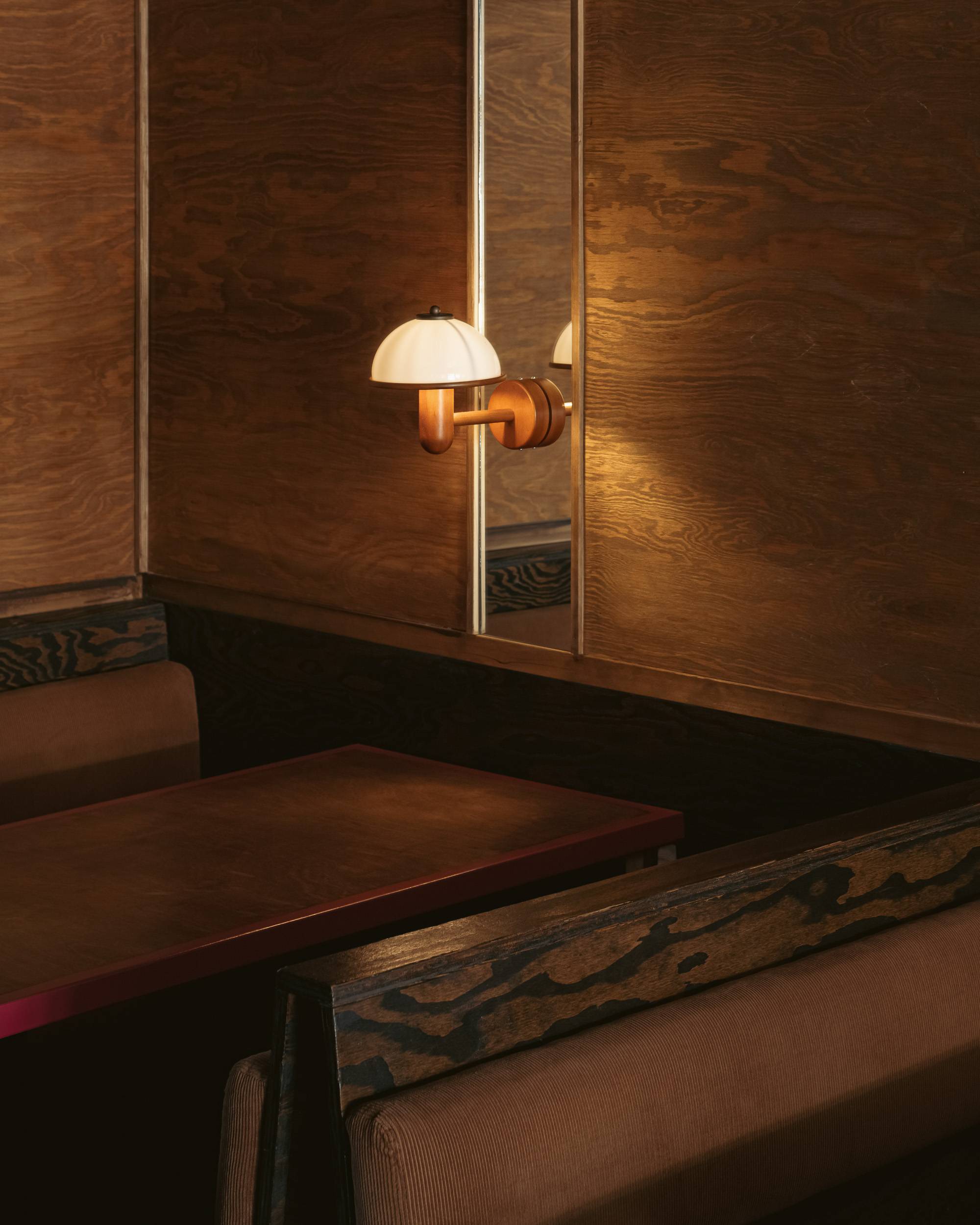
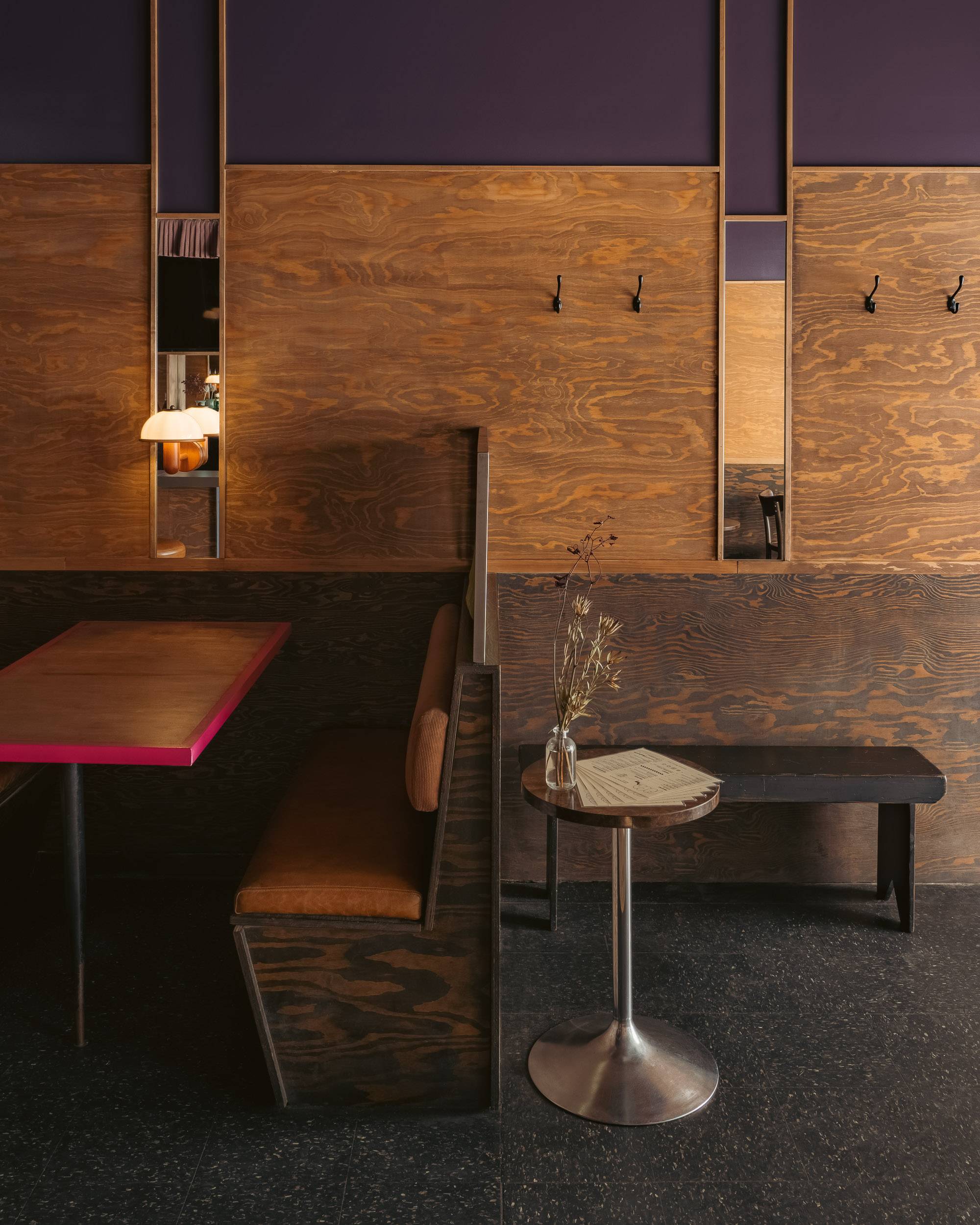
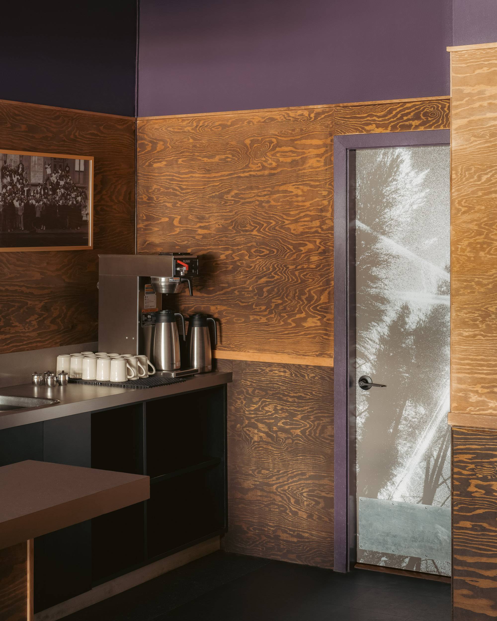
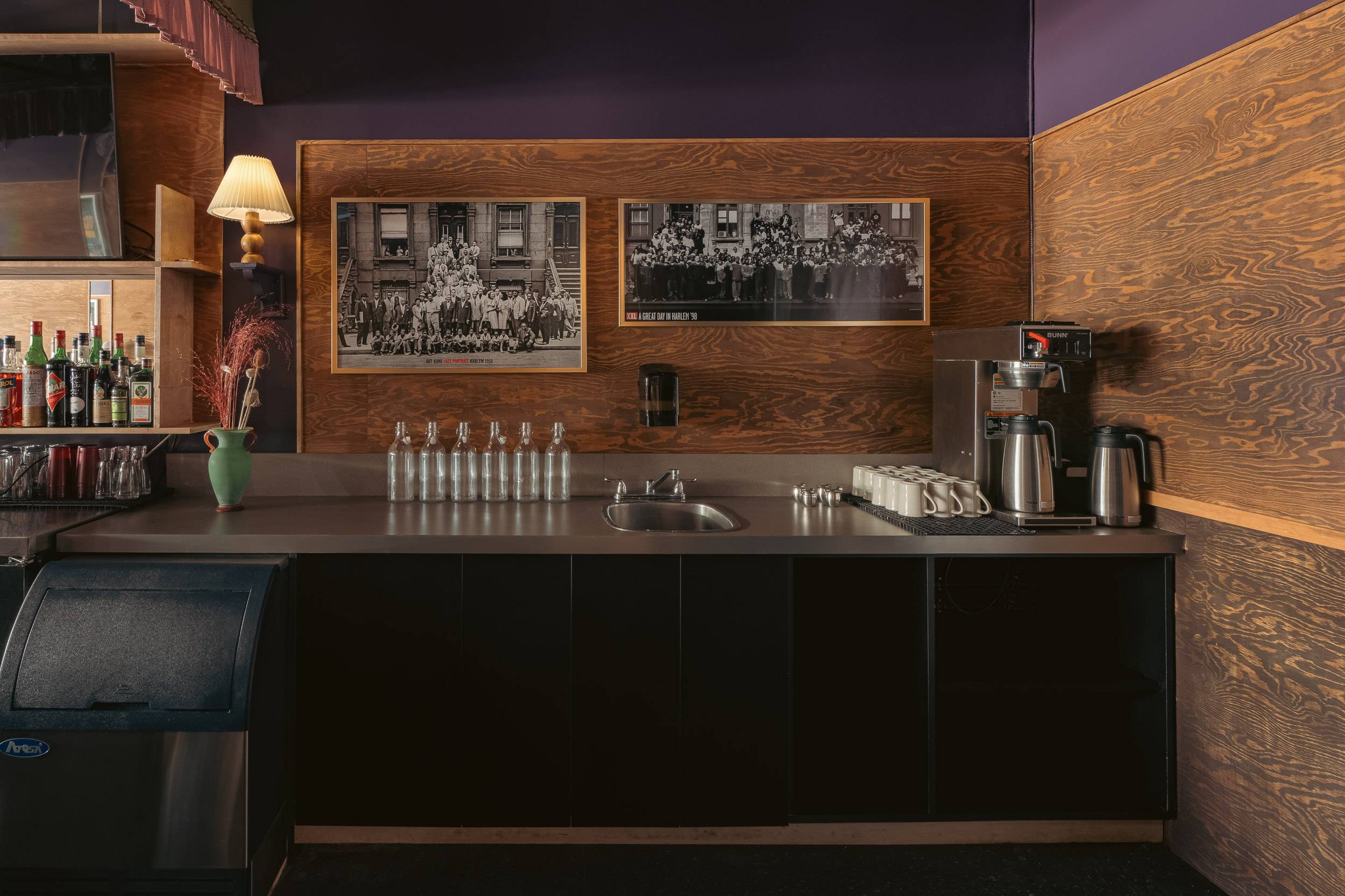
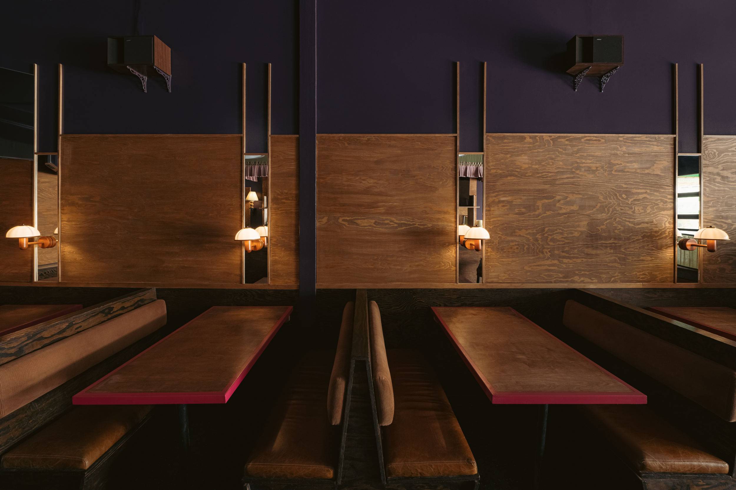
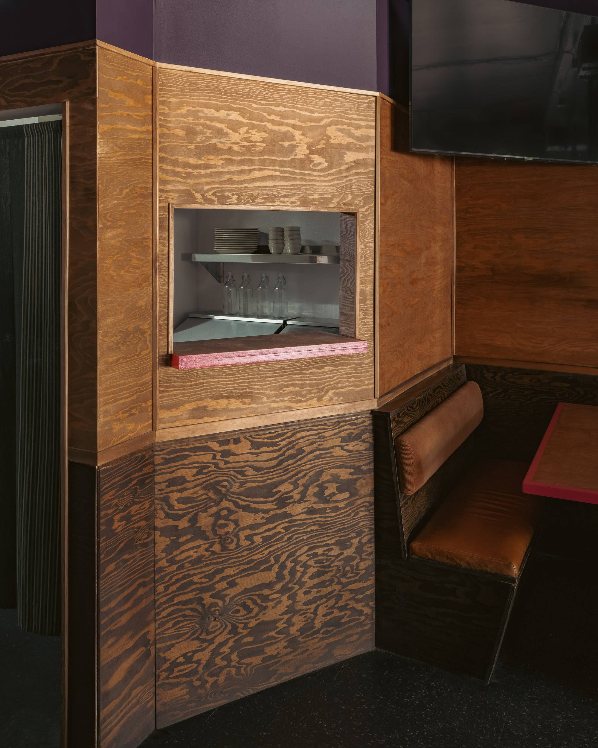
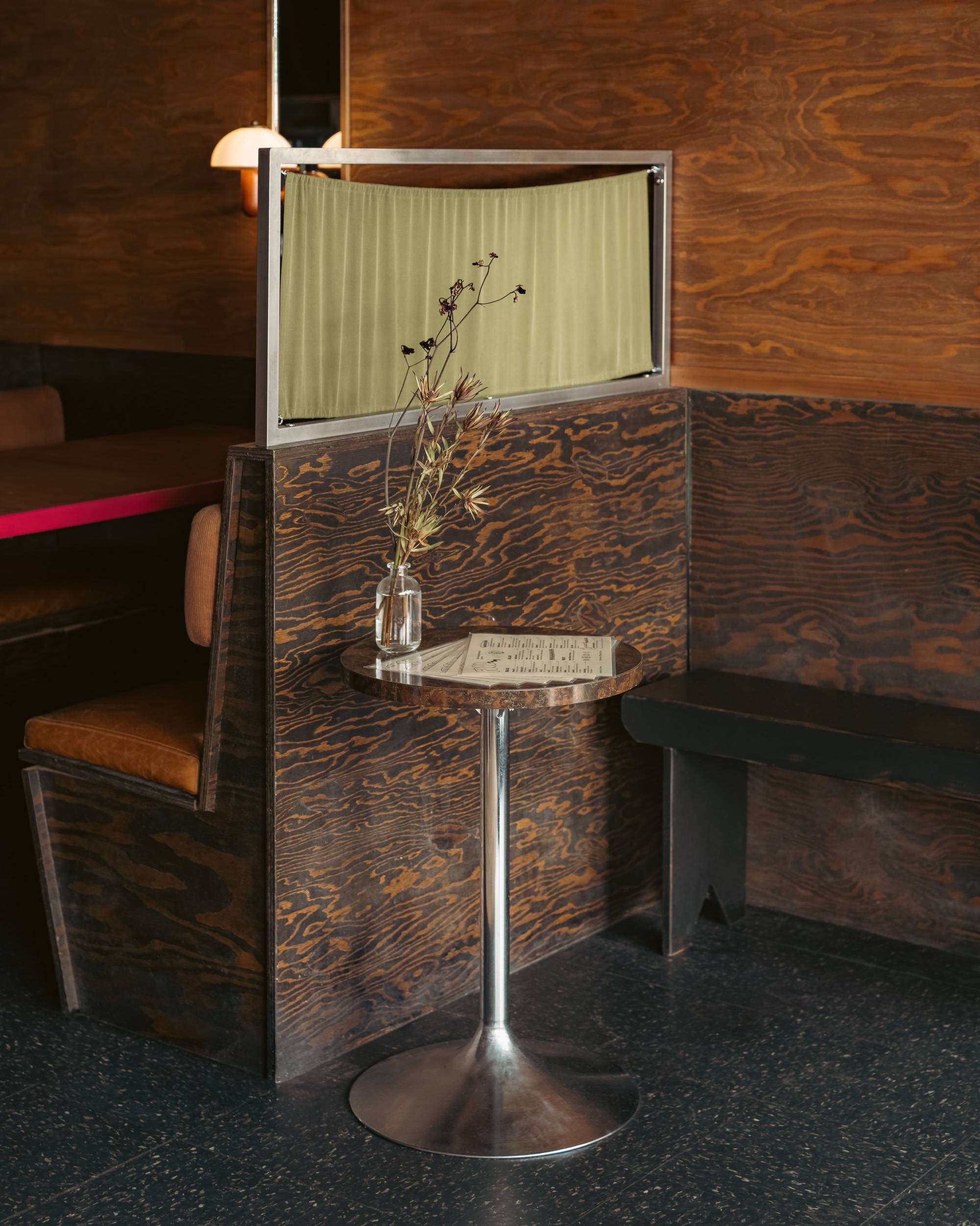
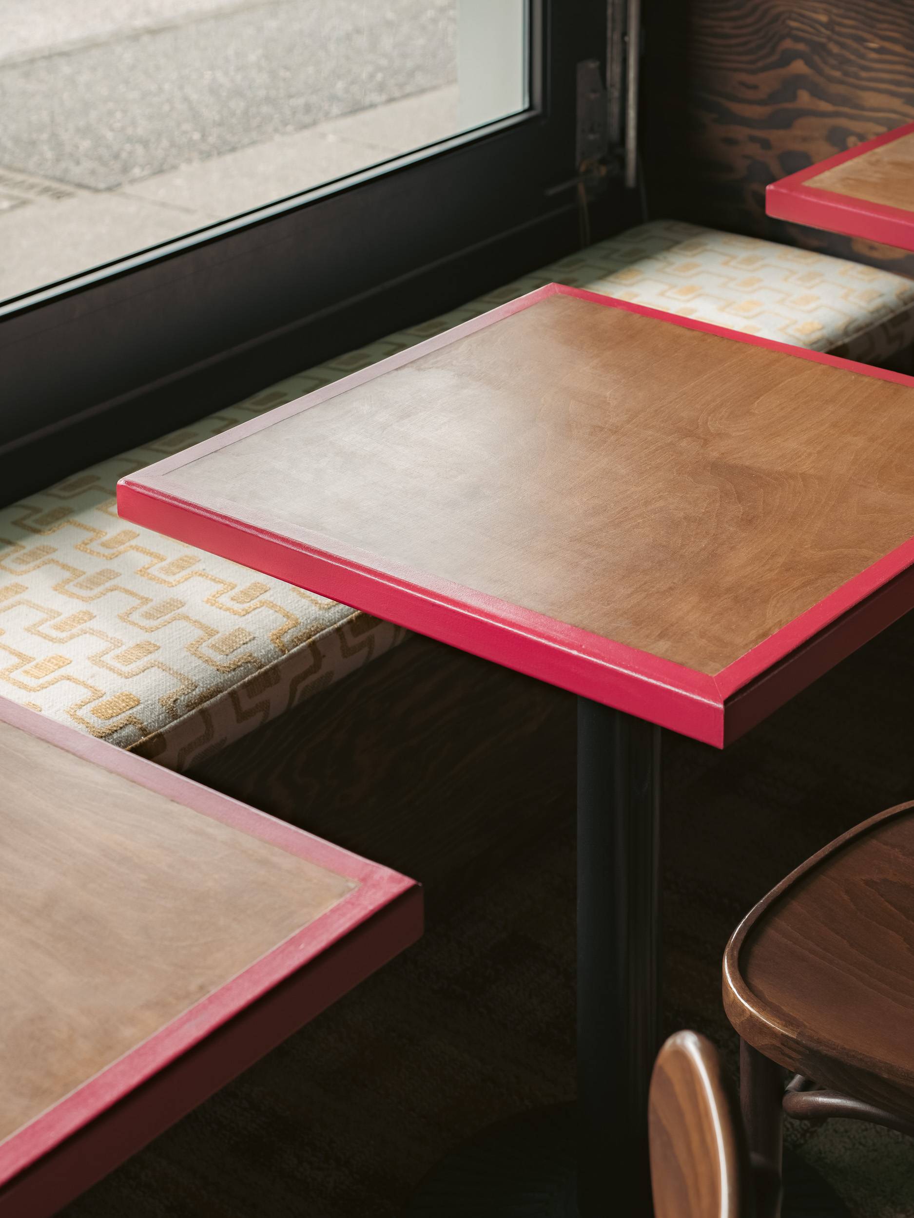
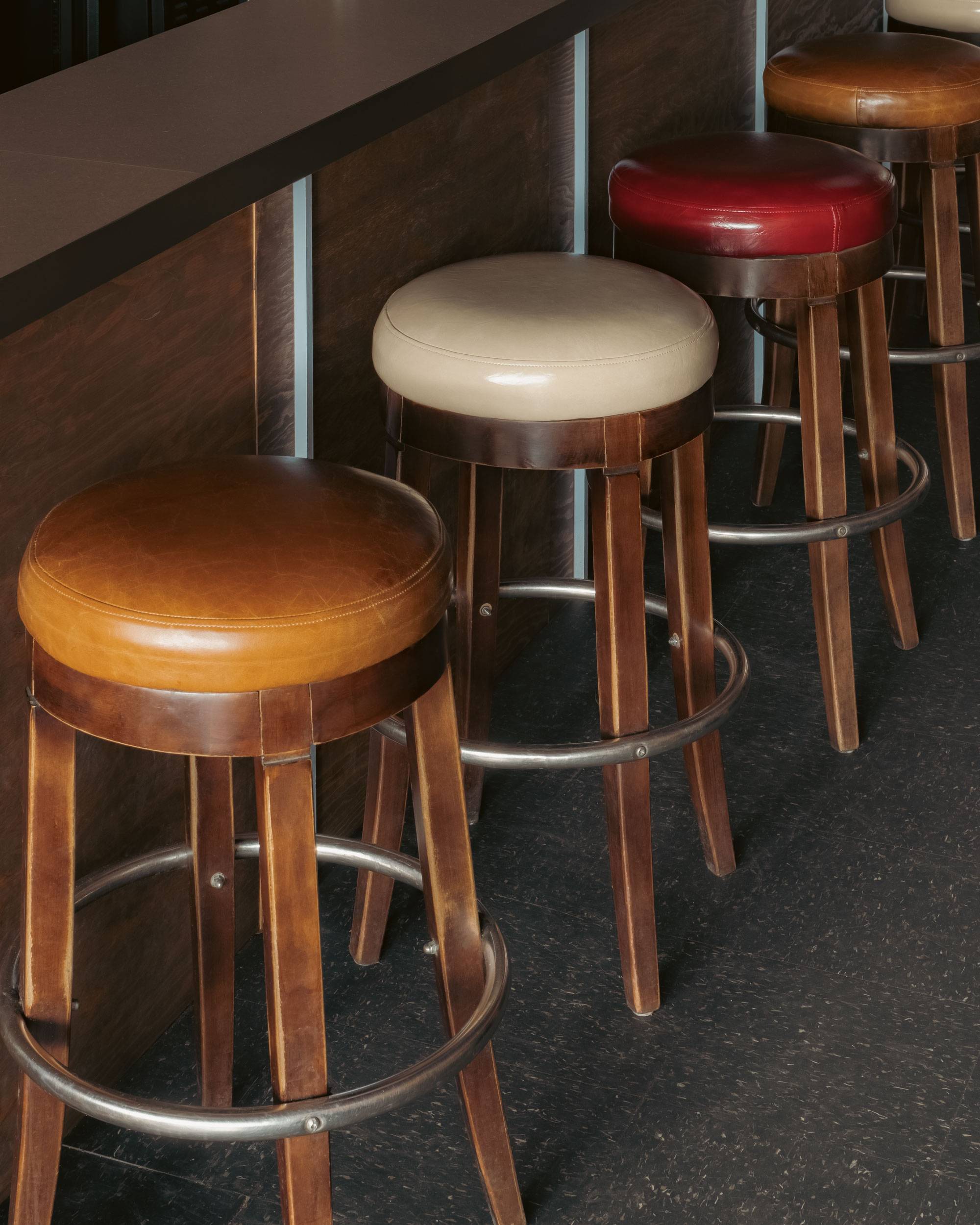
The design direction for It’s Okay was inspired by small-town Canadian pubs and 70’s New York bars. The space, in a word, is nostalgic. Its 35 seats are divided into three distinct areas — a bar, four booths and cafe-style tables. Throughout the space existing furniture and materials are blended seamlessly with new, design-forward details. We kept the bar’s original laminate flooring, adding a carpeted section in a retro, checkered print. A dark stain was used on the existing plywood and wall paneling, reviving these elements and complimenting our two primary paint colours — bright raspberry and deep eggplant.
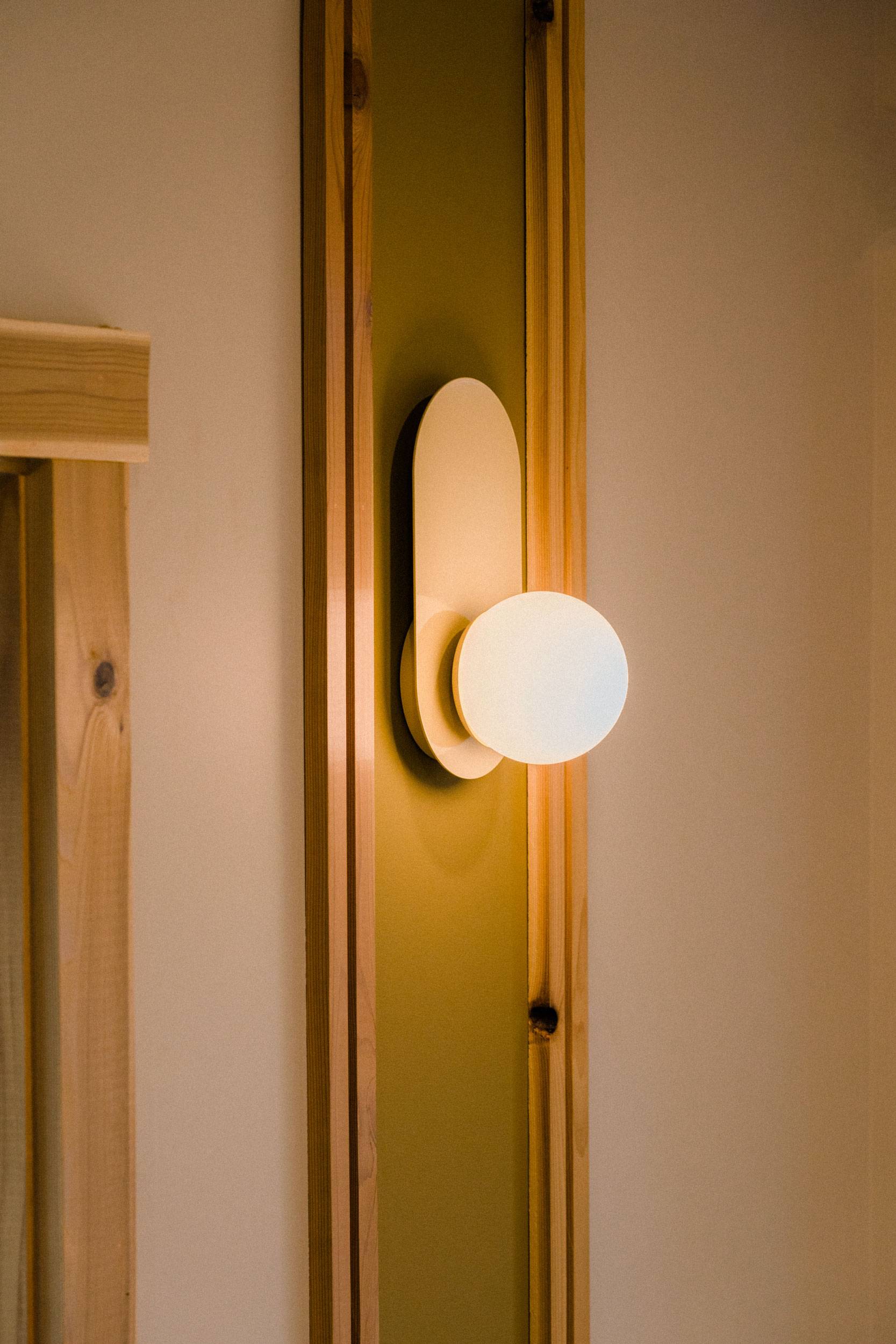
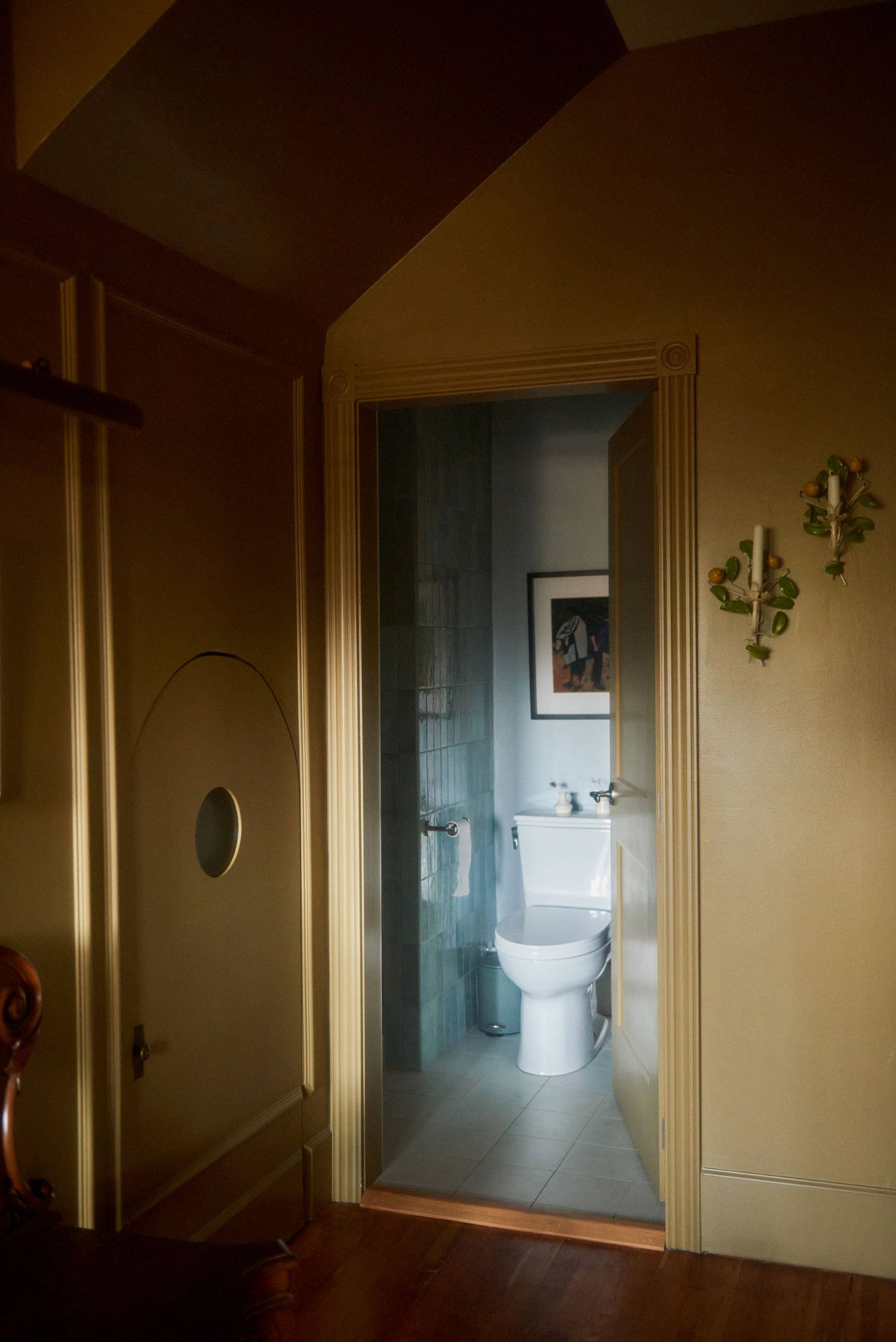
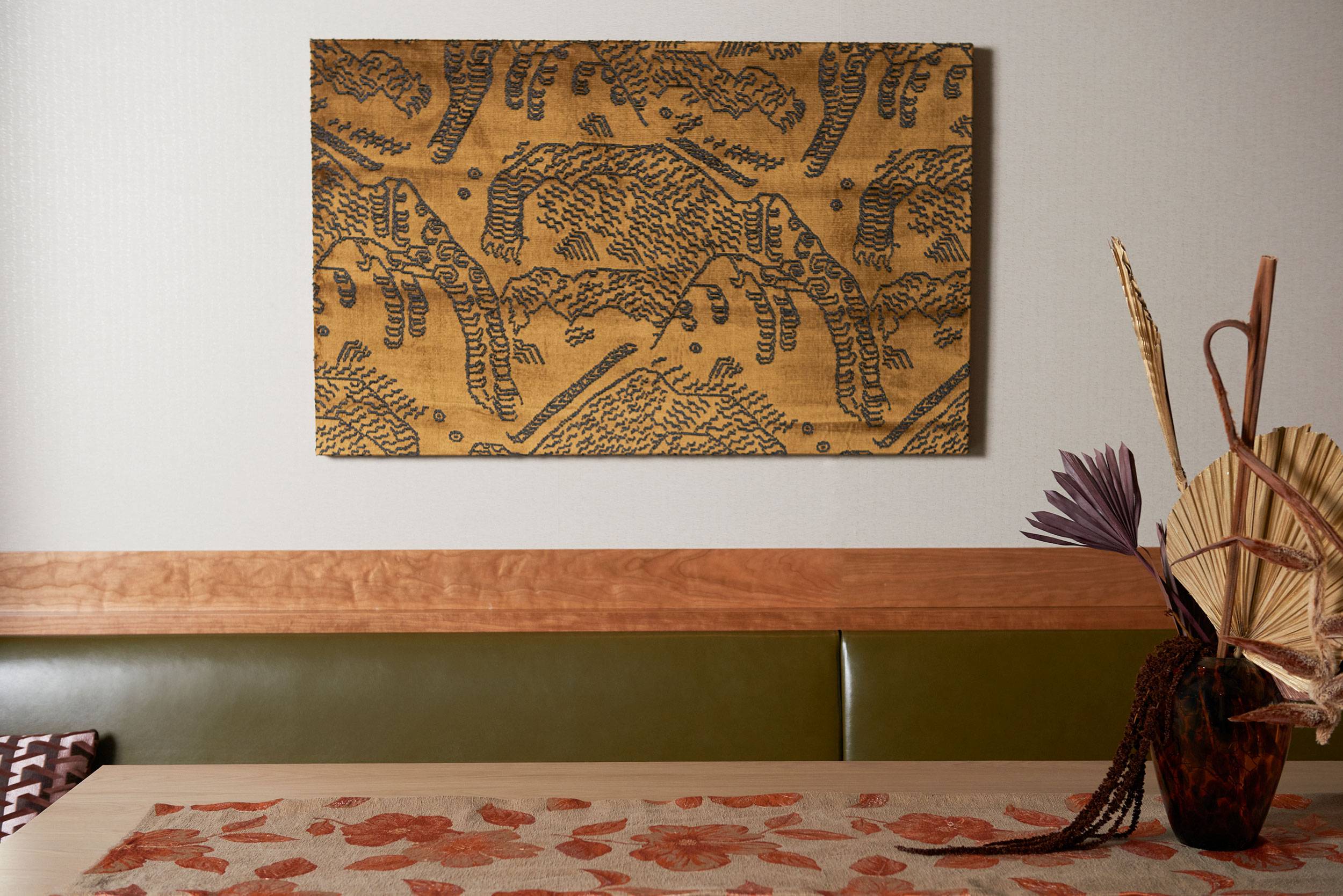
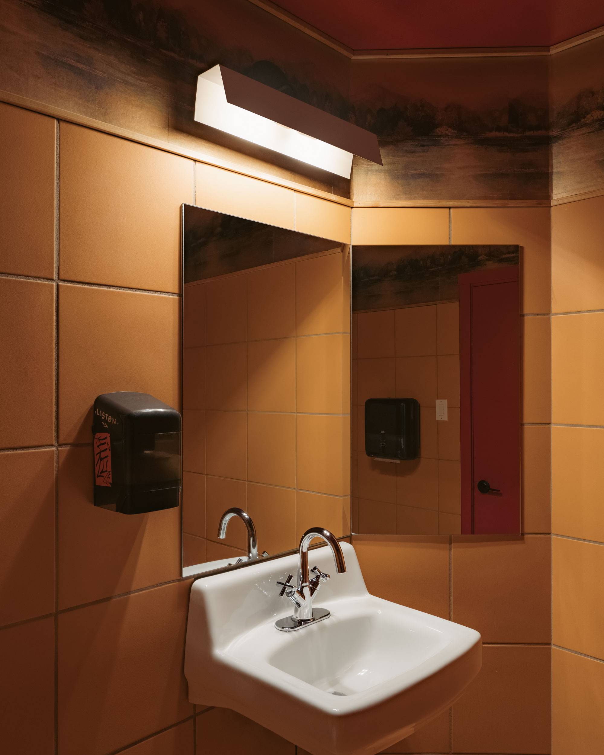
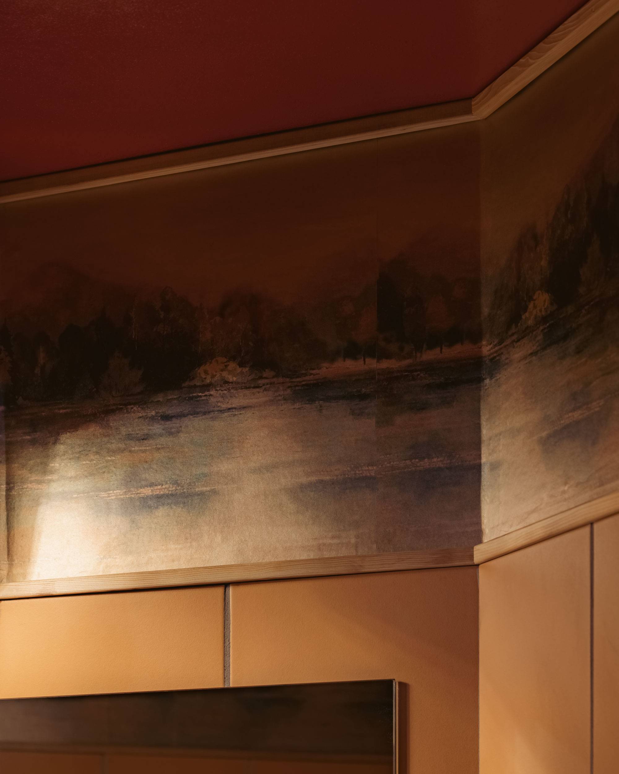
New additions to the space include unexpected details like a curtain canopy above the bar with a pleated pink trim, a parrot suspended from the ceiling and a disco ball above the entranceway. In the bathroom, we wanted to lean into the bold hues of the 70s with orange tiles and wallpaper depicting a mountain scene in muddy greens and browns. The booths are lit by orange toned wood wall sconces and feature comfy leather and corduroy upholstery, encouraging visitors to stay a while.
It’s 8pm – do you know where your friends are?
-
LOCATION—
- Vancouver
-
YEAR—
- 2023
-
SQFT—
- 950
-
PHOTOGRAPHER—
- Conrad Brown
-
MILLWORKER—
- Sequoia
-
BRAND + IDENTITY—
- Bamff Studio
