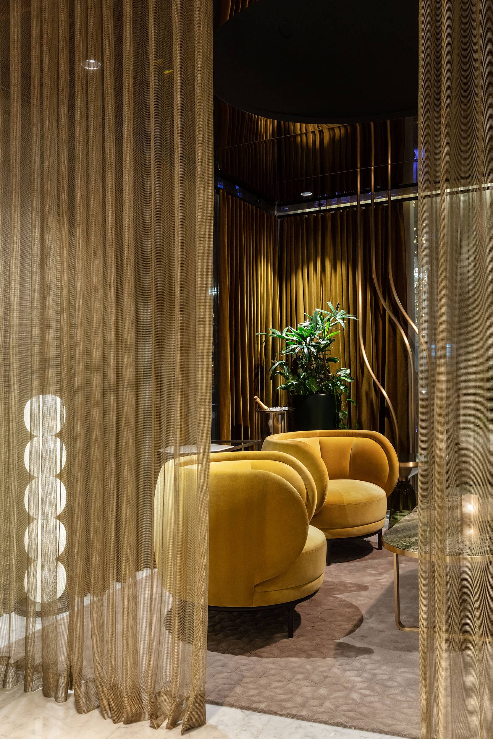
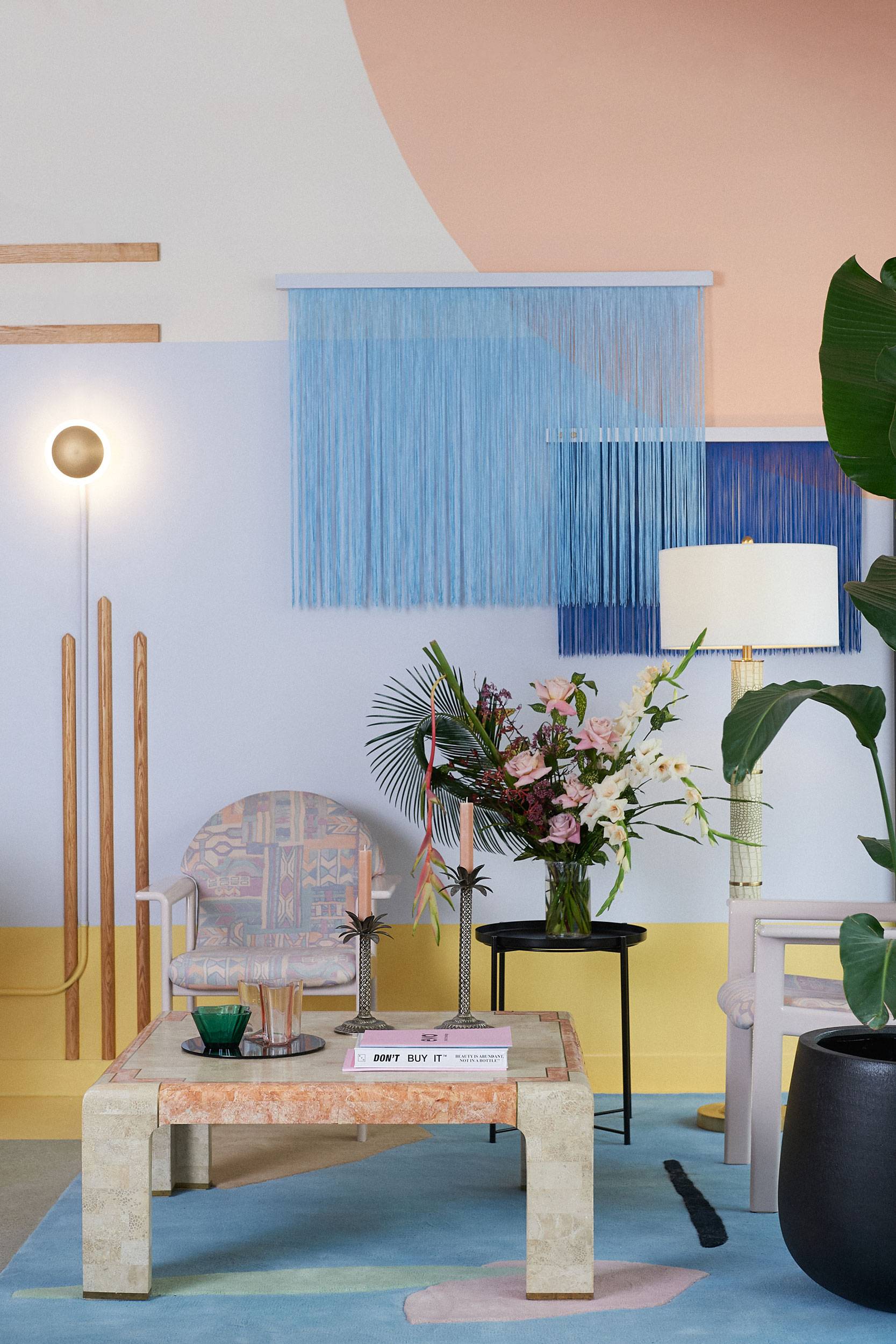
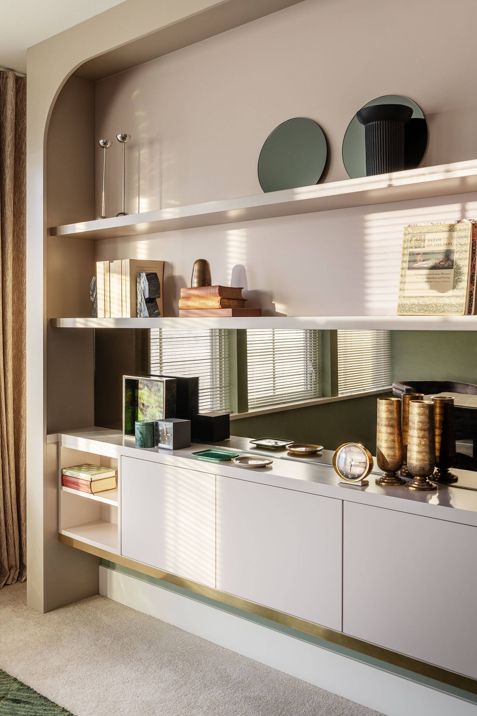
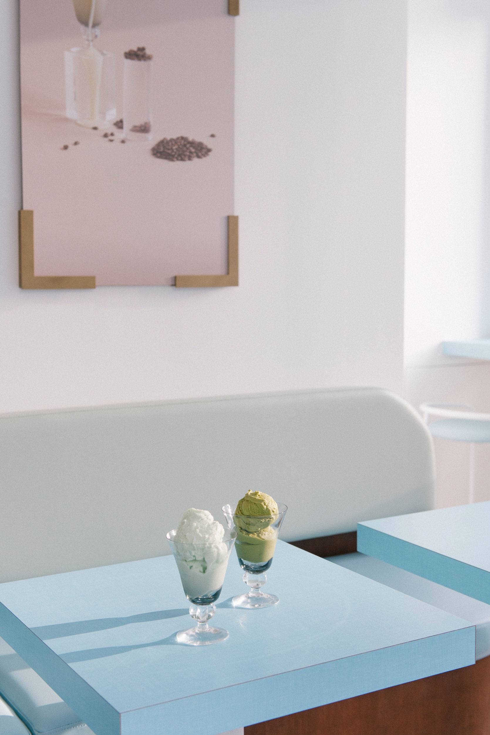
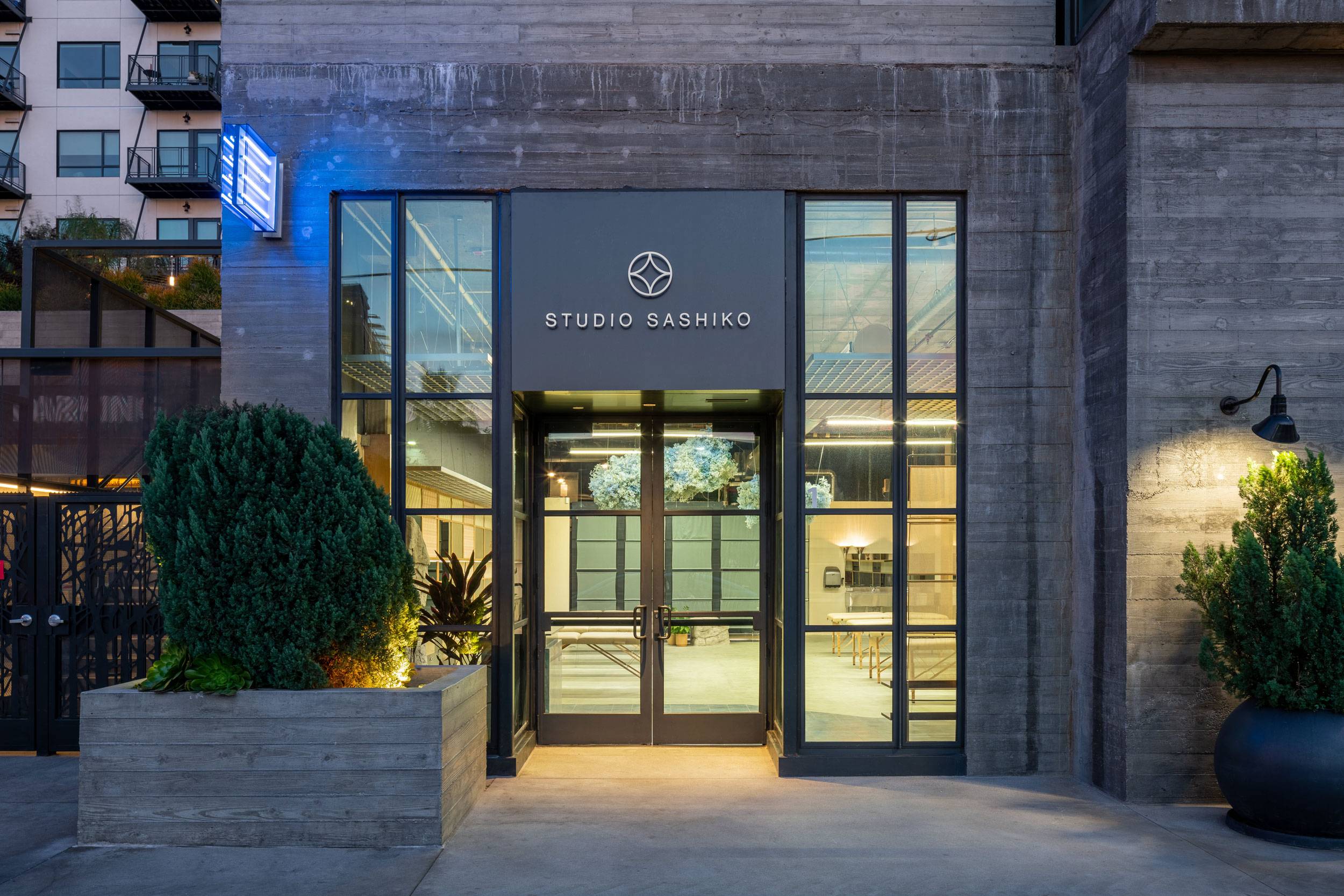
Known for their innovative, high quality work and exceptional customer experience, Studio Sashiko is a microblading and cosmetic tattoo studio with a cult international following. Operating from their original Langley, BC location for the past 6 years, it was a natural progression for the brand to expand to meet the needs of their growing list of international clientele. For their new flagship location, Los Angeles’ Arts District was a natural fit.
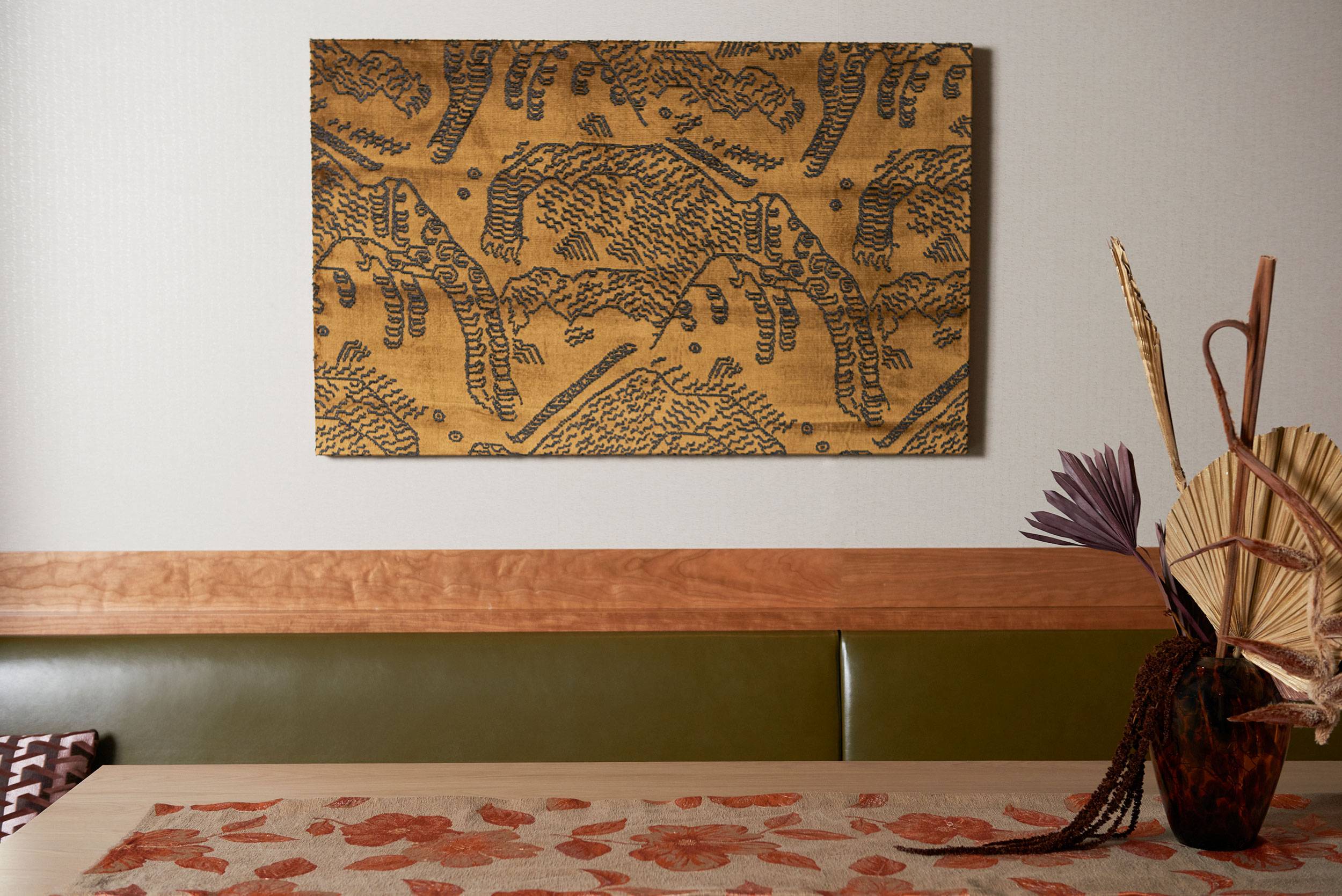
The work of Studio Sashiko embraces the Japanese art of tebori, an ancient practice of tattooing by hand. Its meticulous, highly detailed craftsmanship mirrors the technique and artistry of microblading. Drawing further inspiration from Japanese craft, the name Studio Sashiko is a reference to the decorative embroidery that adorns traditional indigo-dyed textiles that are prized worldwide for their beauty and character.
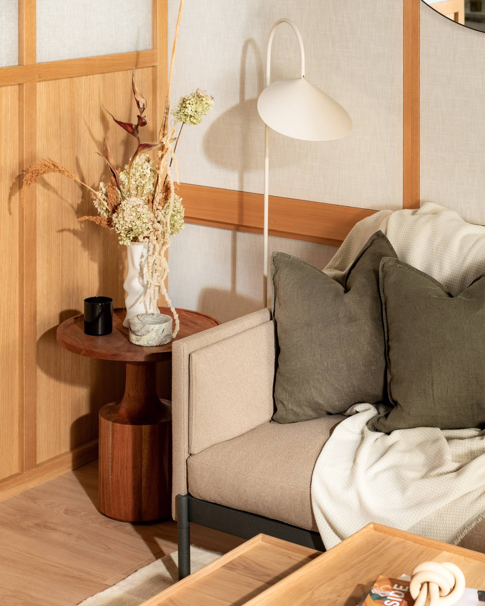
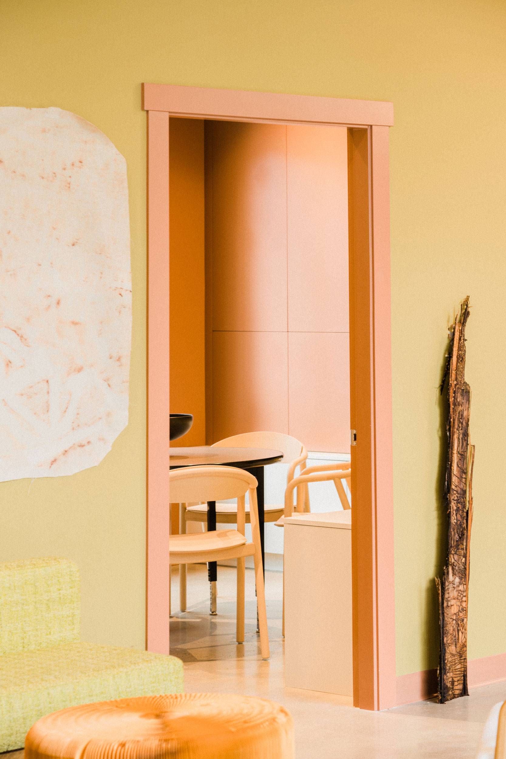
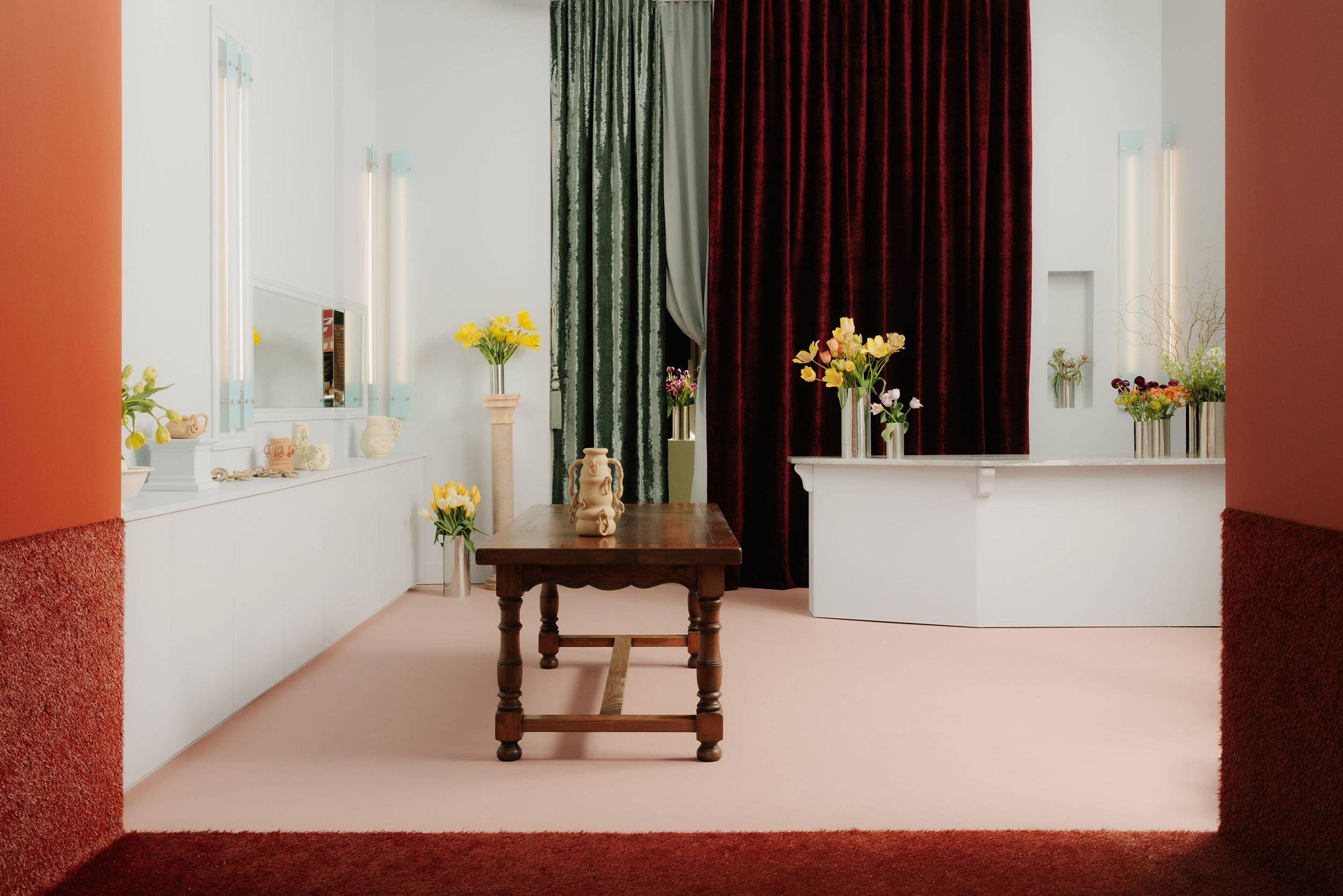
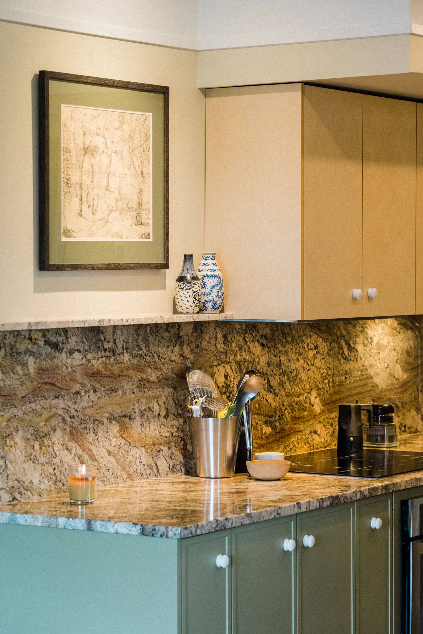
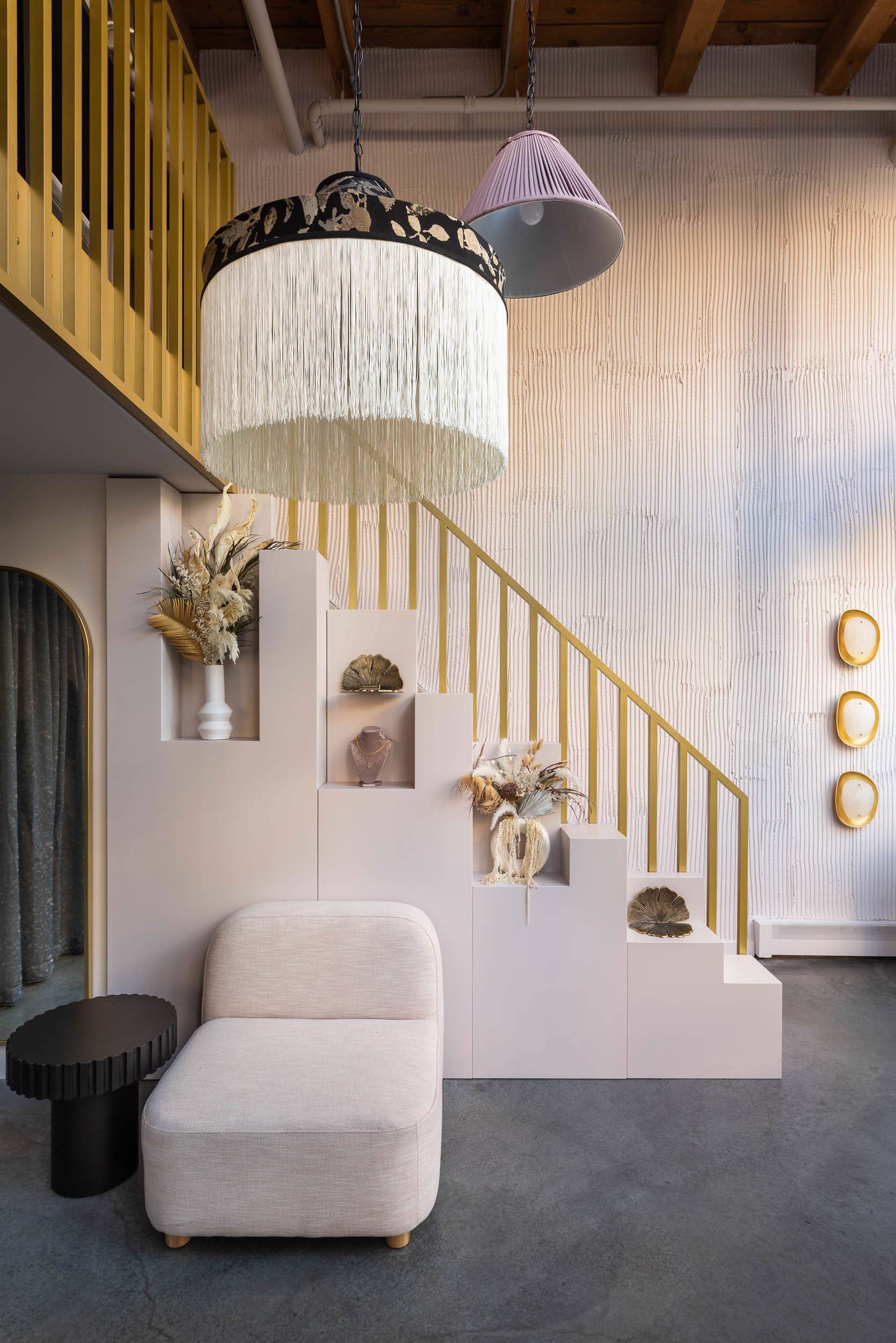
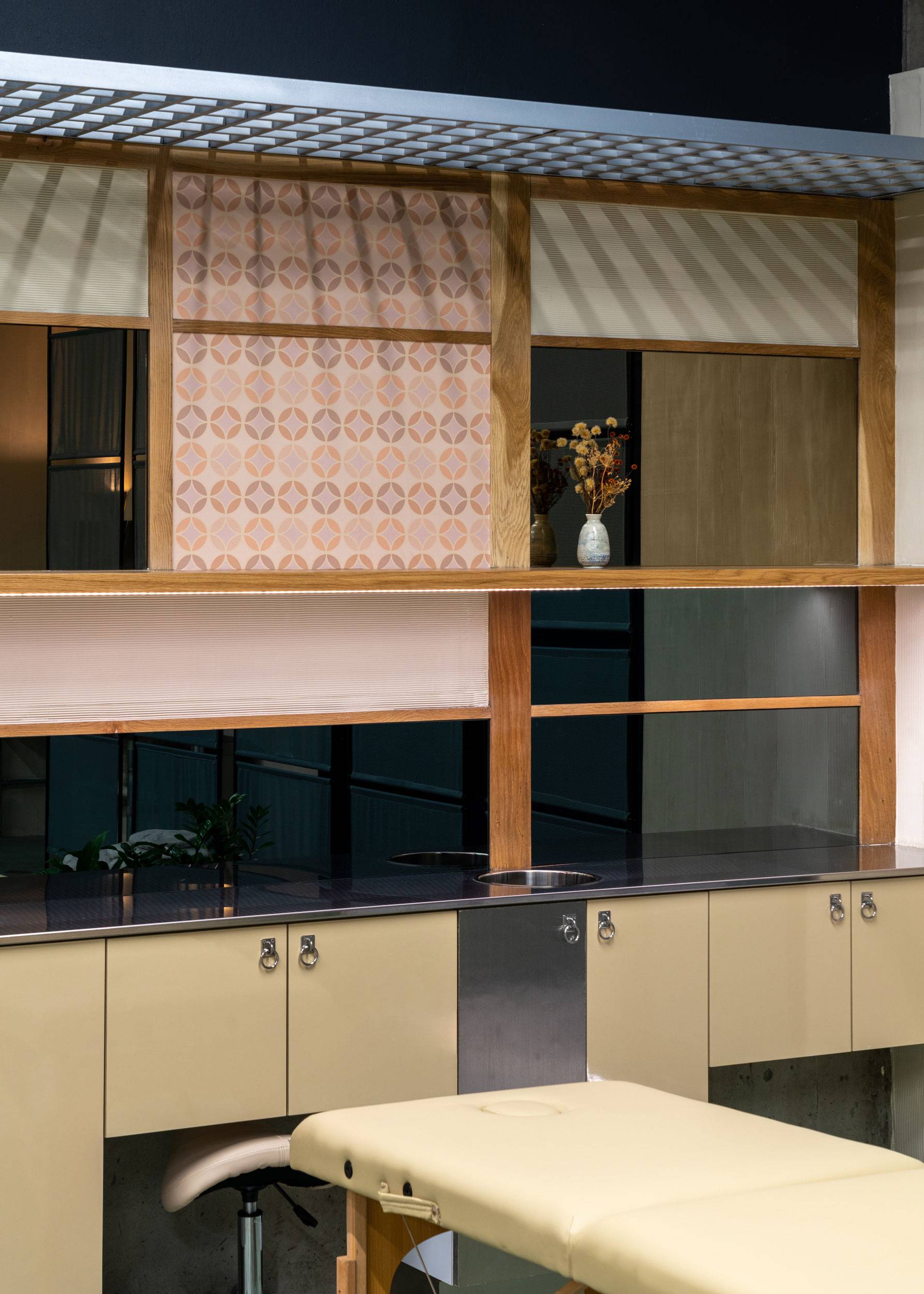
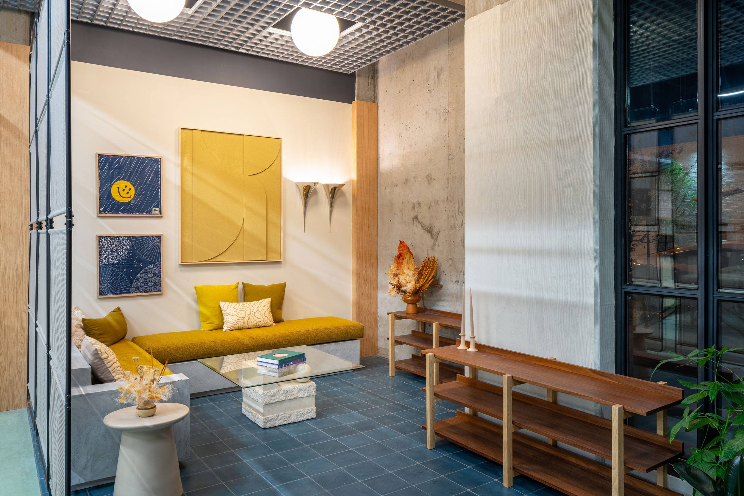
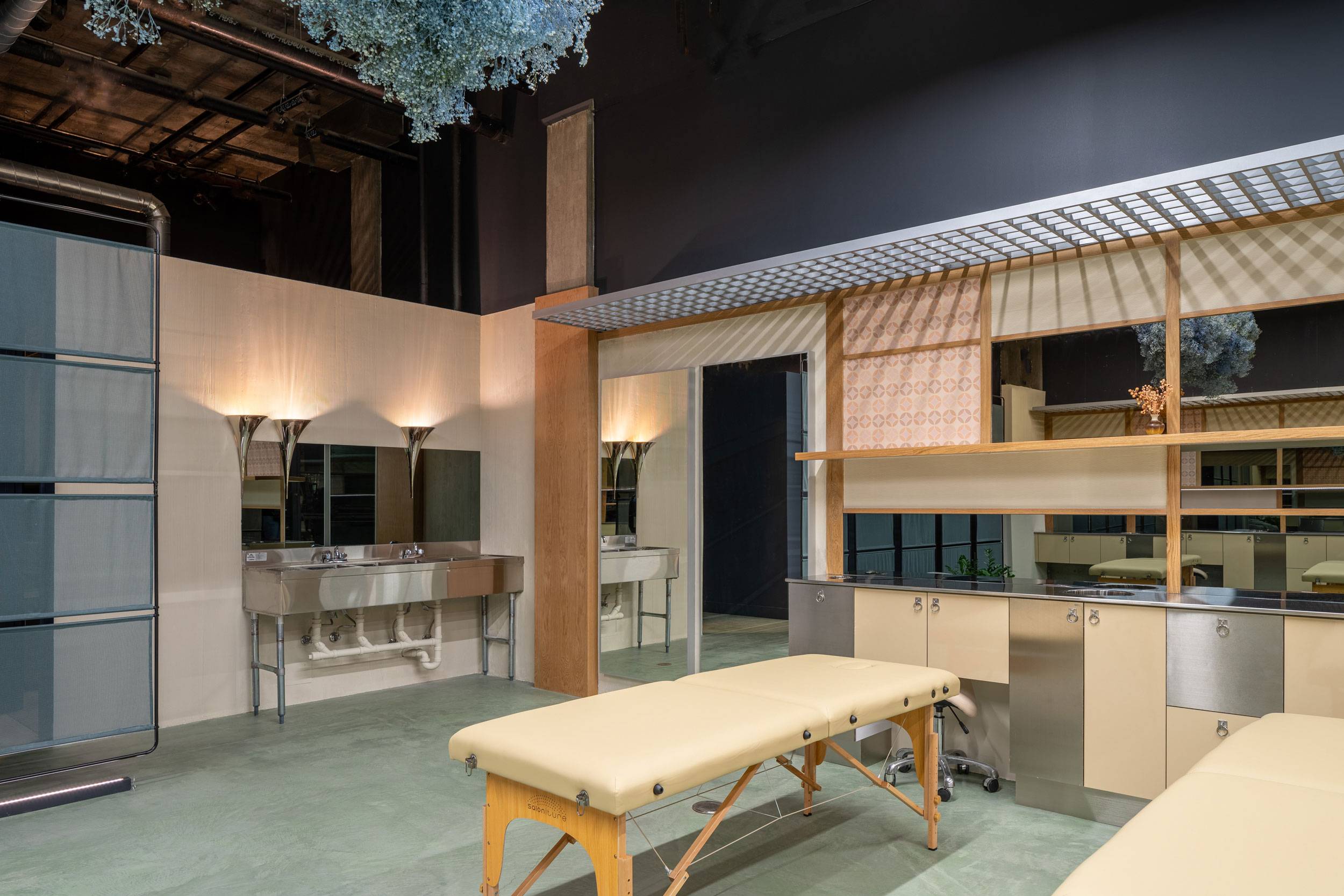
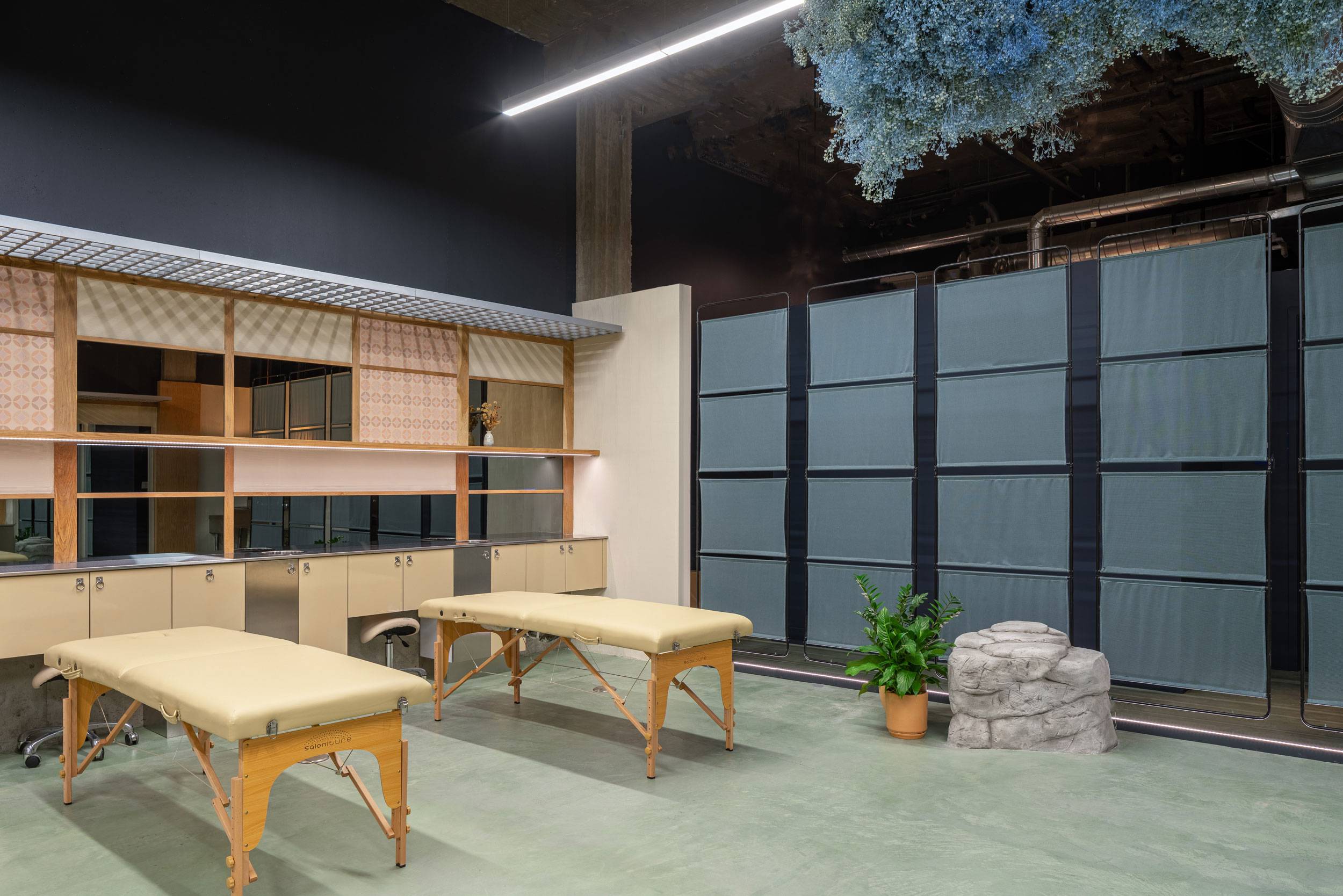
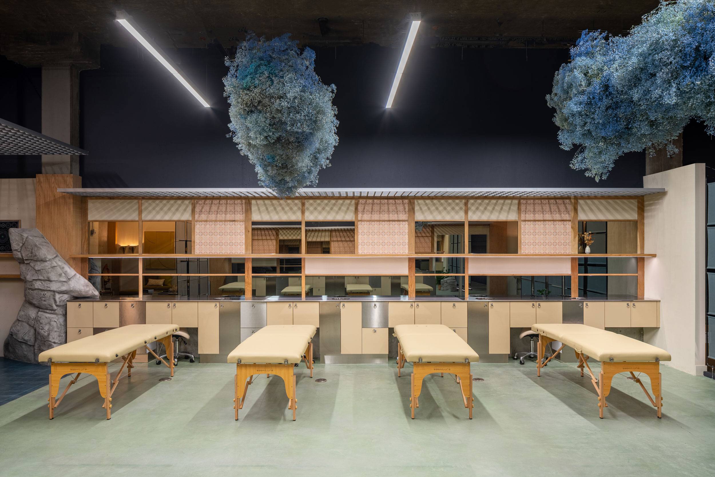
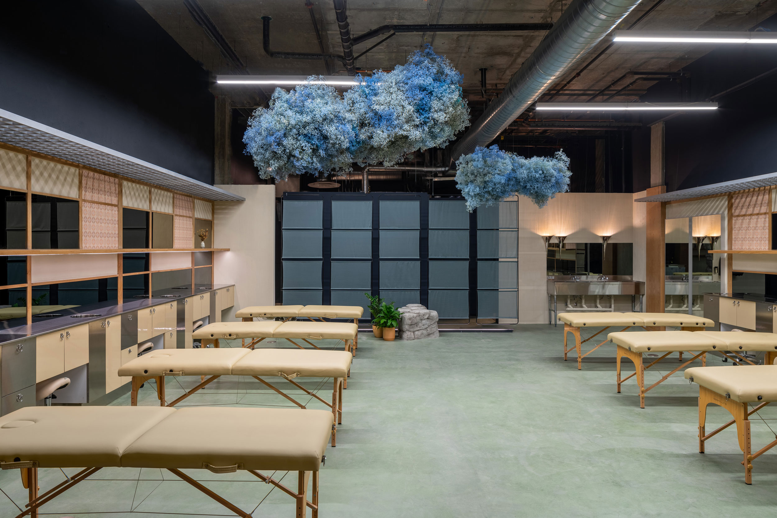
When approaching the interior design of the LA flagship, we wanted to reflect this same balance of beauty and precision. Exploring the greater breadth of Japanese patchwork and fabric techniques, we discovered that this century old tradition is one of the first forms of upcycling. Coupled with contemporary reference points in the realm of fashion, these traditions informed our material choices for the project—honest, natural materials used in a modern way. The idea of patchwork was conceptually realized by how we articulated the ‘patching’ of millwork and wall finishes. Wallpaper, raked plaster and warm paint colours juxtaposed with wood moulding inspired by Japanese joinery adorn the walls of the space, echoed through the custom millwork of each artist station in the studio.
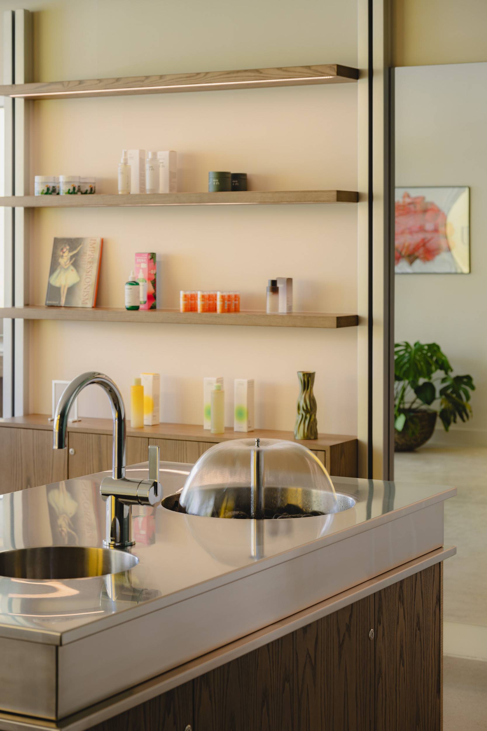
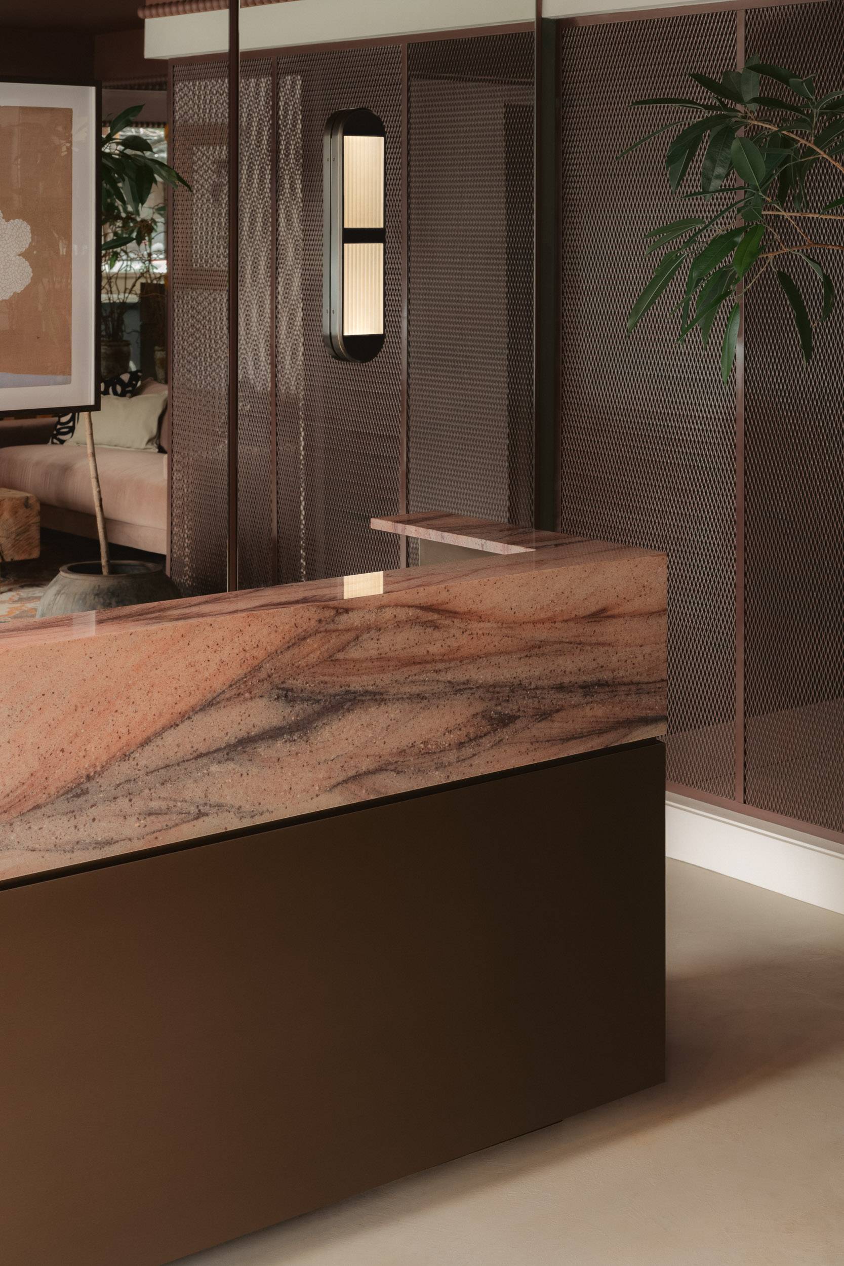
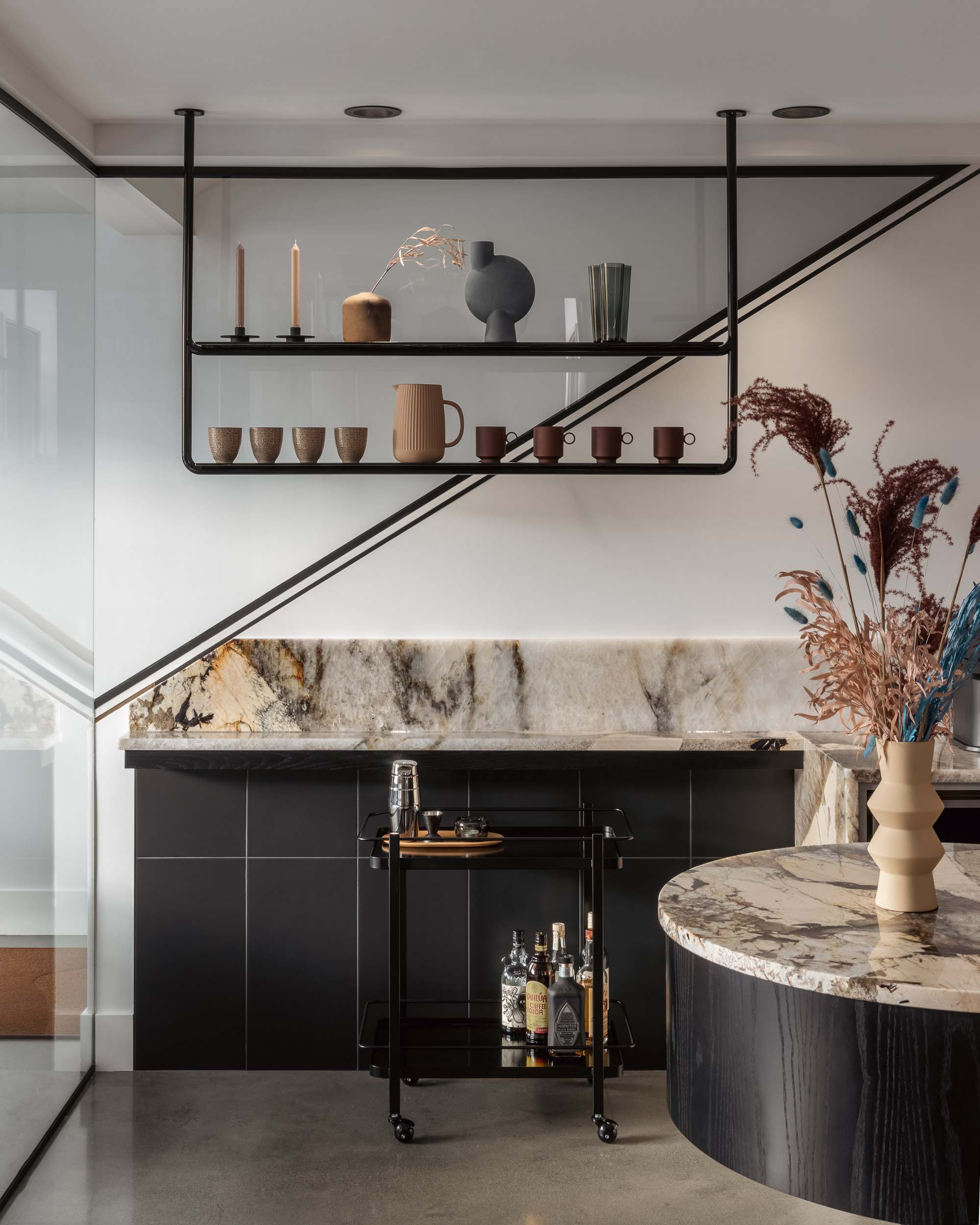
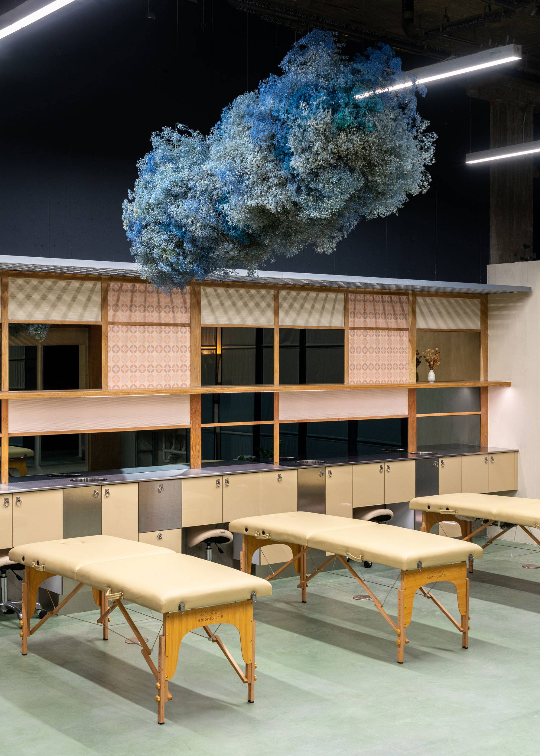
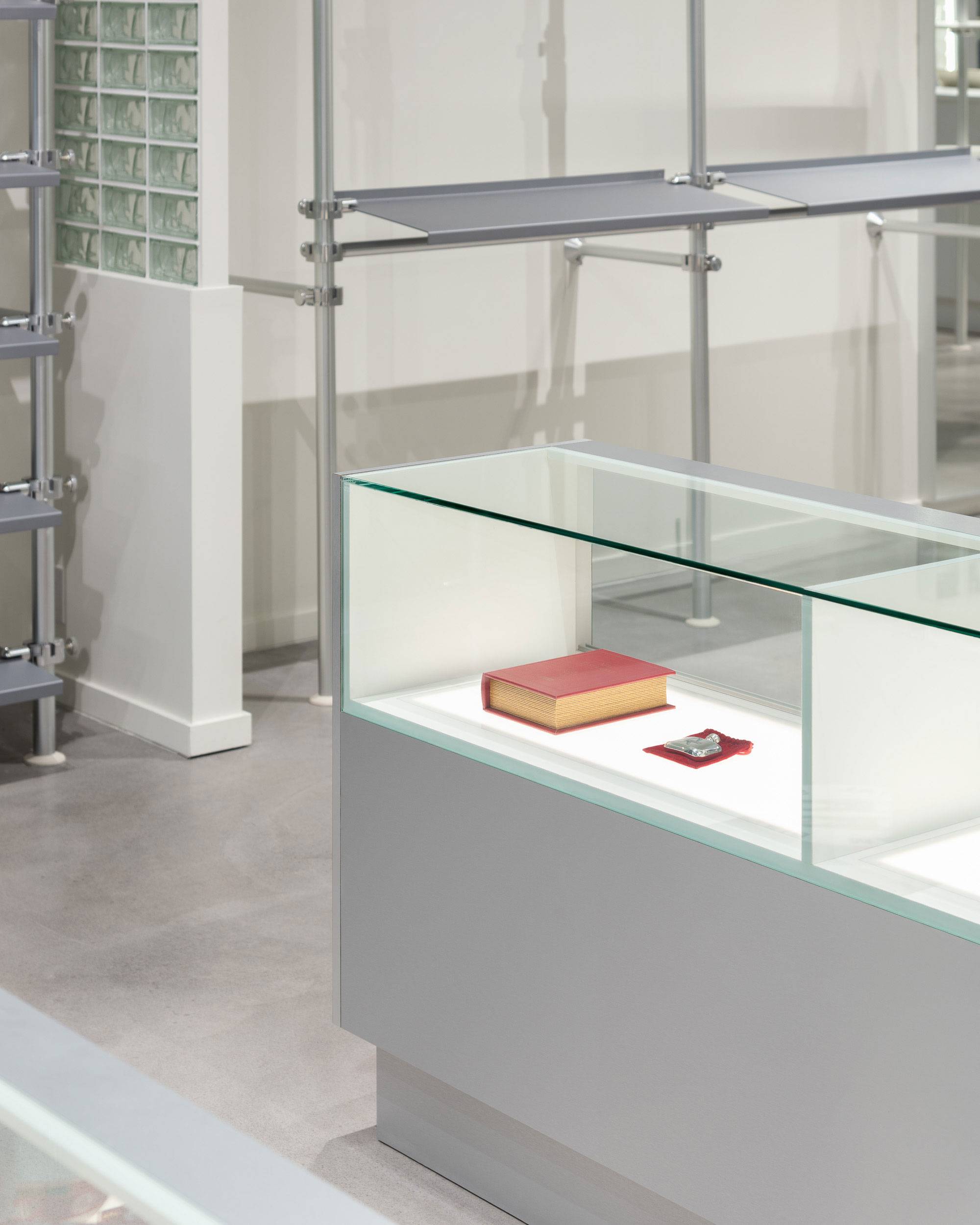
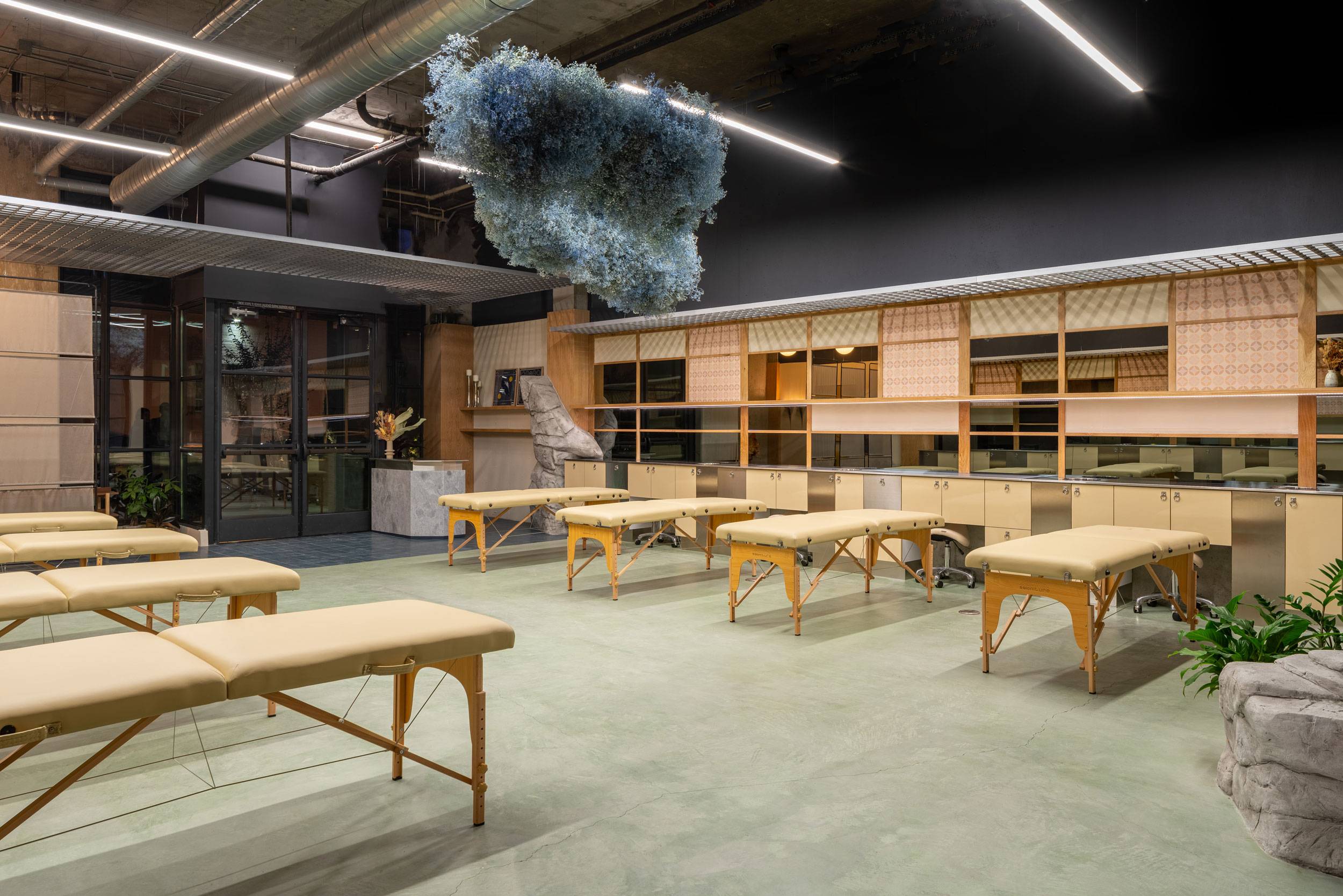
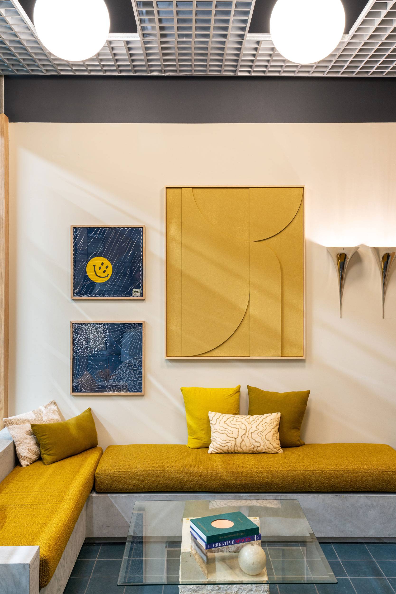
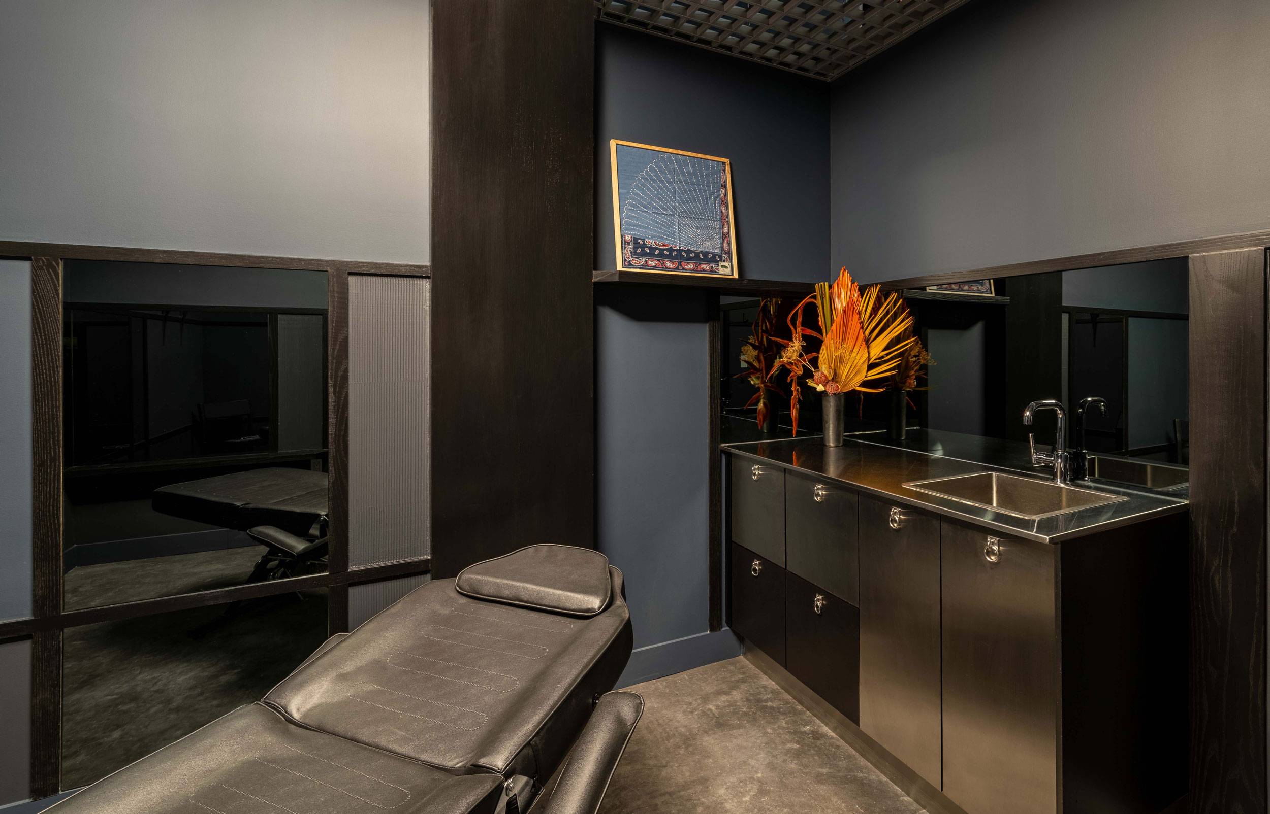
Expressions of craftsmanship and heritage are offset by the clinical and professional side of Sashiko’s business, utilizing contemporary elements of stainless steel, chrome and mirror finishes. To provide structure and division to what is otherwise an open concept studio, we developed an open cell grid ceiling, rendered in stainless steel with considered placement of lighting and floral elements to provide visual interest while customers look upwards during sessions. Contemporary fixtures continue this thread of modernity with their chrome finishes and sculptural forms, creating two distinct lighting programs focusing on the artist stations (functional) and the creation of space within the open areas of the studio (dynamic).
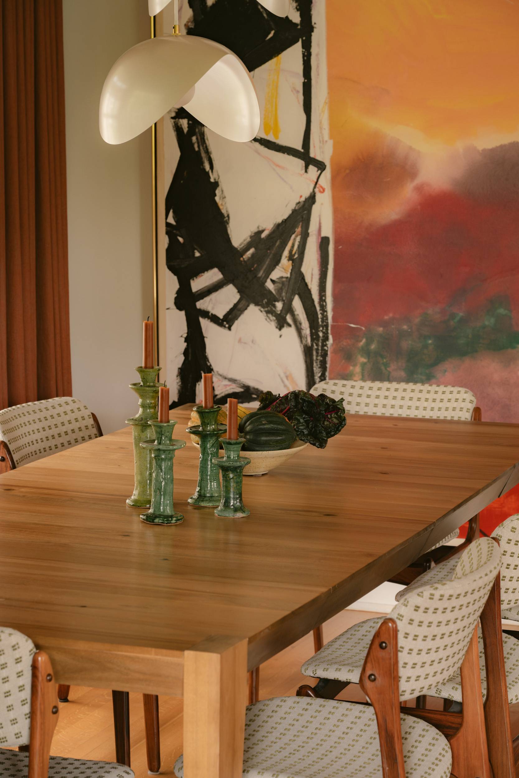
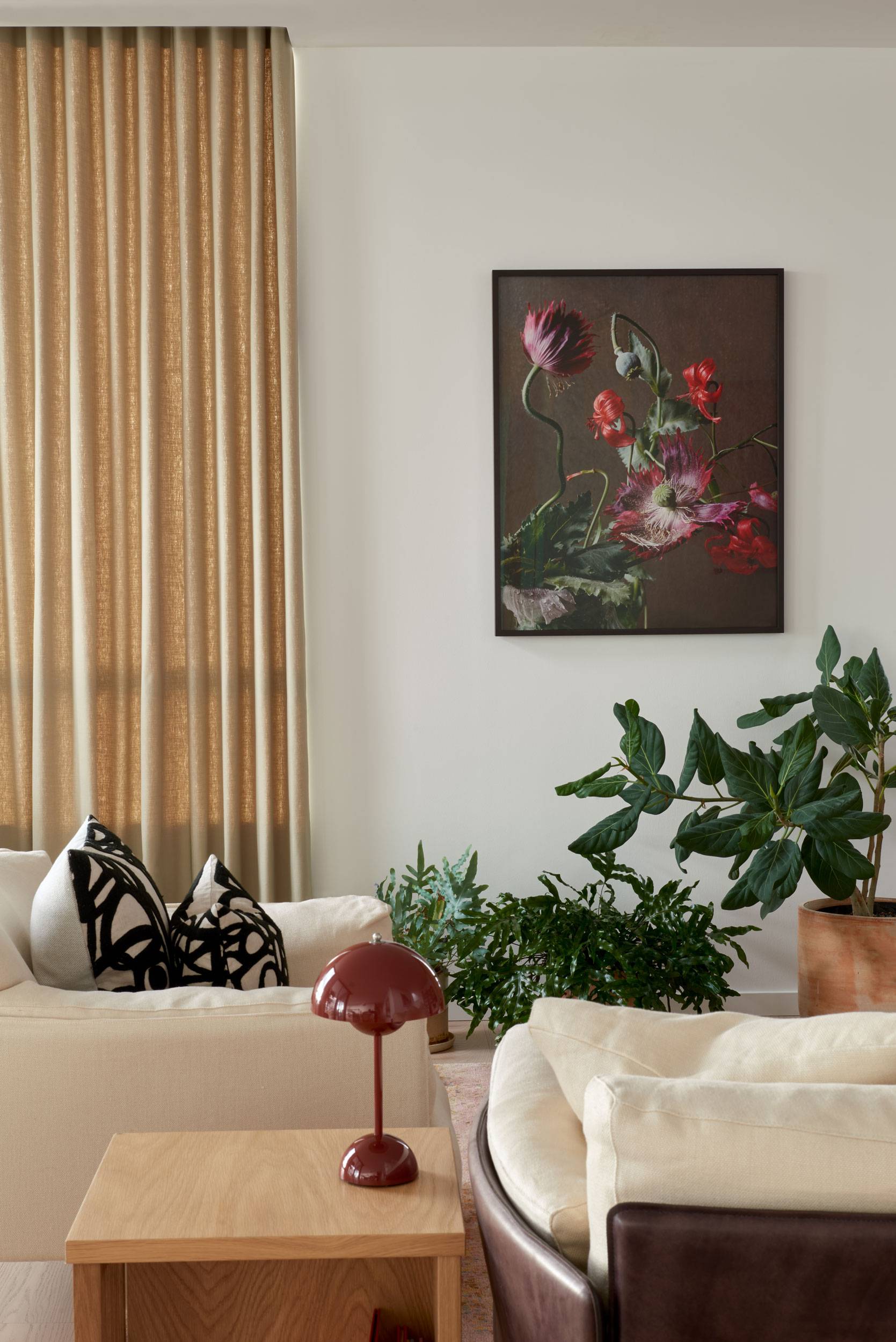
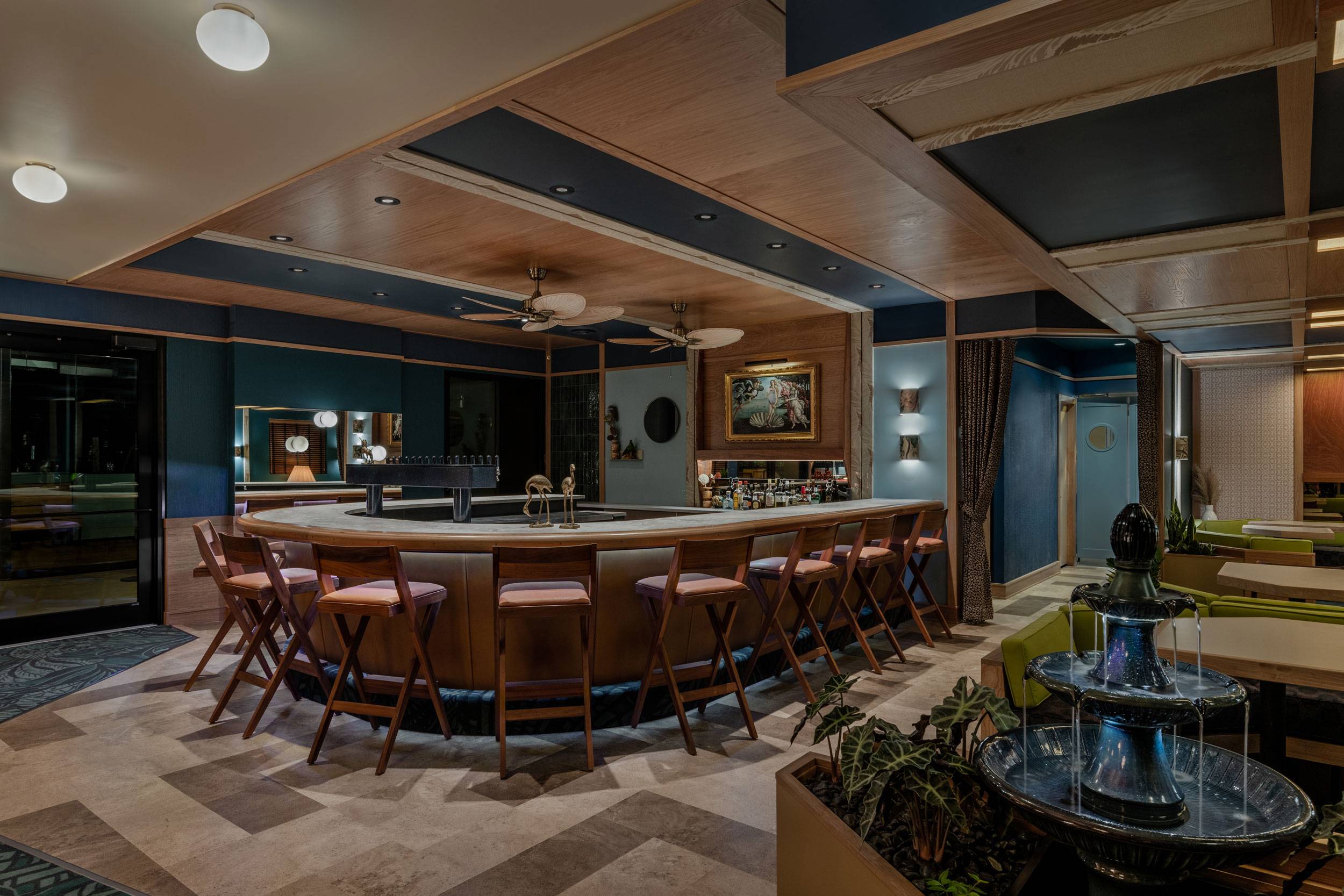
We also drew a great deal of inspiration from the personalities and interest of Sashiko’s two founders, Kyle and Shaughnessy. Functioning as the key muses of the project, we worked to reflect their personal connections and interest in mid-century furniture, contemporary streetwear and Kyle’s personal connection to California mid-century architecture.
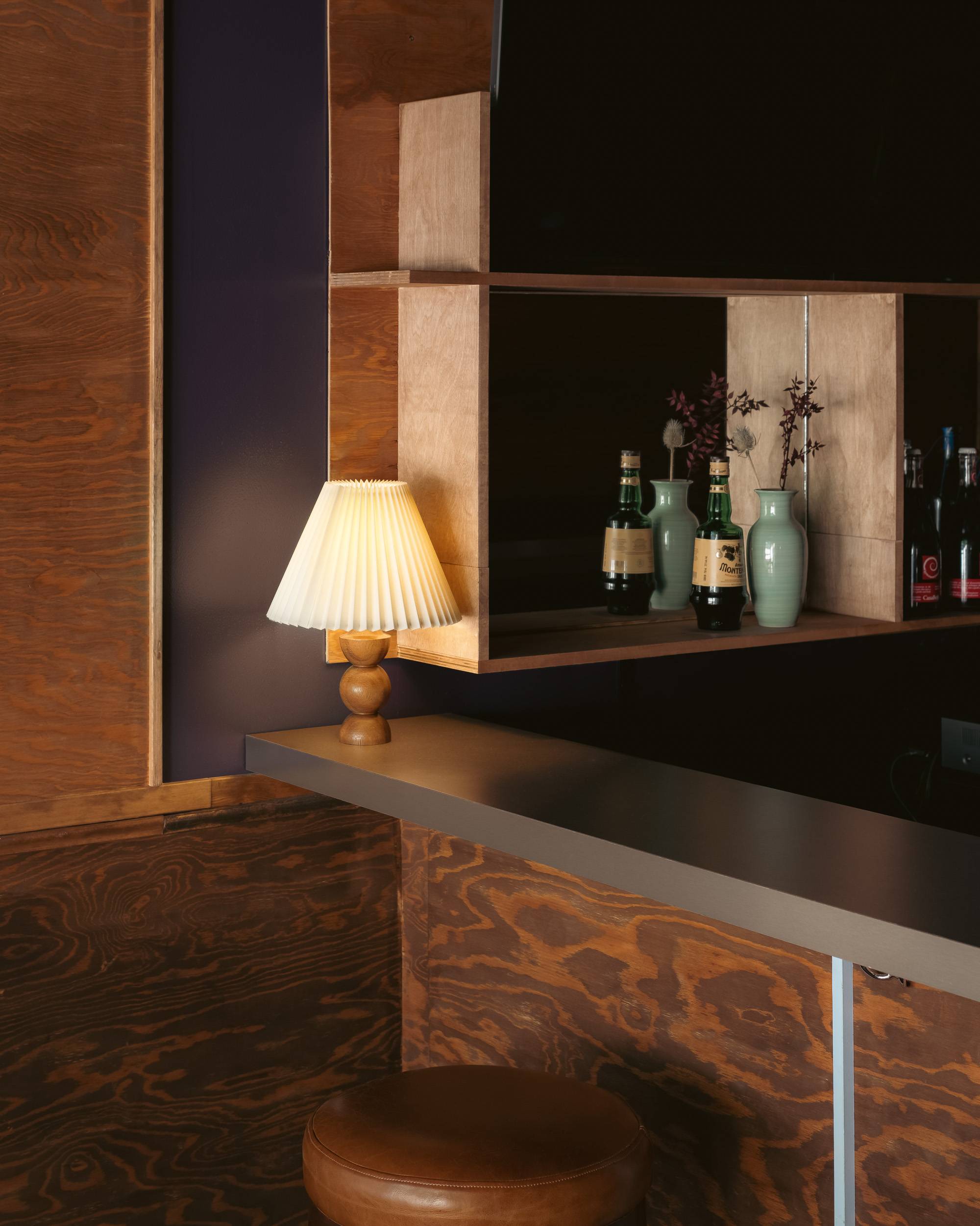
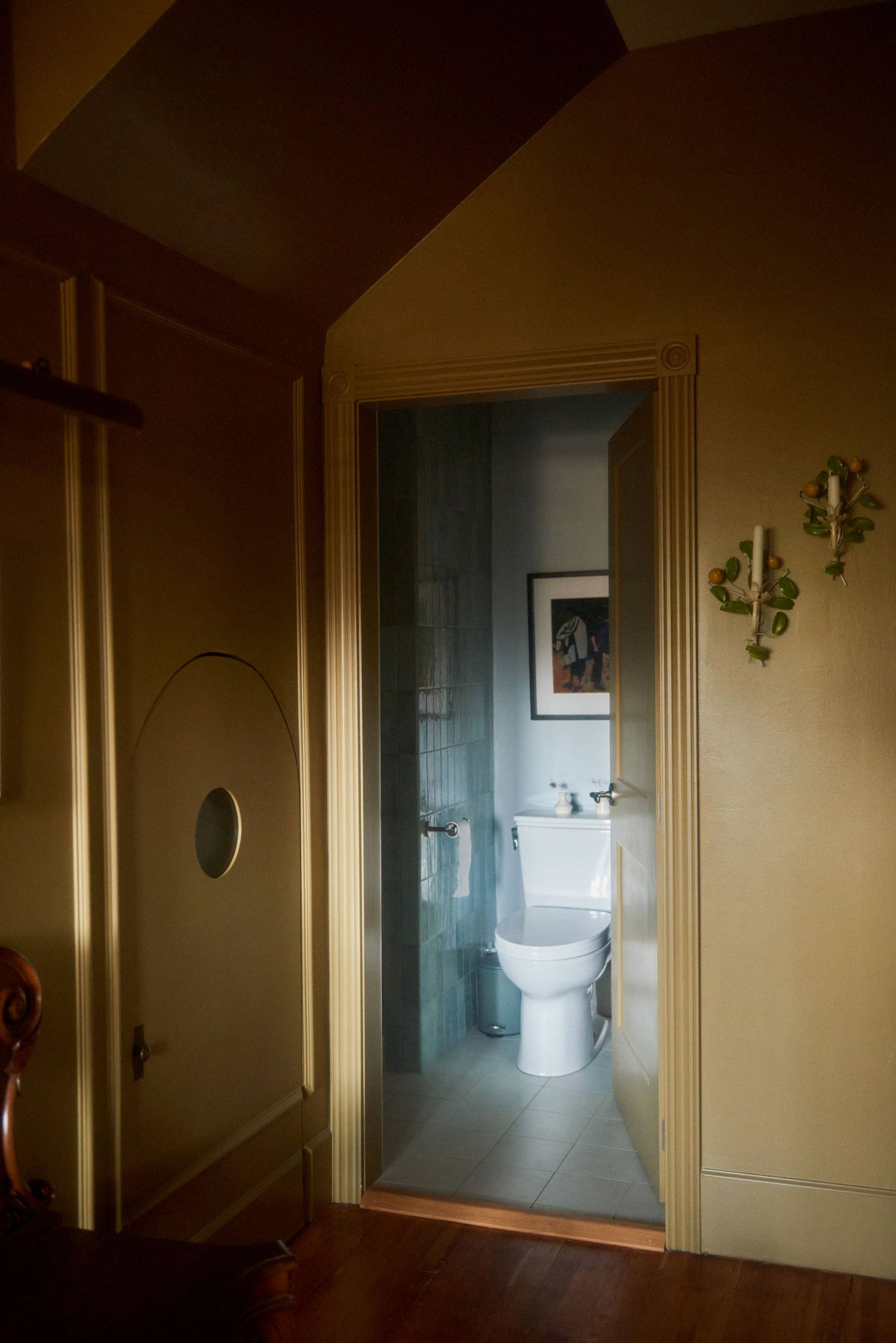
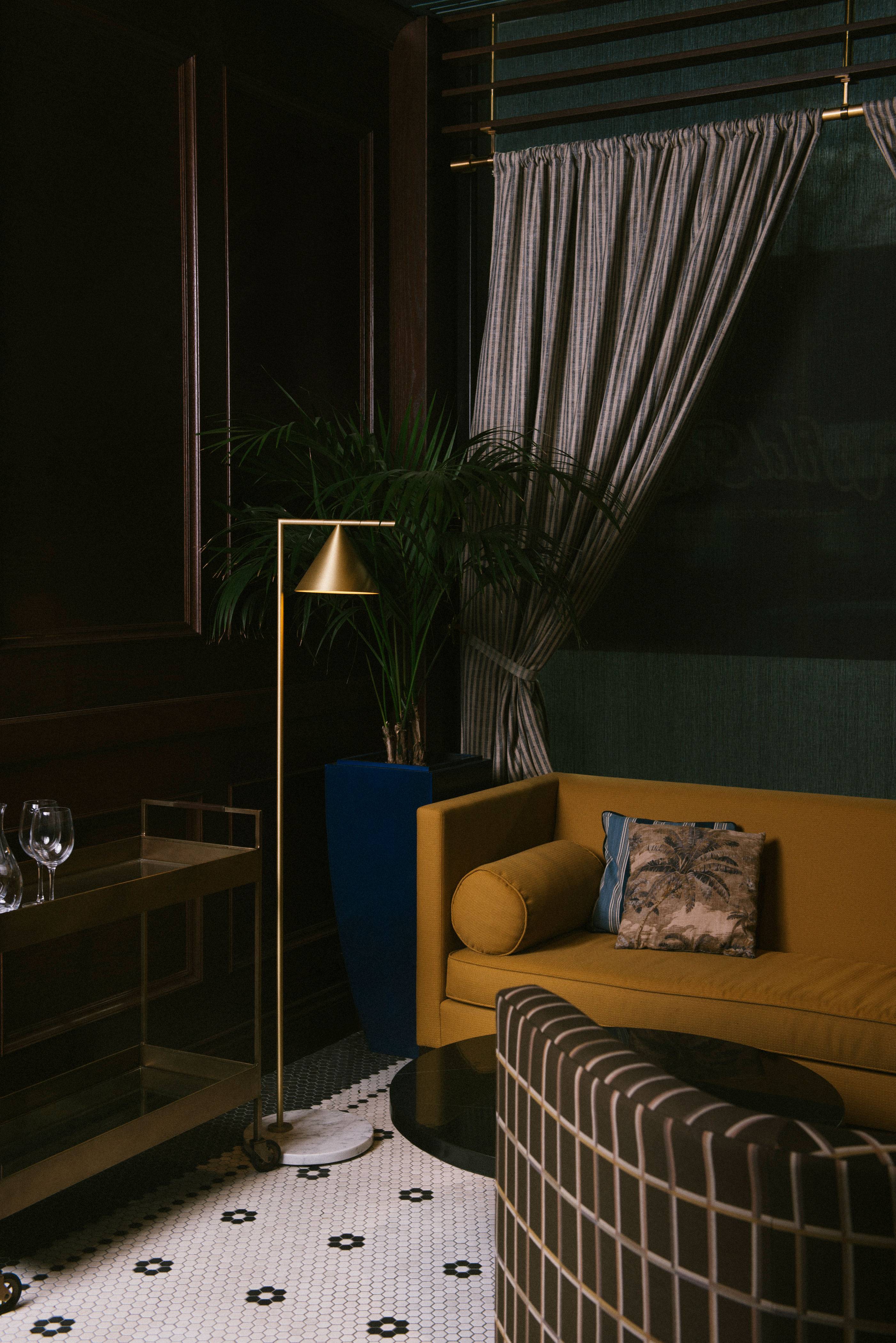
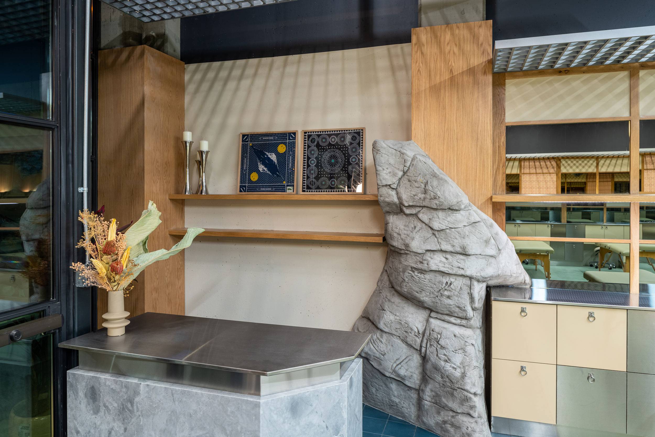
To create a distinct flow to the space from reception through the artist stations and into the back of the space, we again drew from Japanese influences to inform the execution of the interior elements and finishes. Drawing loosely from the idea of land, water and air, we created transitions from varying shades of blue concrete tiles (water), to a solid poured green stained concrete (land) and finally to the ceiling (sky) with warm globe pendants and an installation of greenery and florals to function as clouds. As a nod to California modernist design and Kyle’s family connection to architectural practice in the region, we installed a boulder as a grounding element to the entrance area to further reinforce the idea of water and land meeting sky. The back of the space, housing a private artist studio, washroom and BOH areas, finally transitions to dark and moody materials and colours to denote the intimacy and privacy of these functions.
-
LOCATION—
- Arts District, Los Angeles
-
YEAR—
- 2021
-
SQFT—
- 1600
-
PHOTOGRAPHER—
- Hunter Kerhart
-
CONTRACTOR—
- Barling Construction
-
BRAND + IDENTITY—
- Round Two Agency
-
FLORALS—
- Birch + Bone
