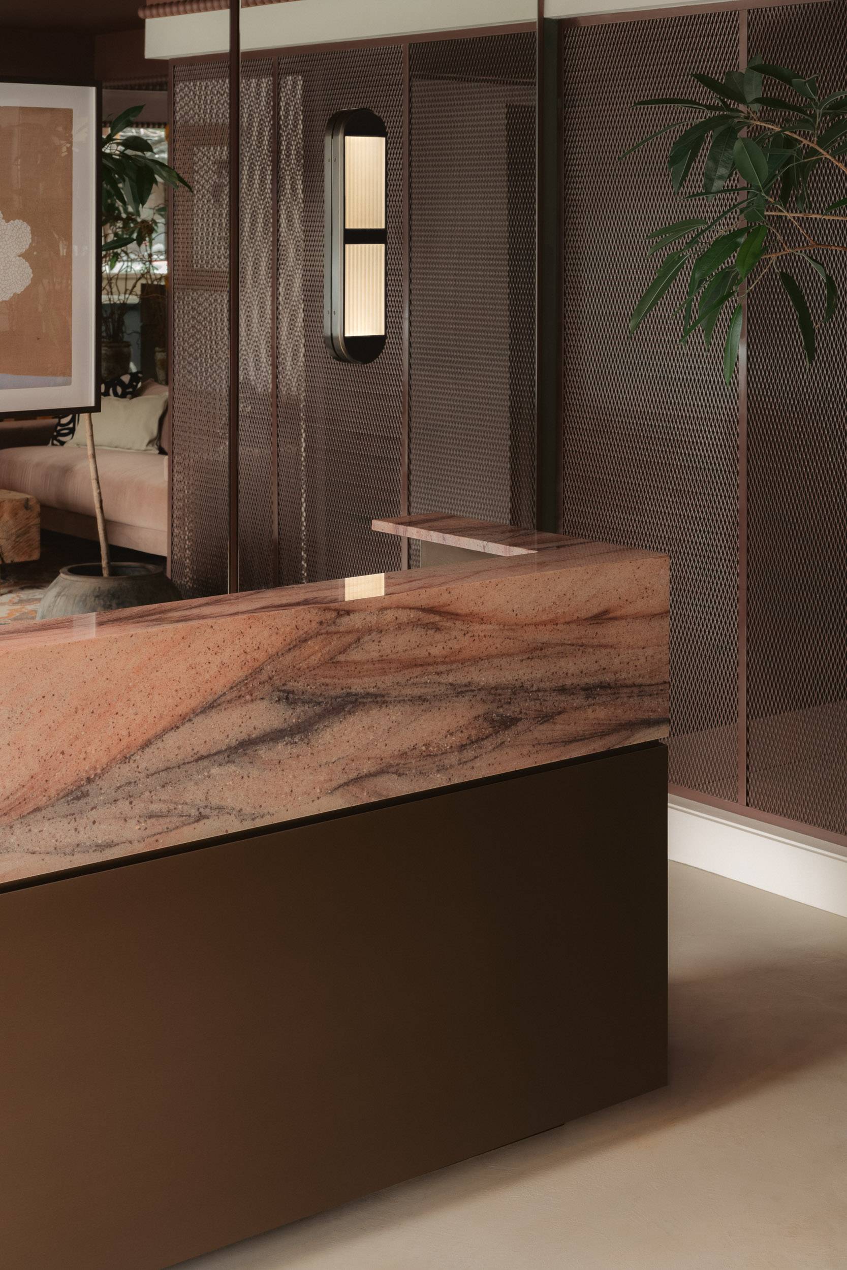
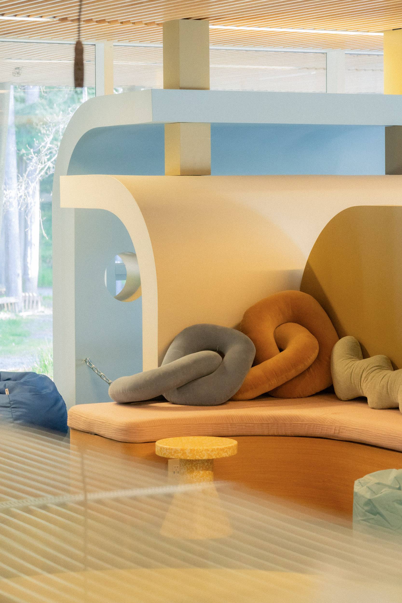
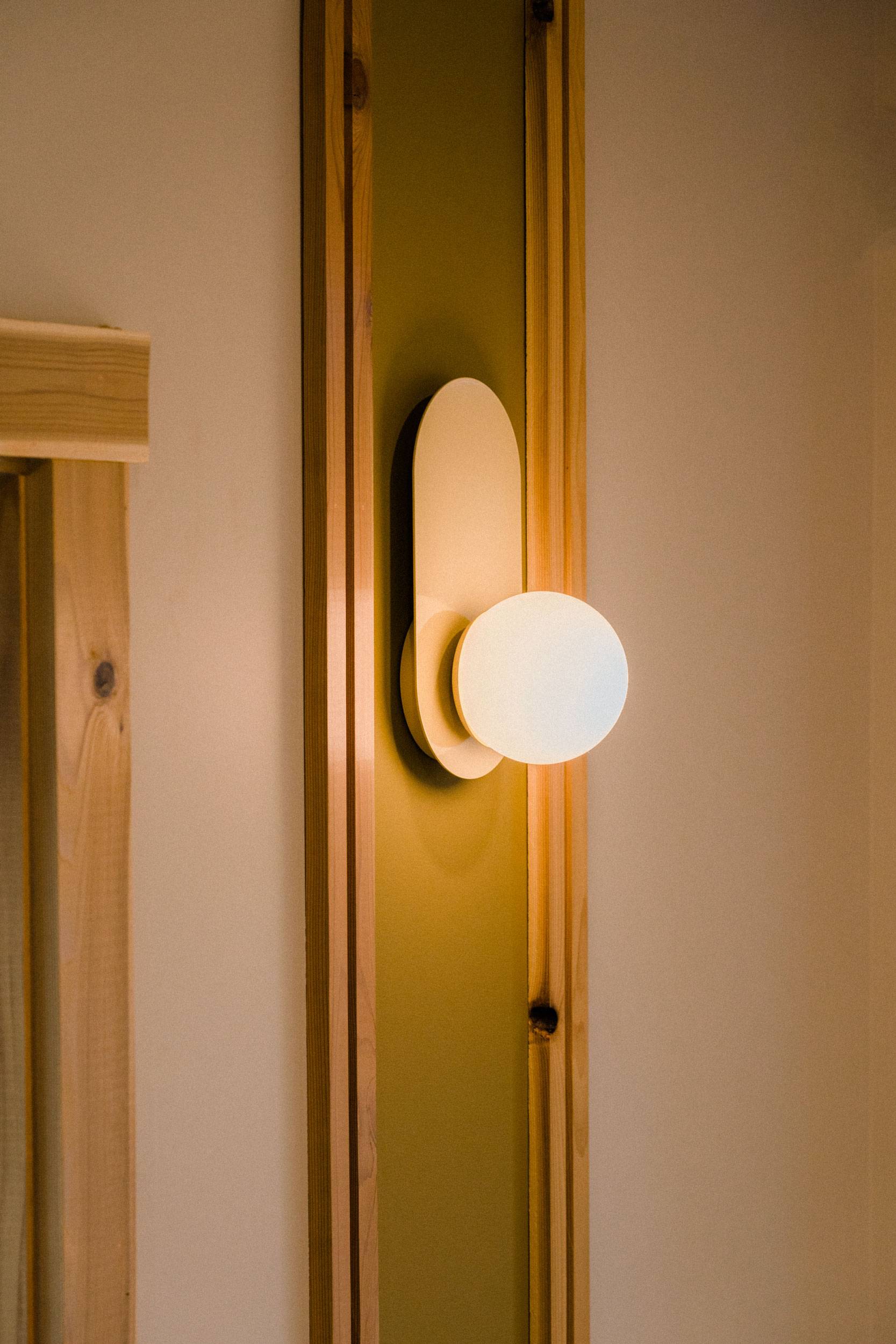
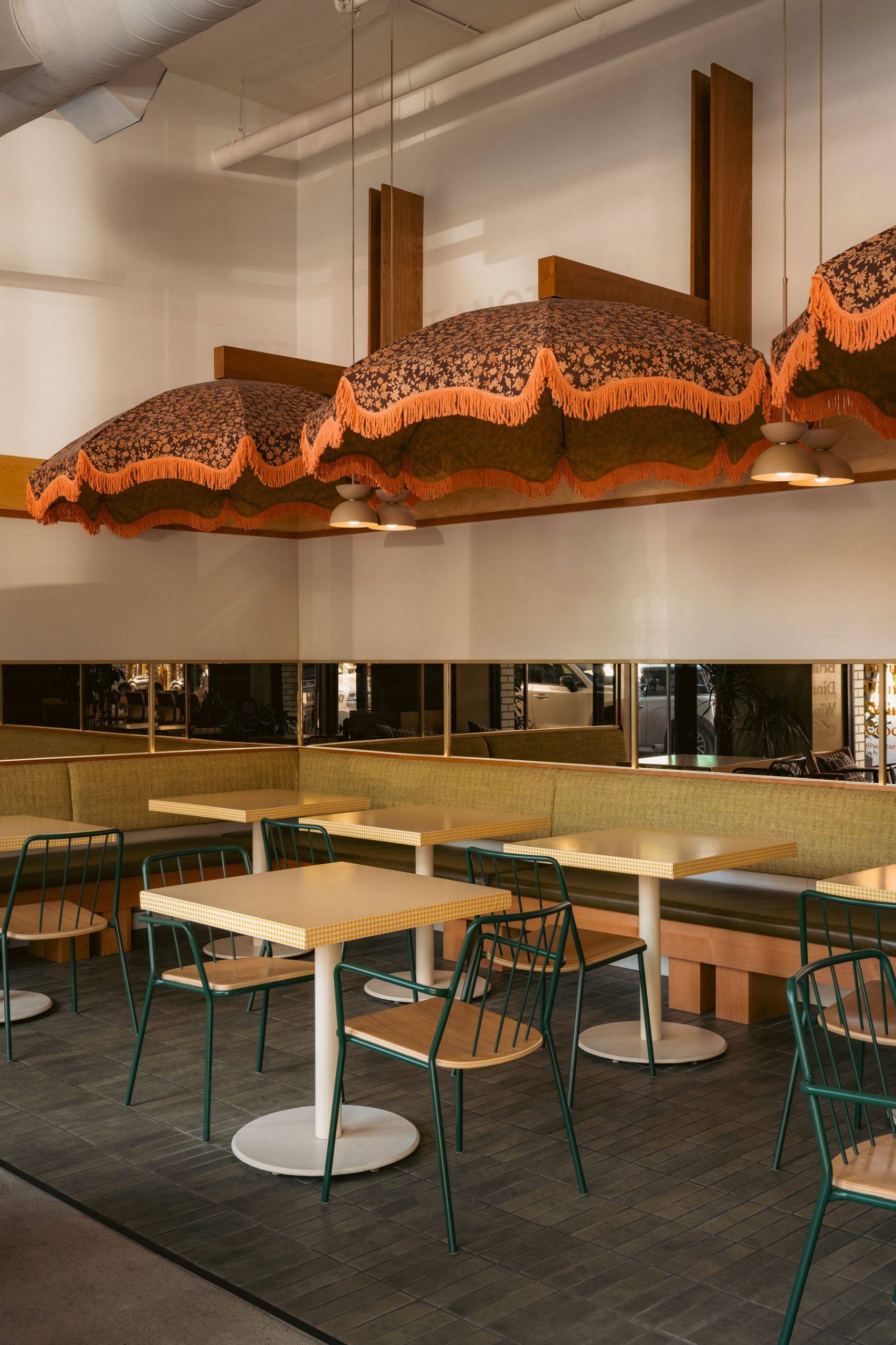
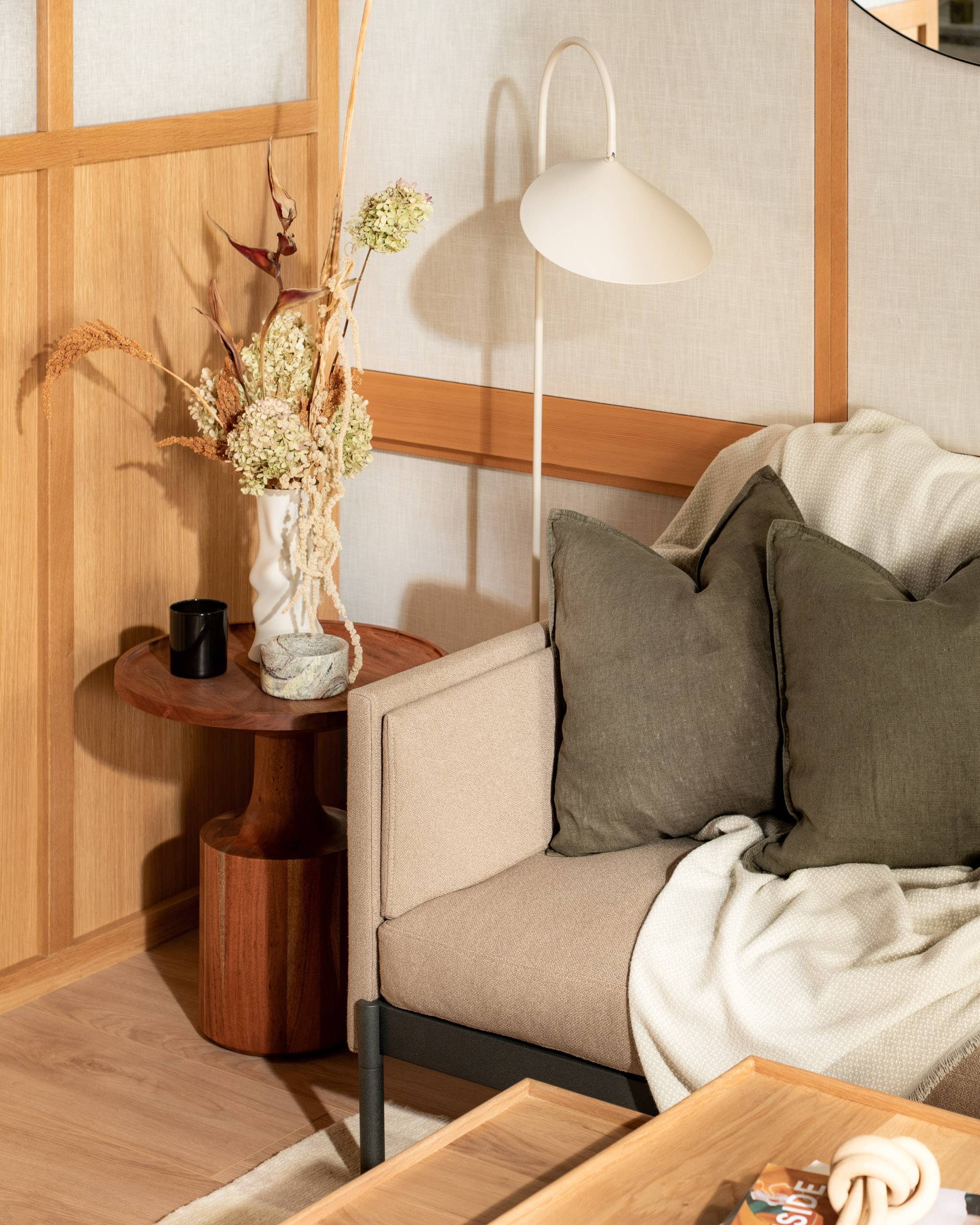
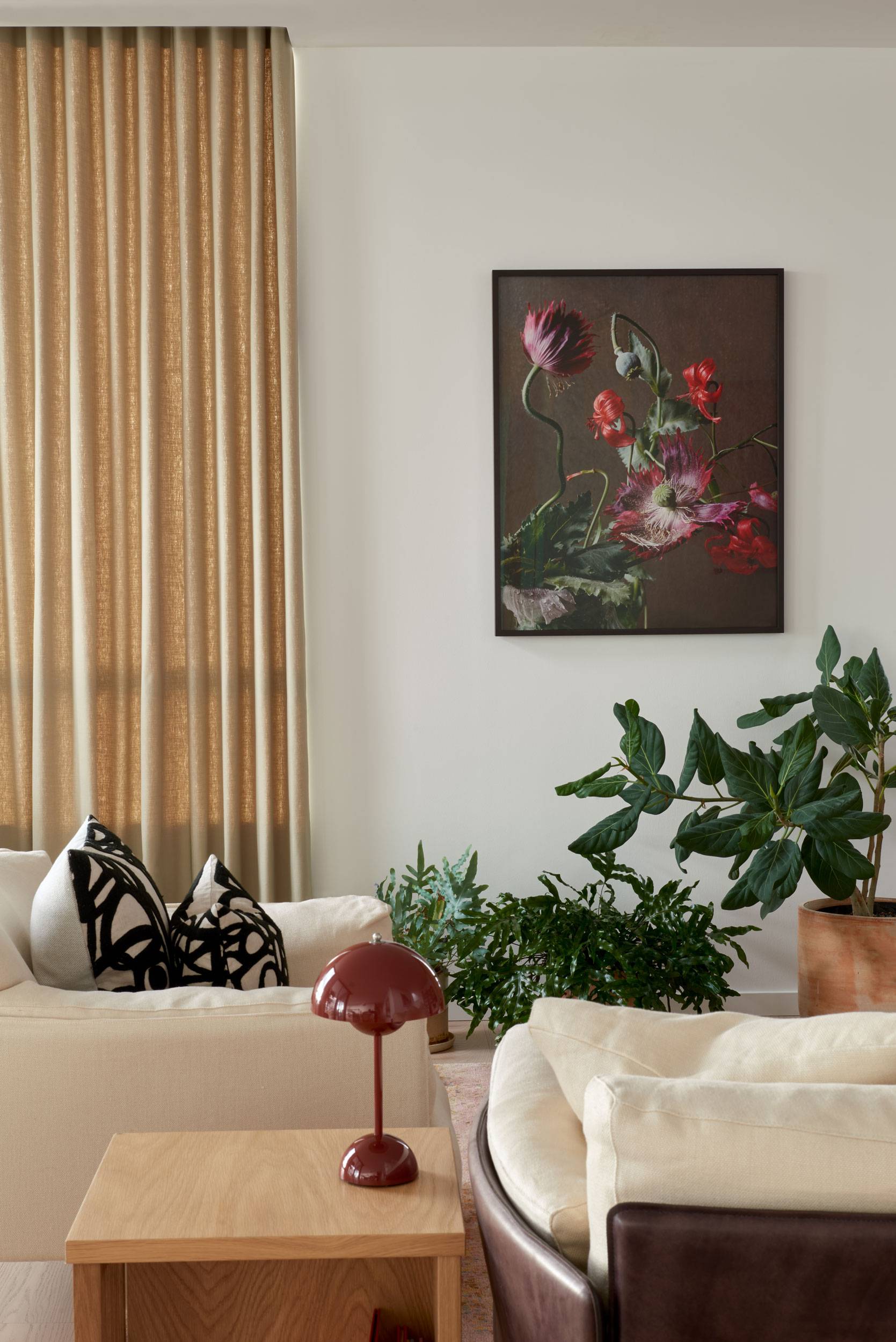
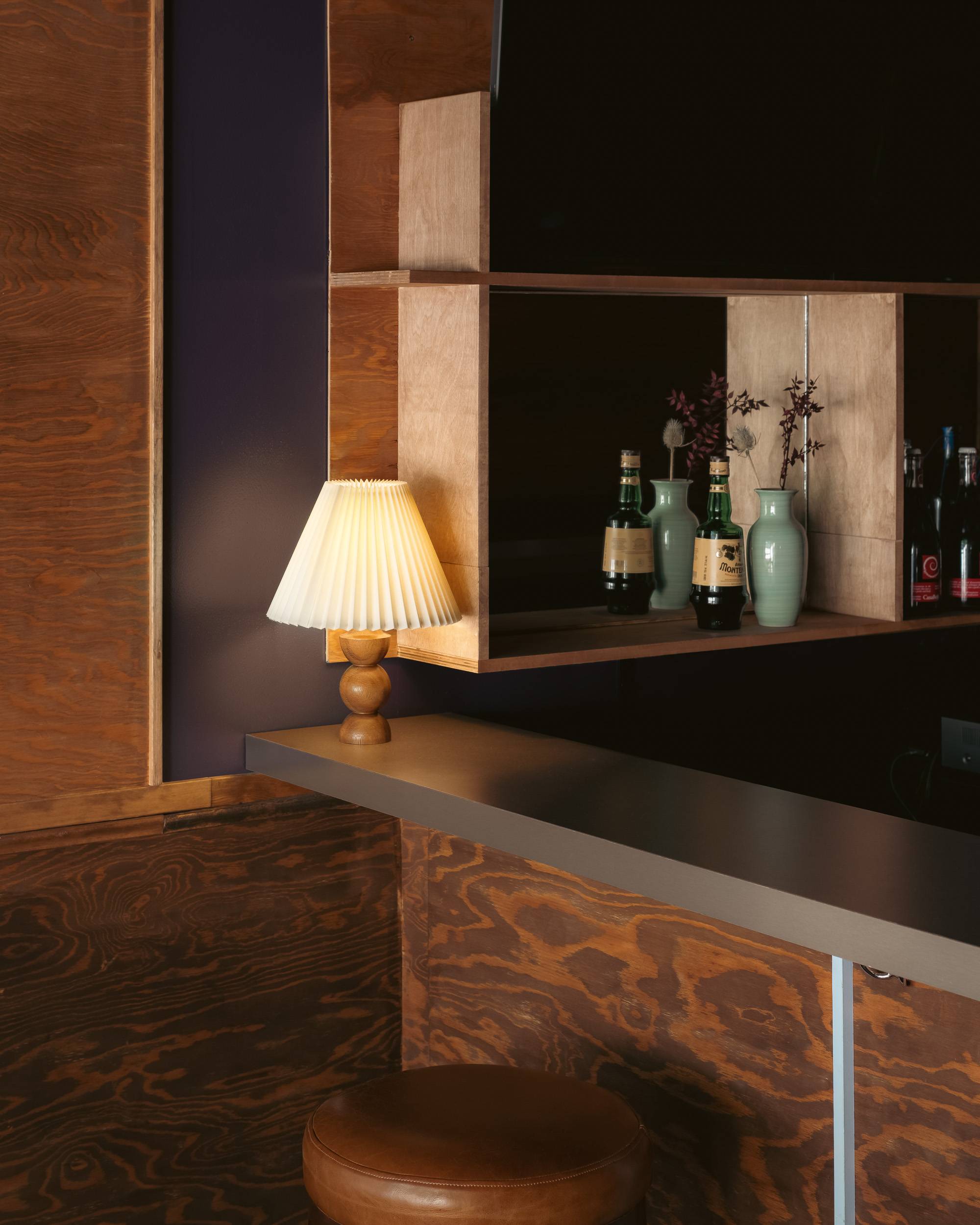
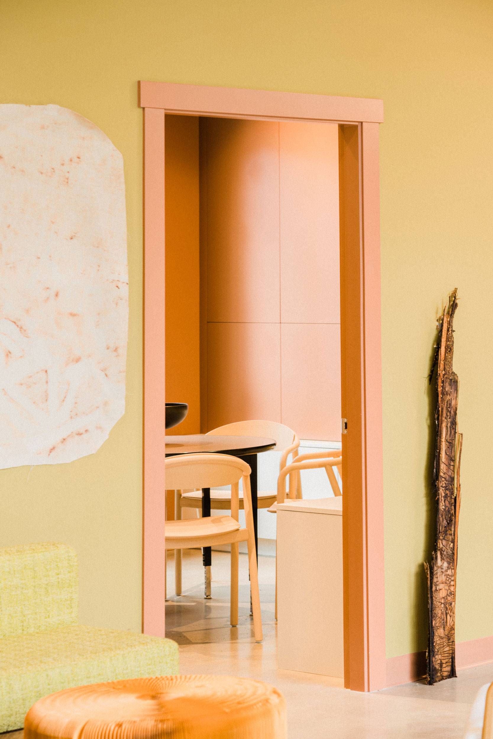
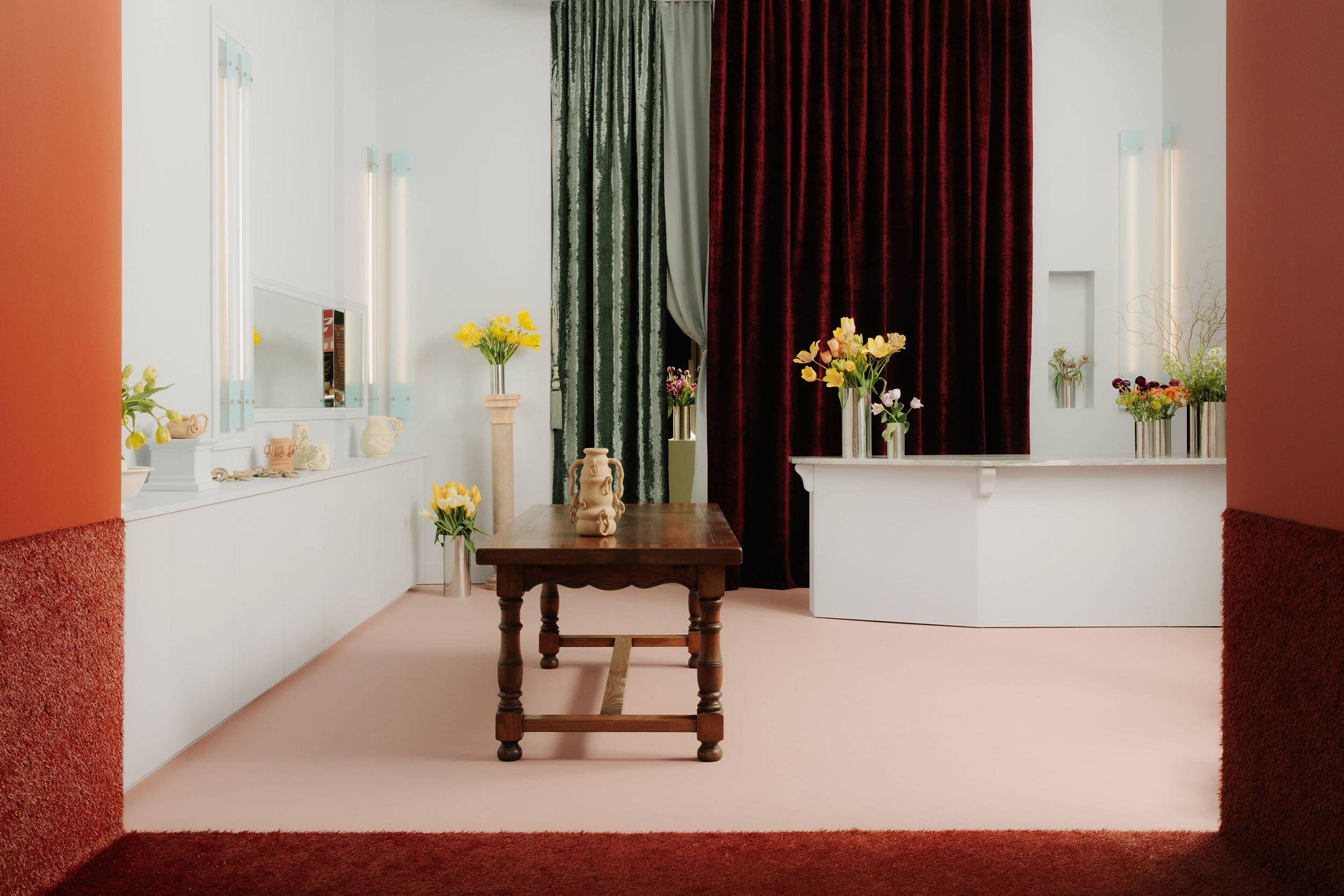
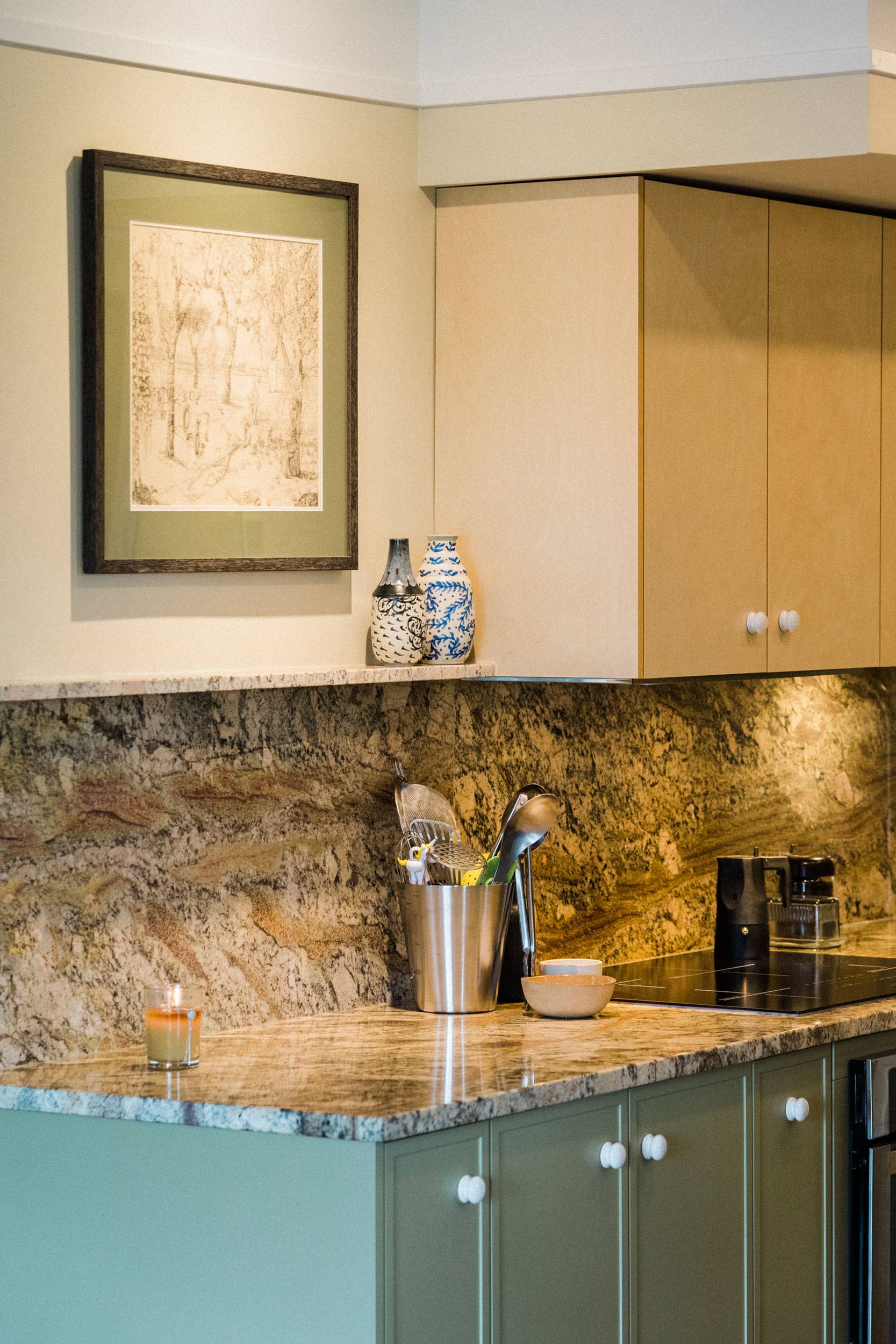
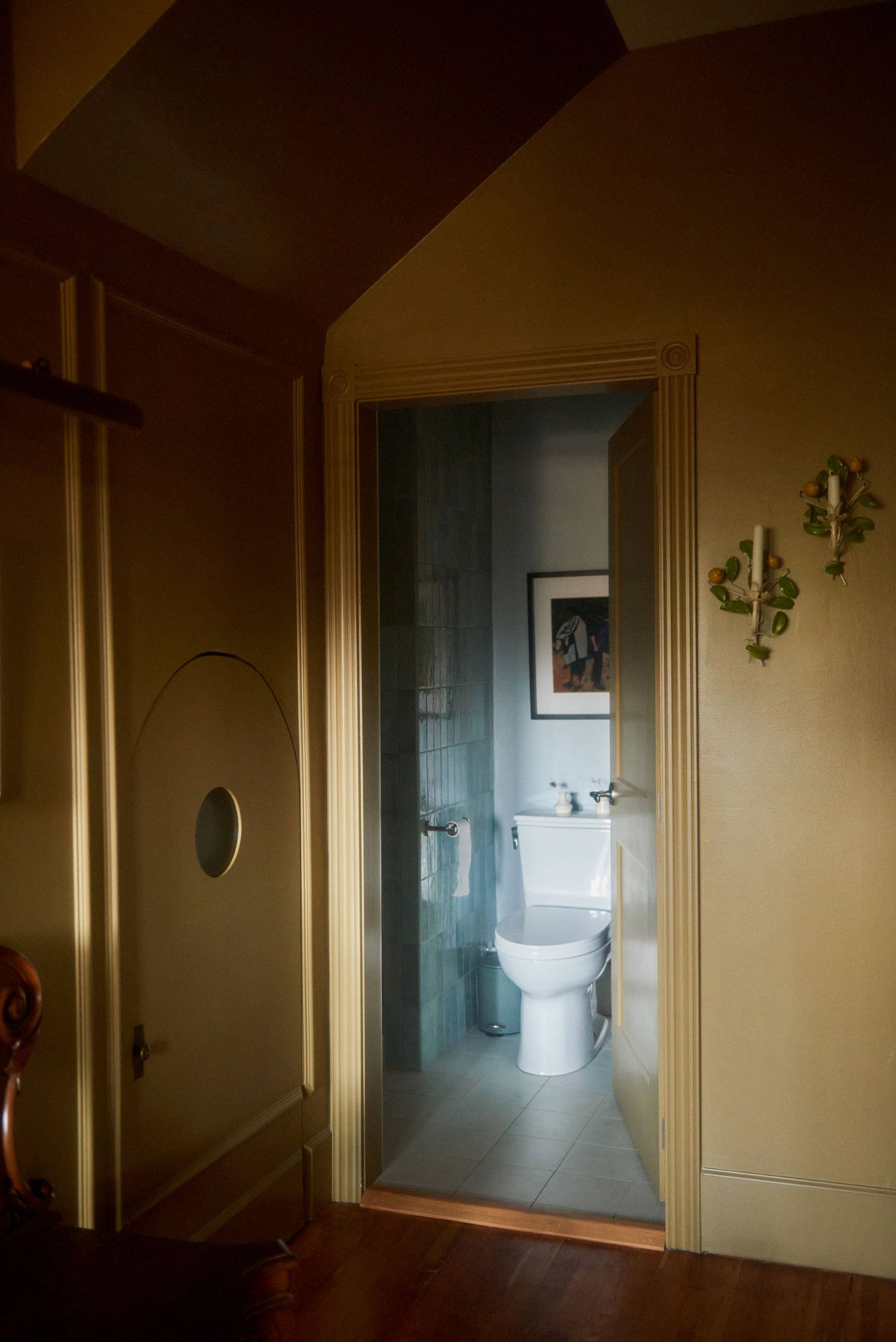
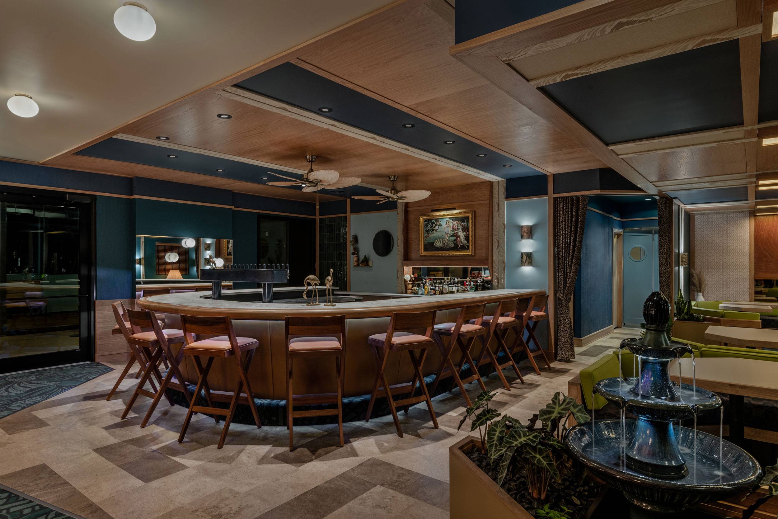
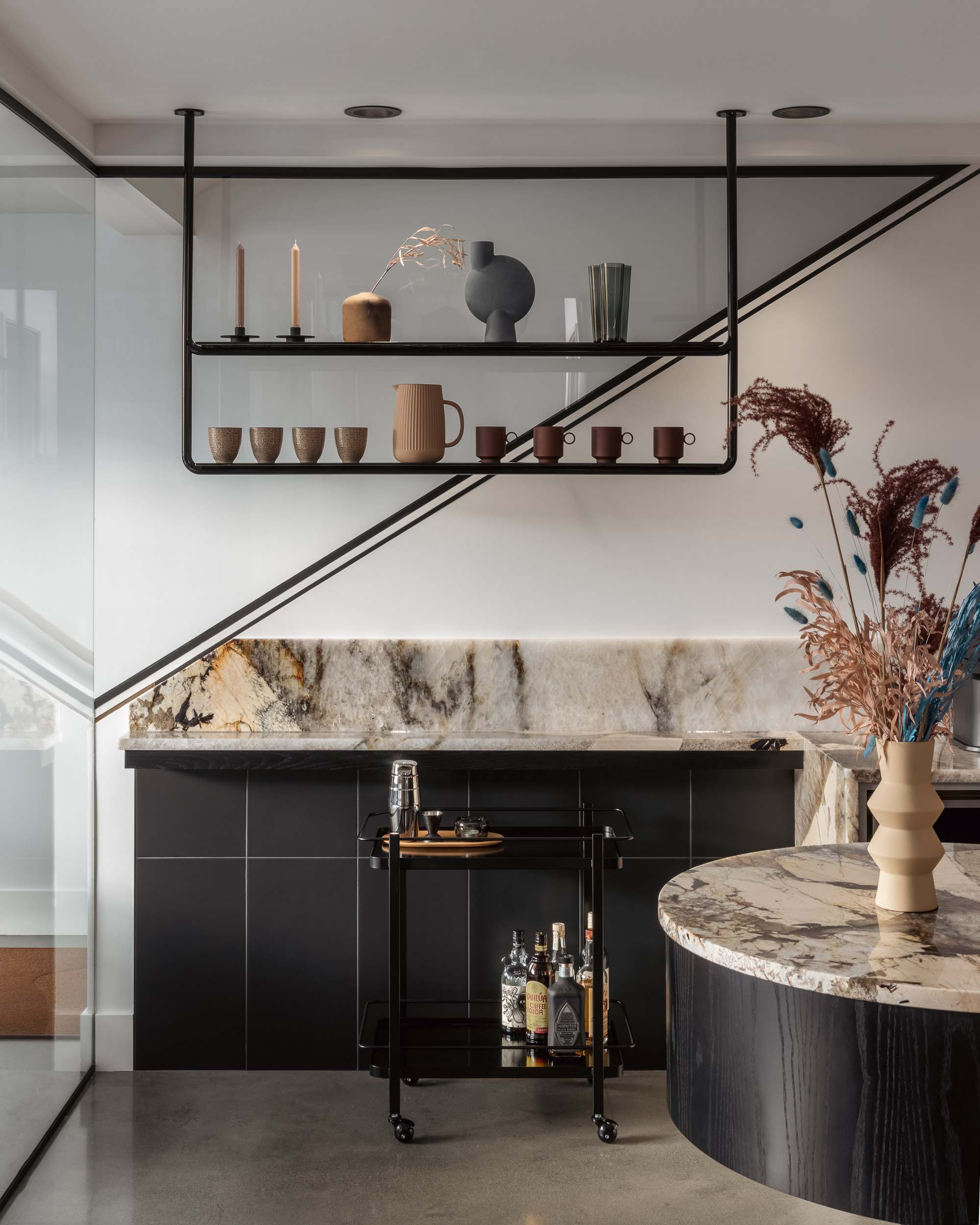
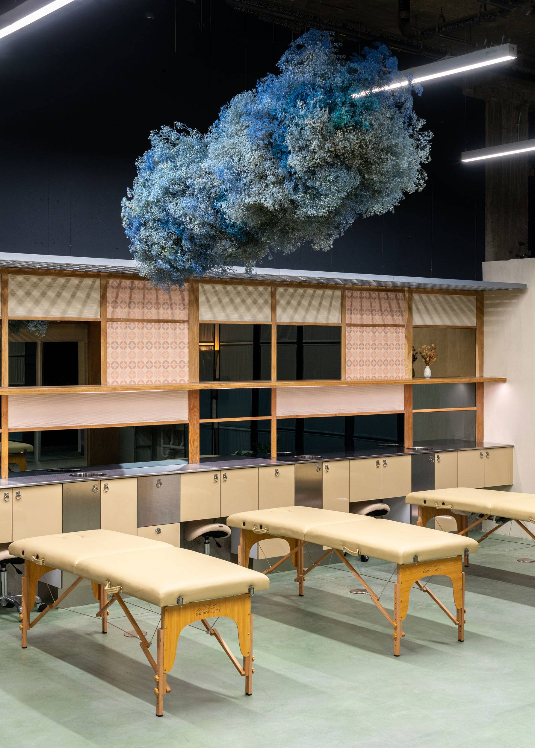
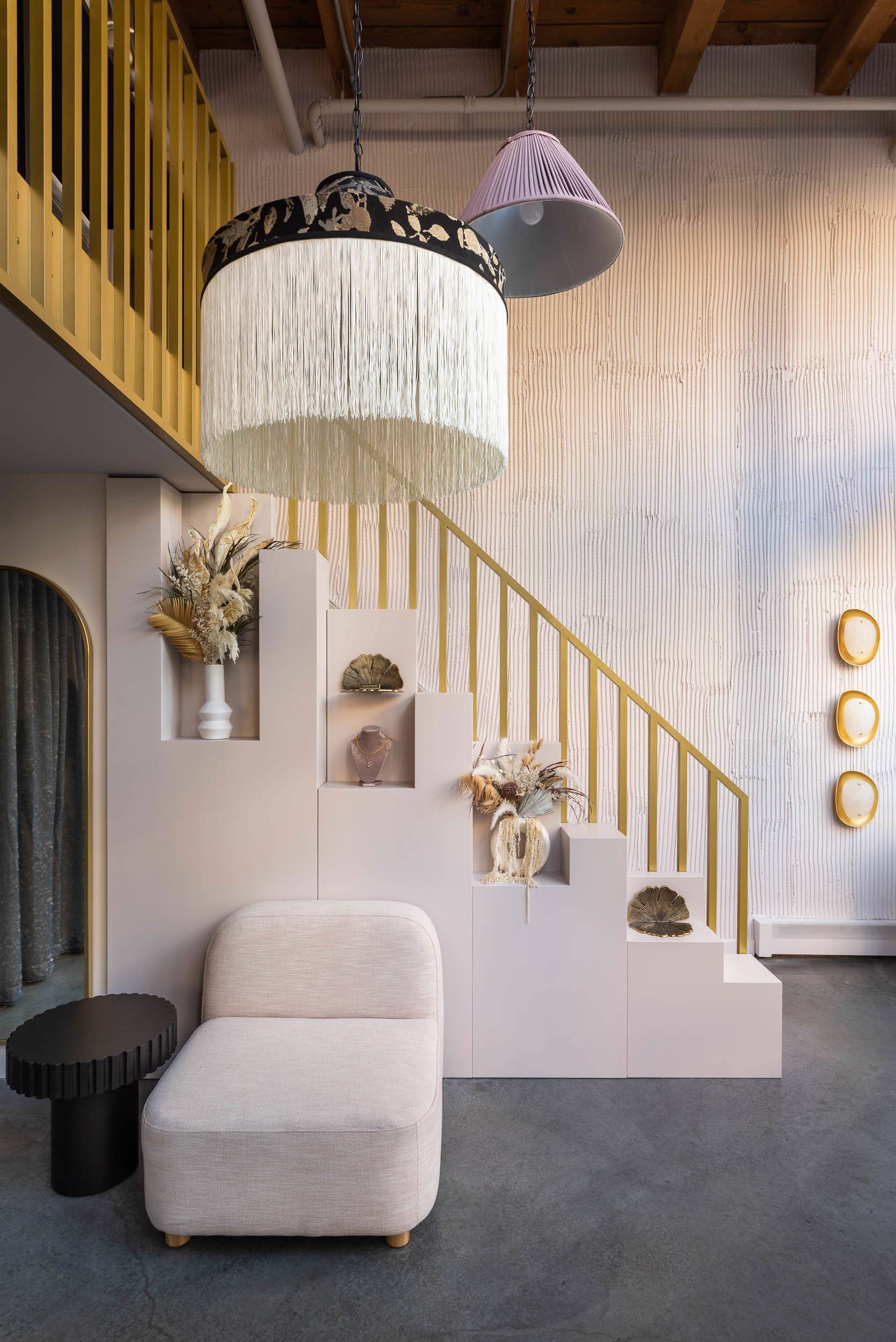
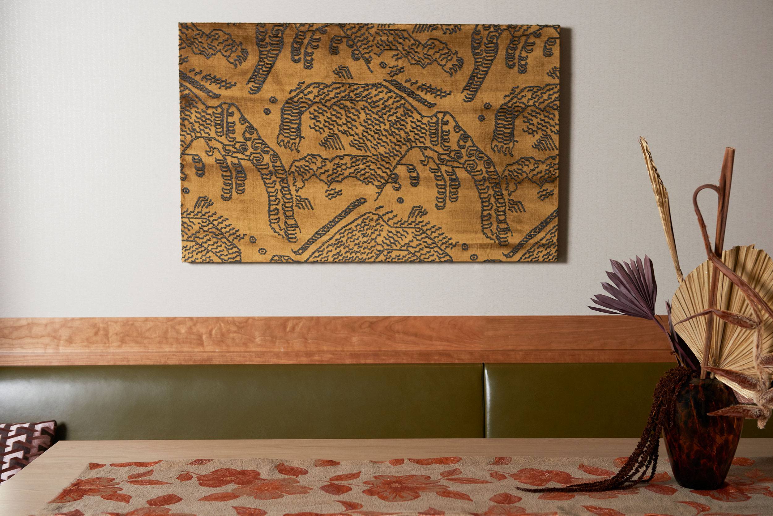
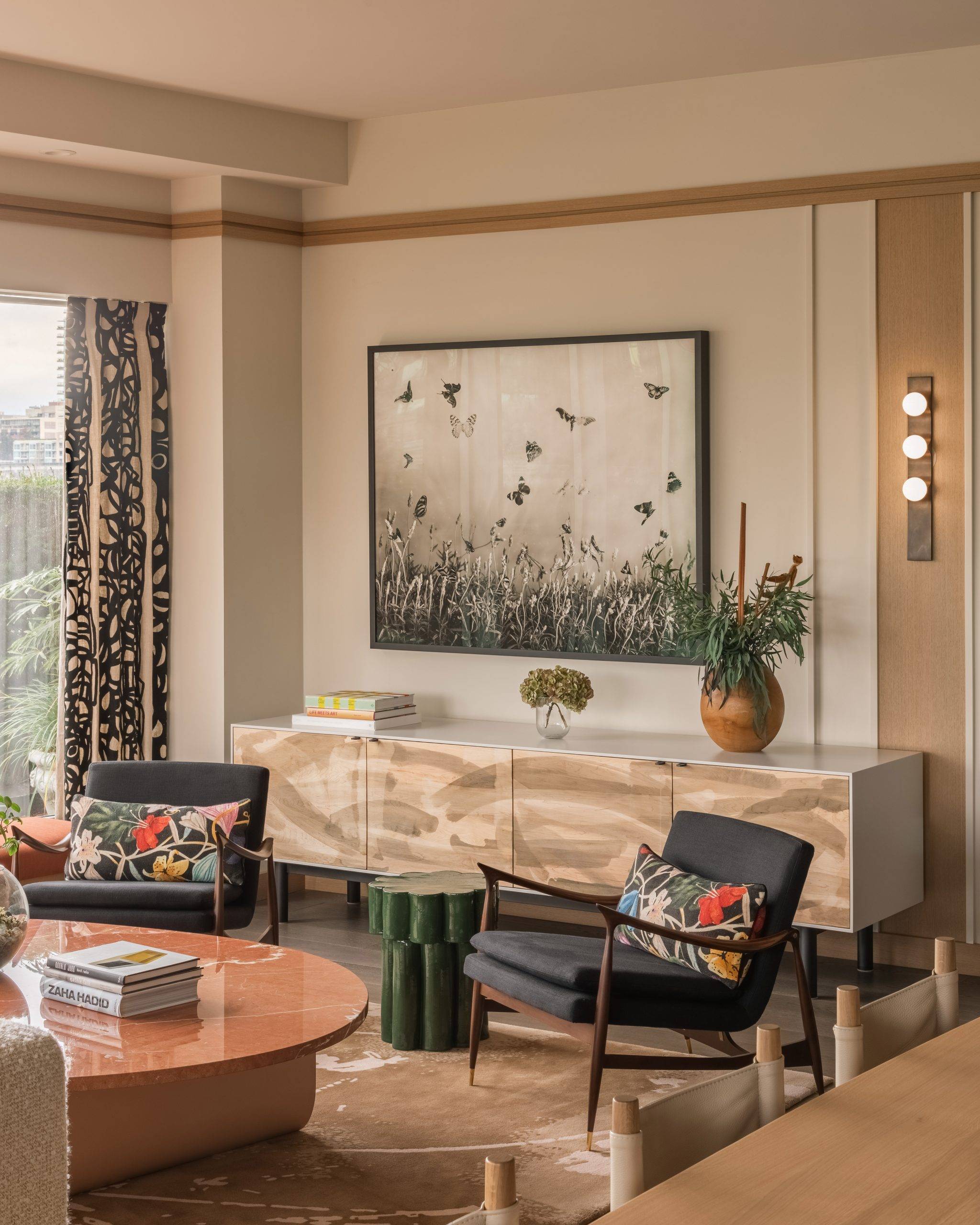
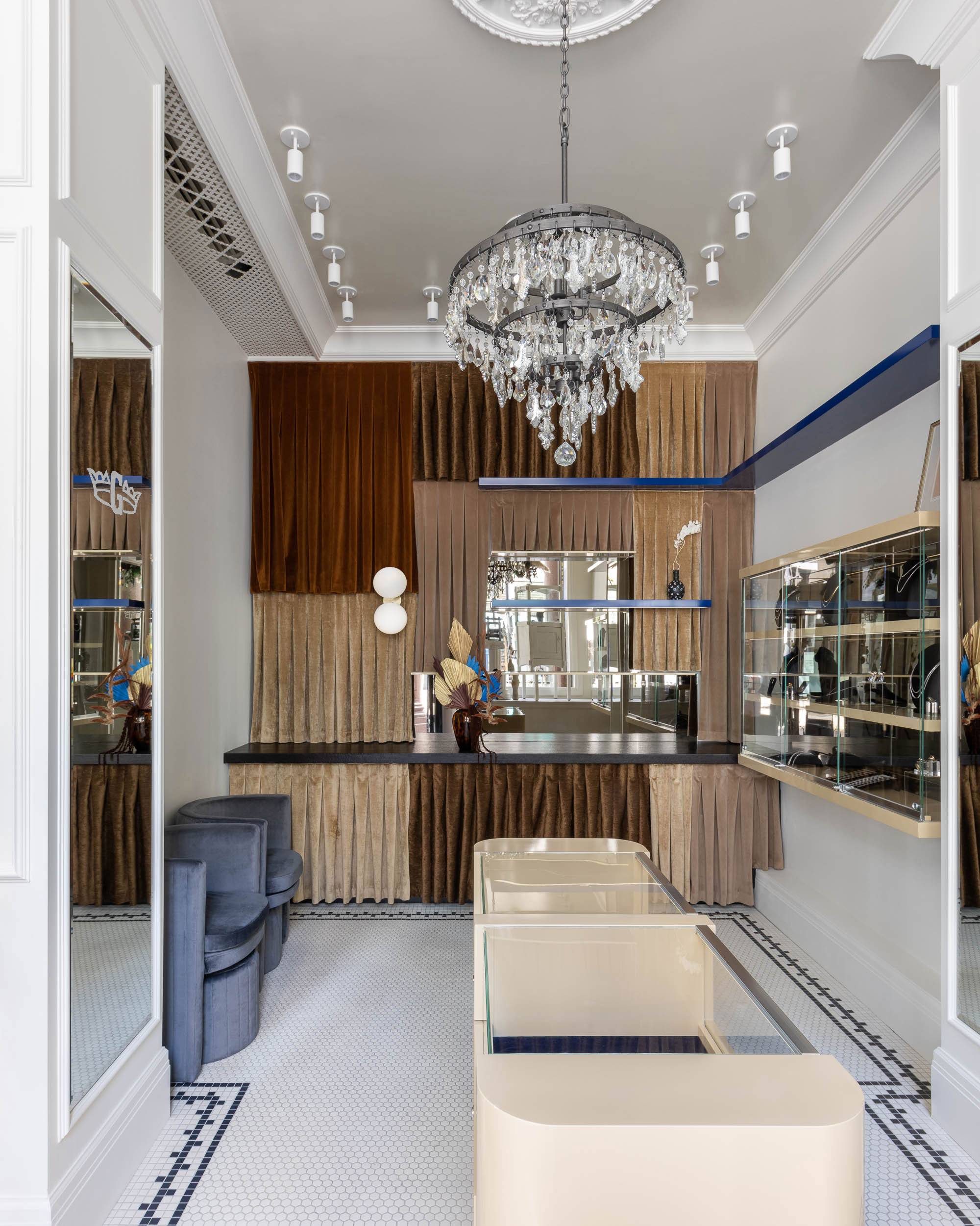
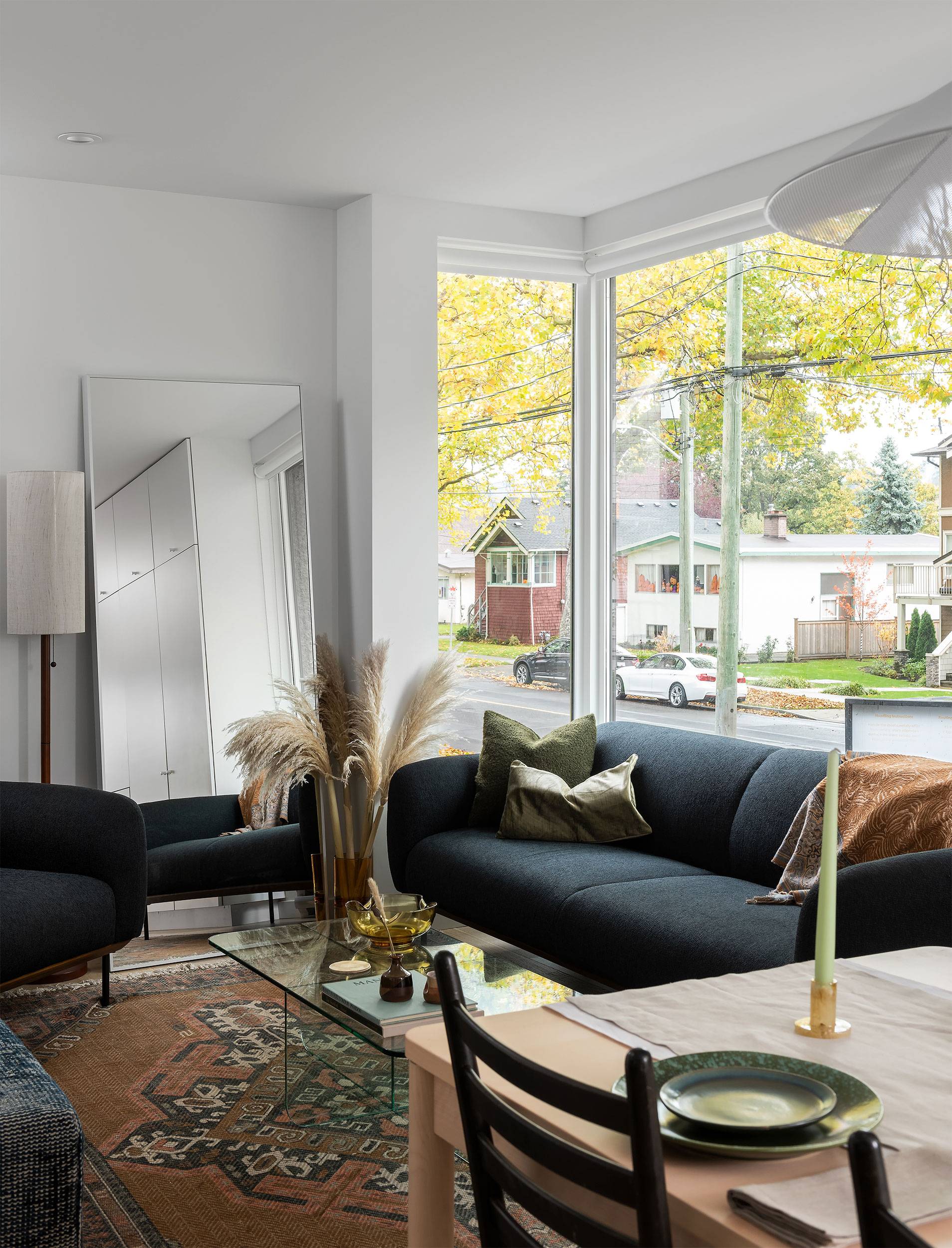
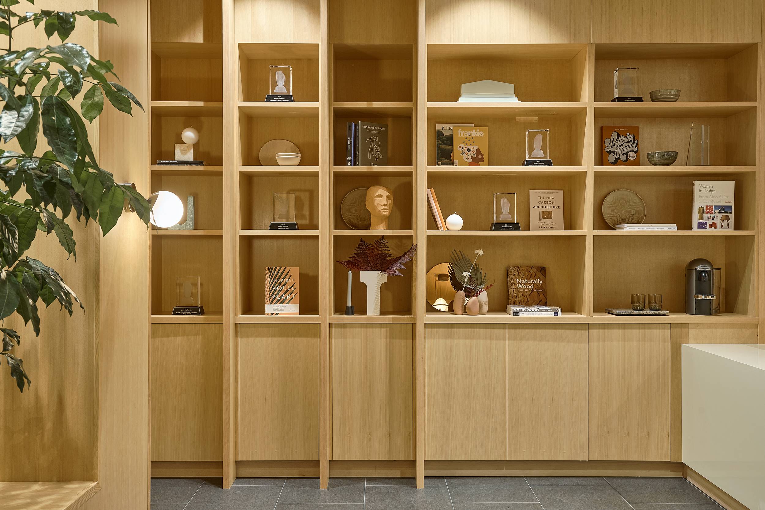
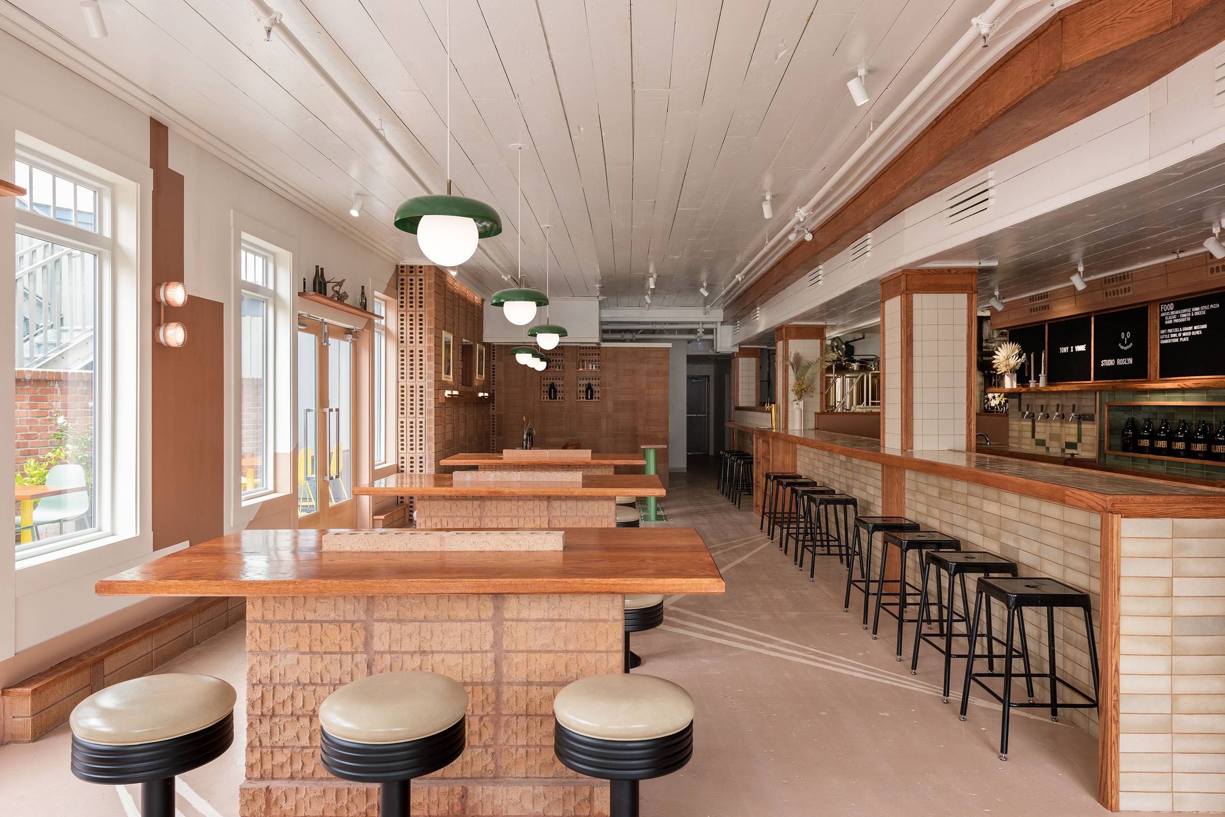
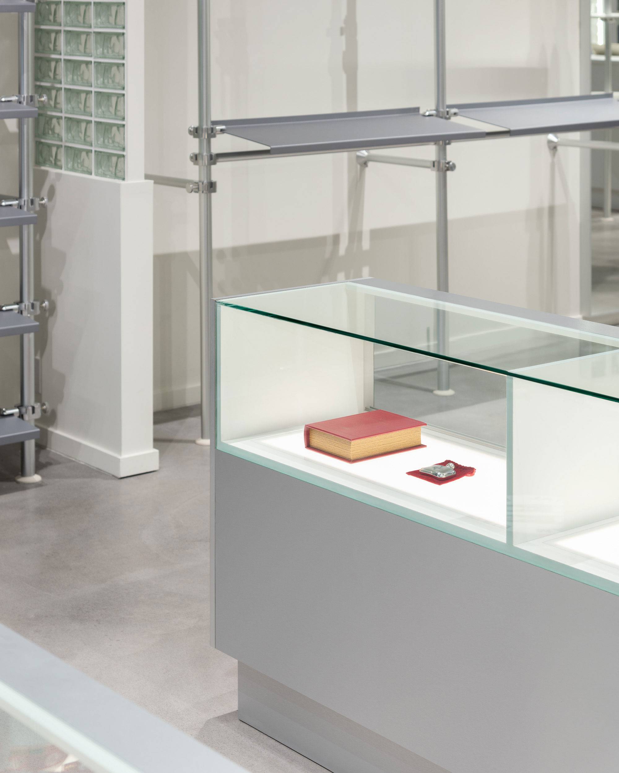
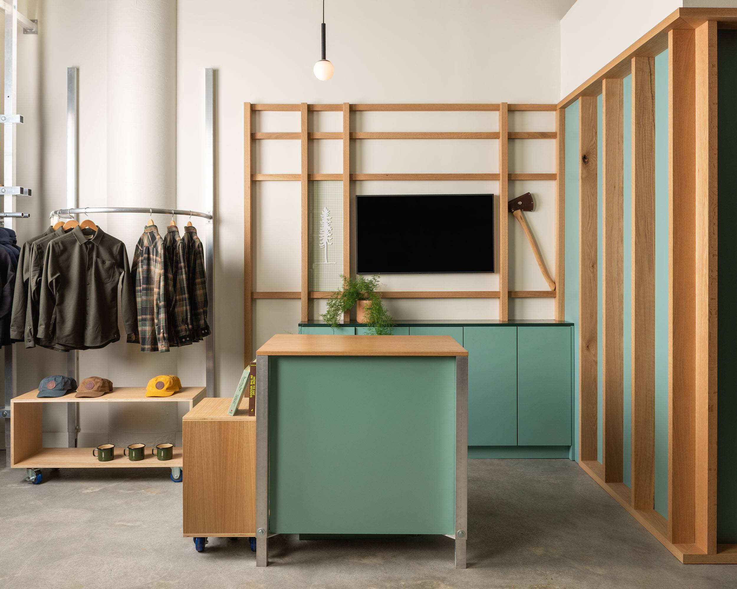
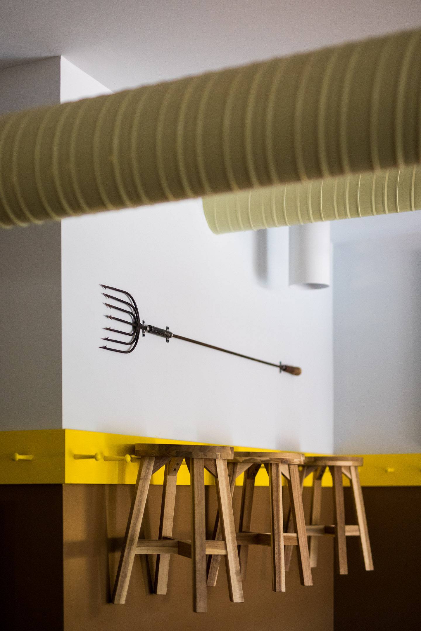
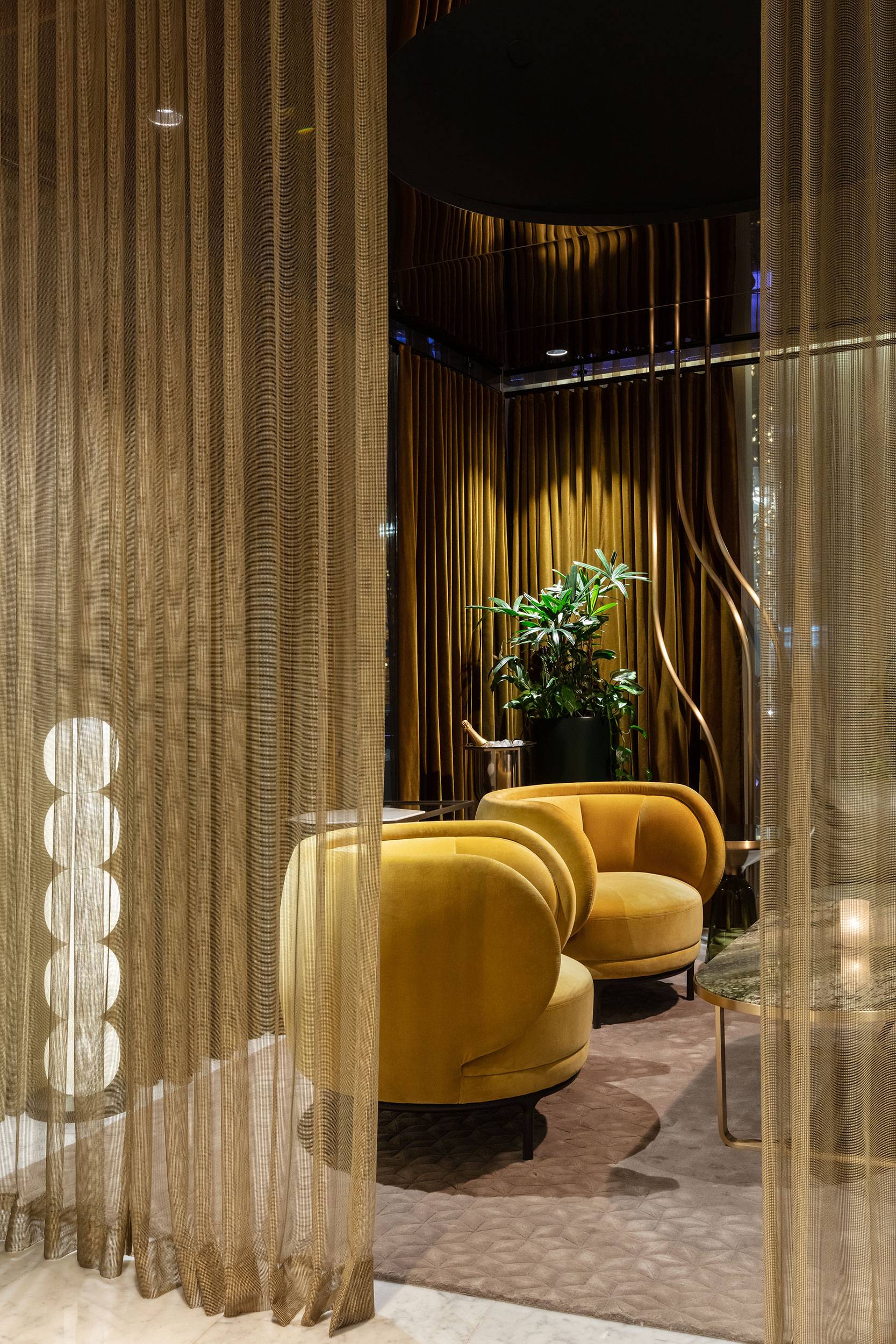
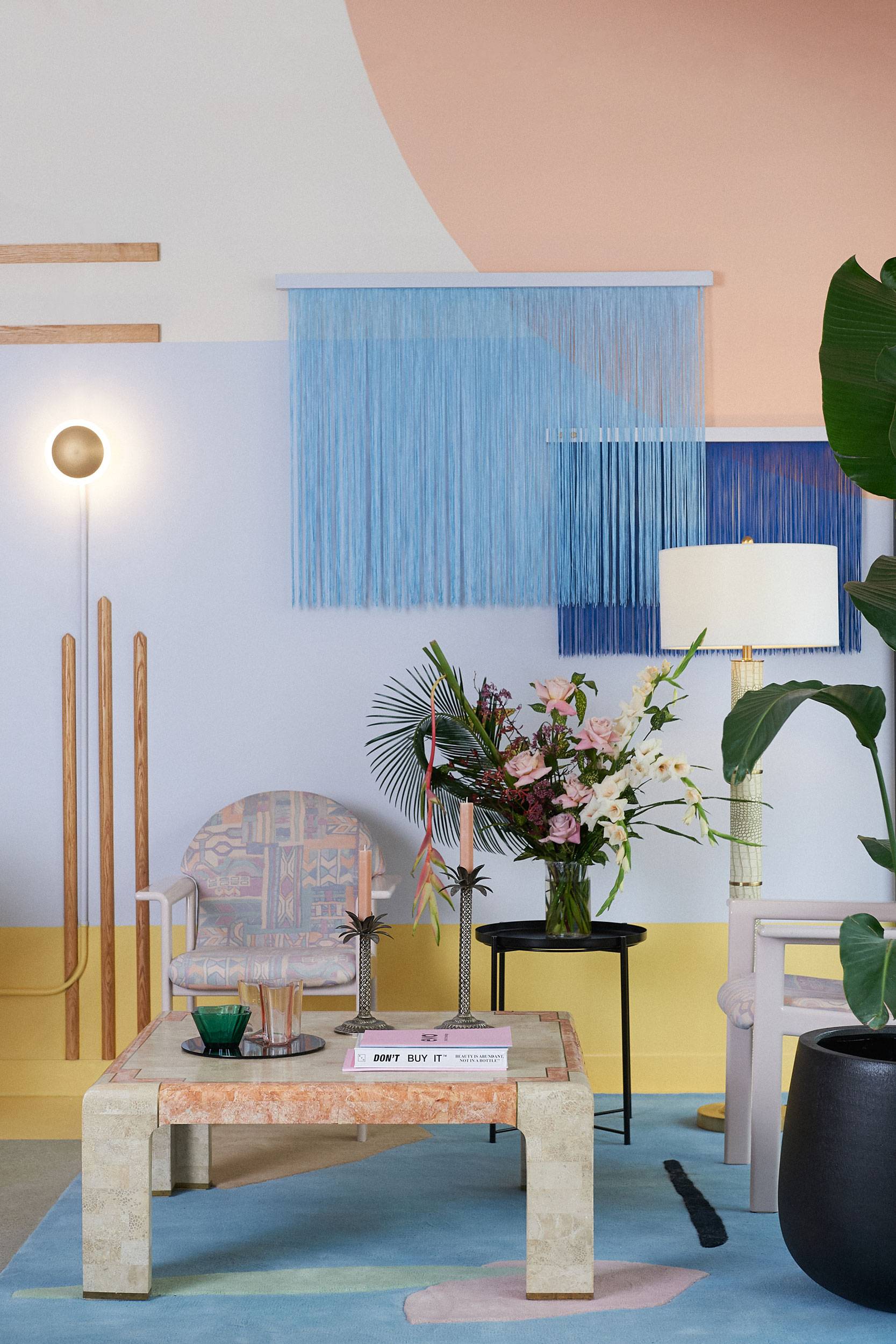
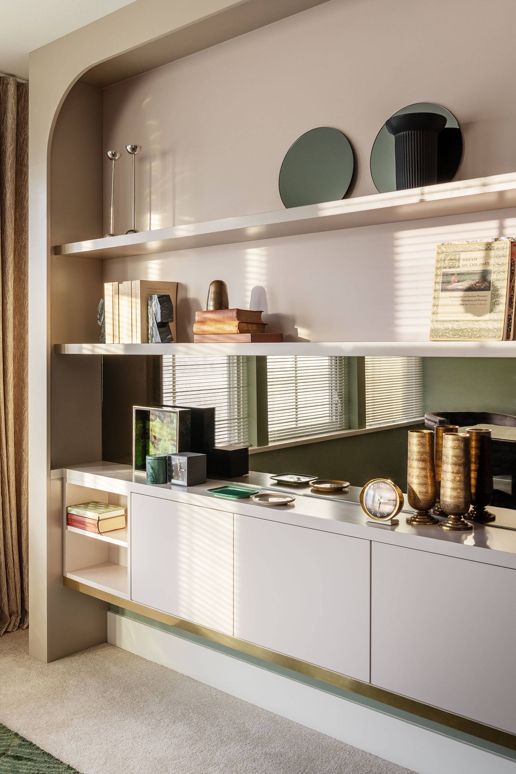
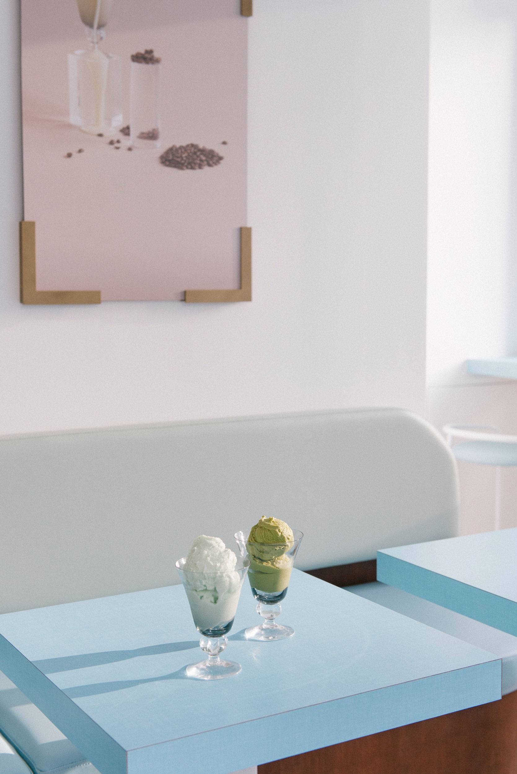
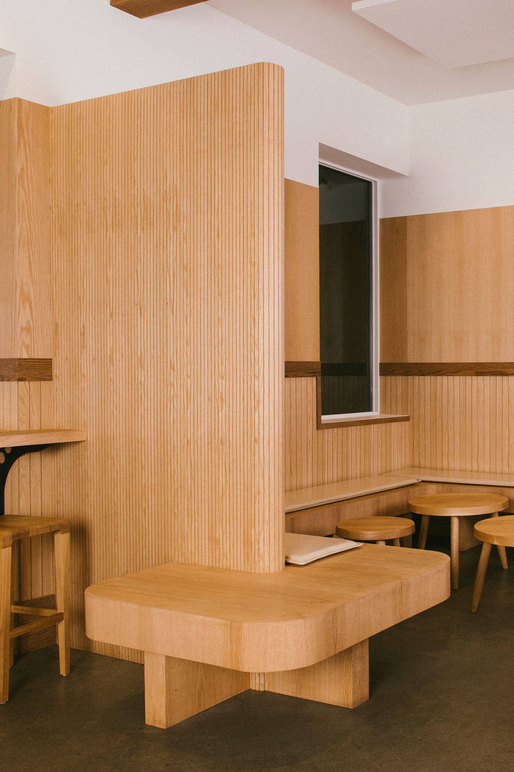
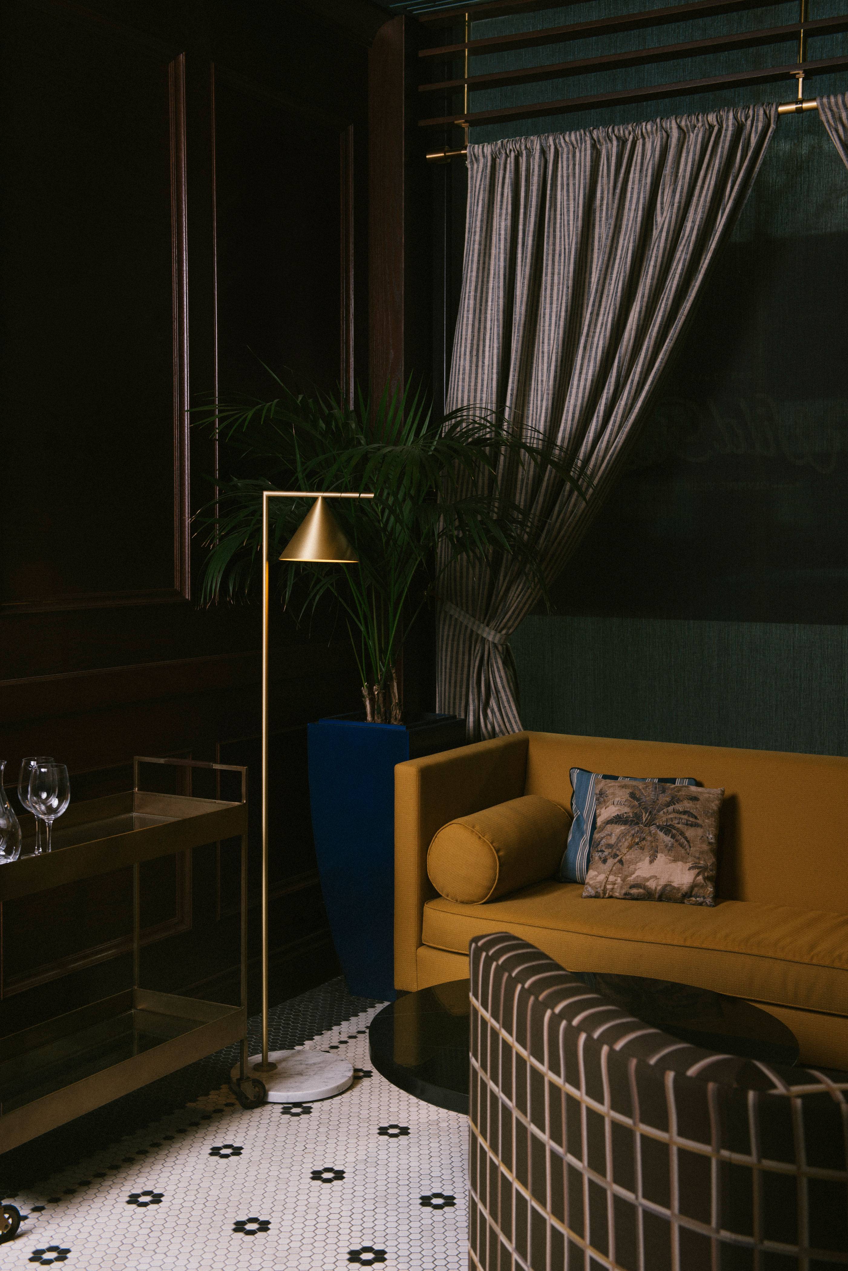
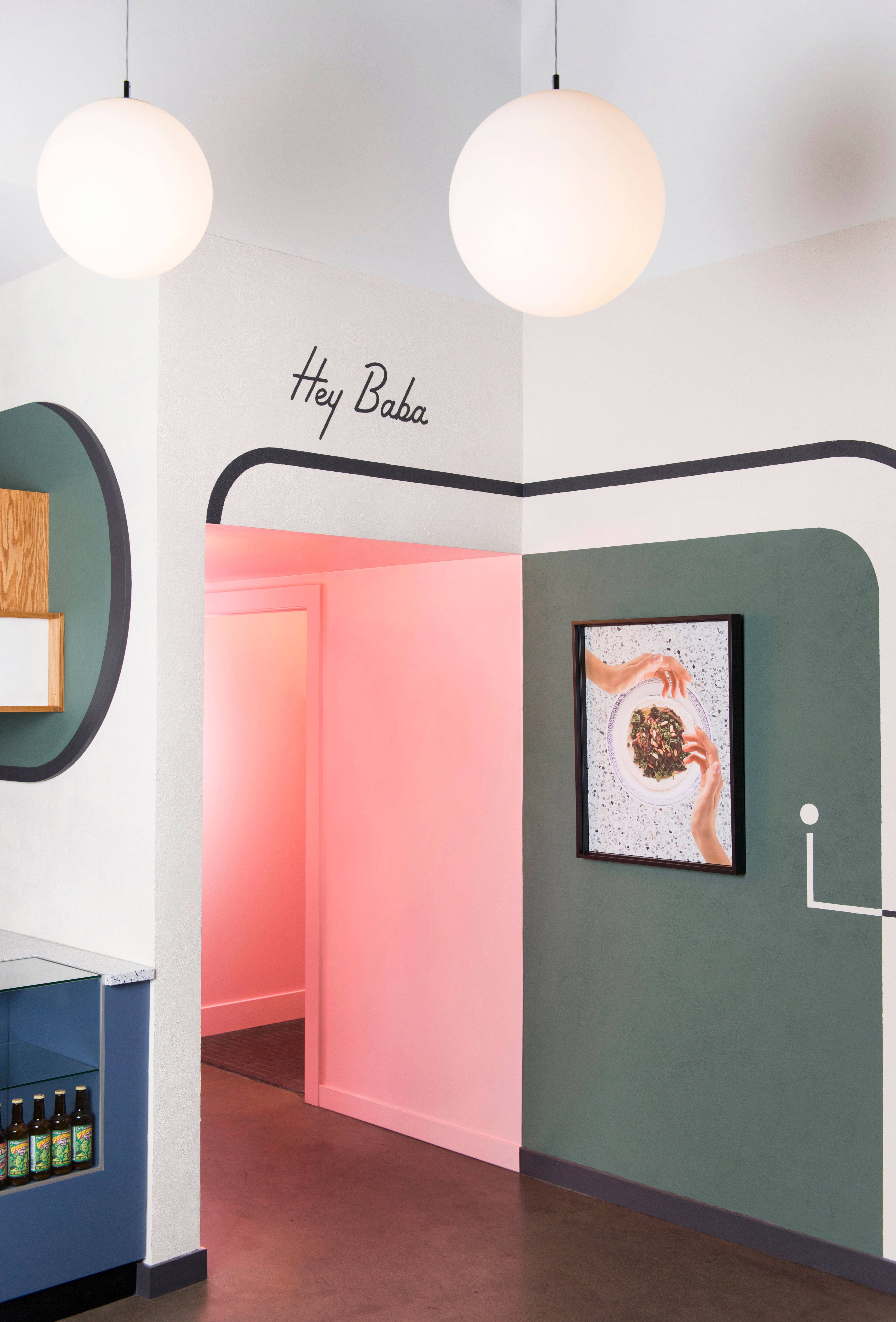
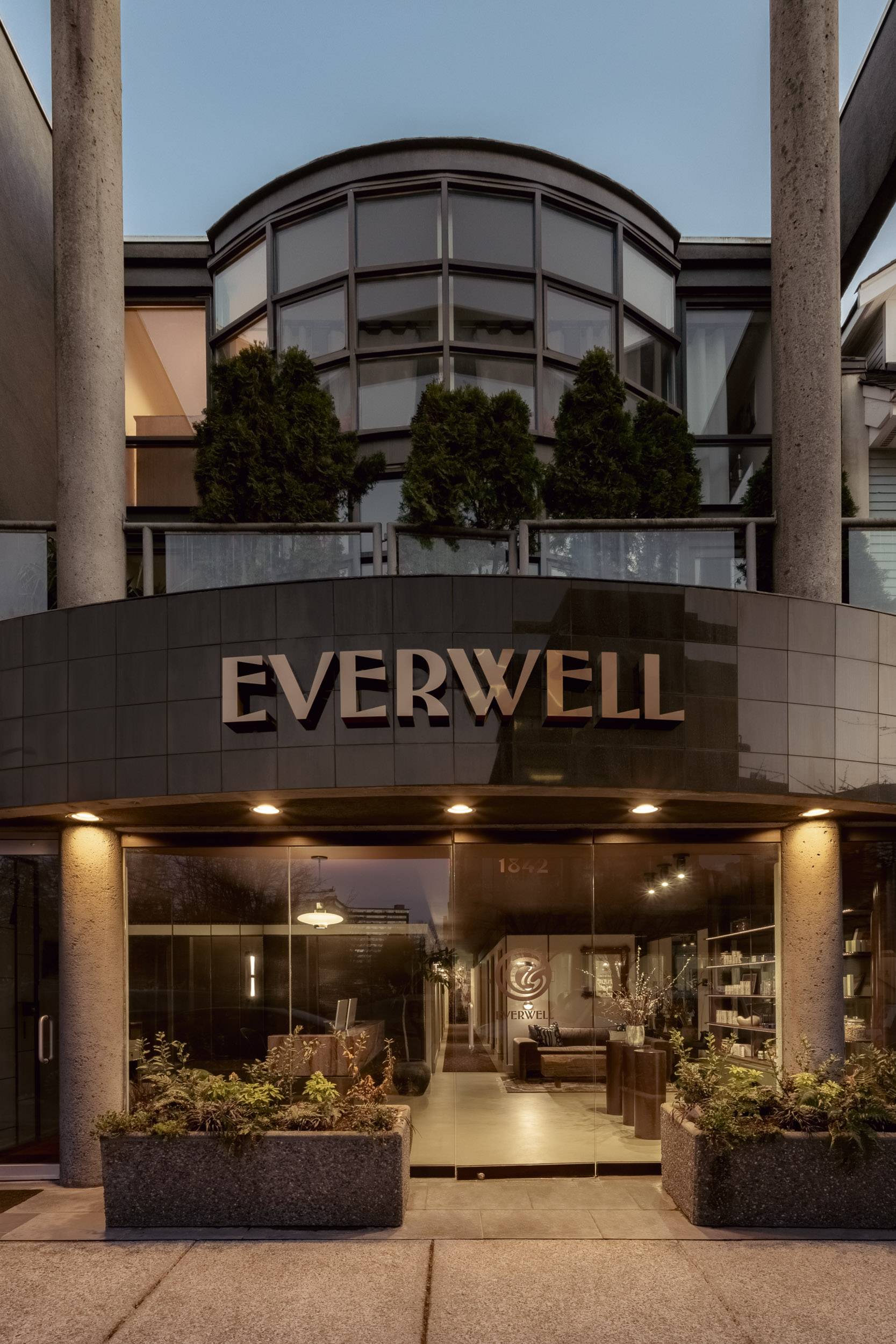
Everwell represents a new beginning for our client, who has provided wellness services to Vancouver’s Point Grey community for over a decade. With a clear vision for her growing business, we were engaged to design both a physical space and a visual identity for Everwell. We developed the brand in conjunction with the interior design of the clinic to create a cohesive and immersive wellness experience for visitors. Working collaboratively with the client in creative sessions, we coined the name ‘Everwell’, and established brand qualities of confidence, security, beauty, inclusivity, serenity, a connection to nature, and a touch of magic.
Because the treatments offered at Everwell are a blend of traditional practices (naturopathy and Chinese medicine) and new medical technology, we felt the brand should embody this meeting of ancient rituals and modern science. We found inspiration in the work of The Wiener Werkstätte (1902-1932), a group of artists and craftspeople in Vienna who were adjacent to the Arts & Crafts and Art Nouveau movements but regarded as pioneers of modern design (and who influenced the Art Deco period that followed). These artists turned away from historic European styles and created a bold avant-garde aesthetic based on non-Western and folk sources, as well as direct inspiration from nature.
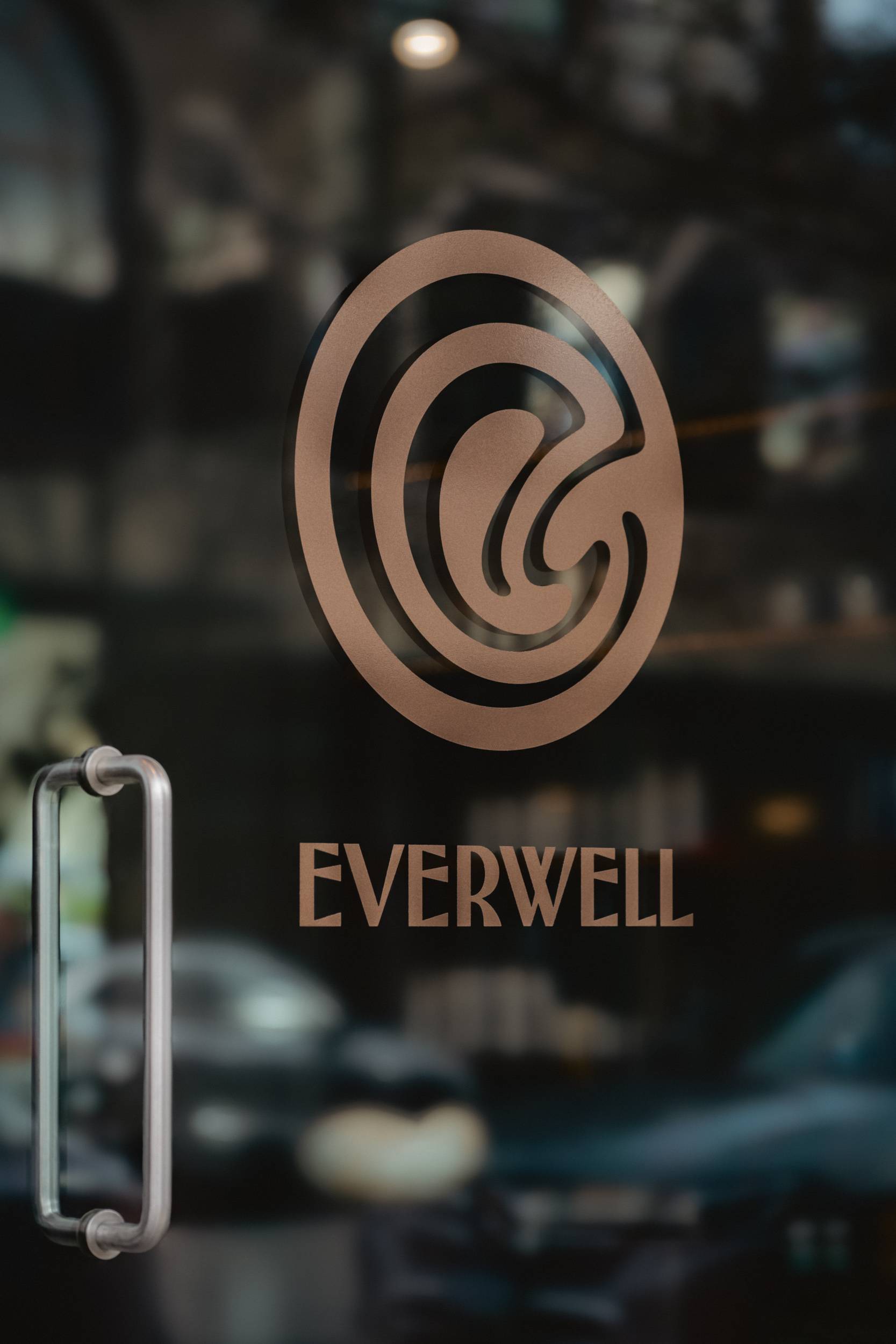
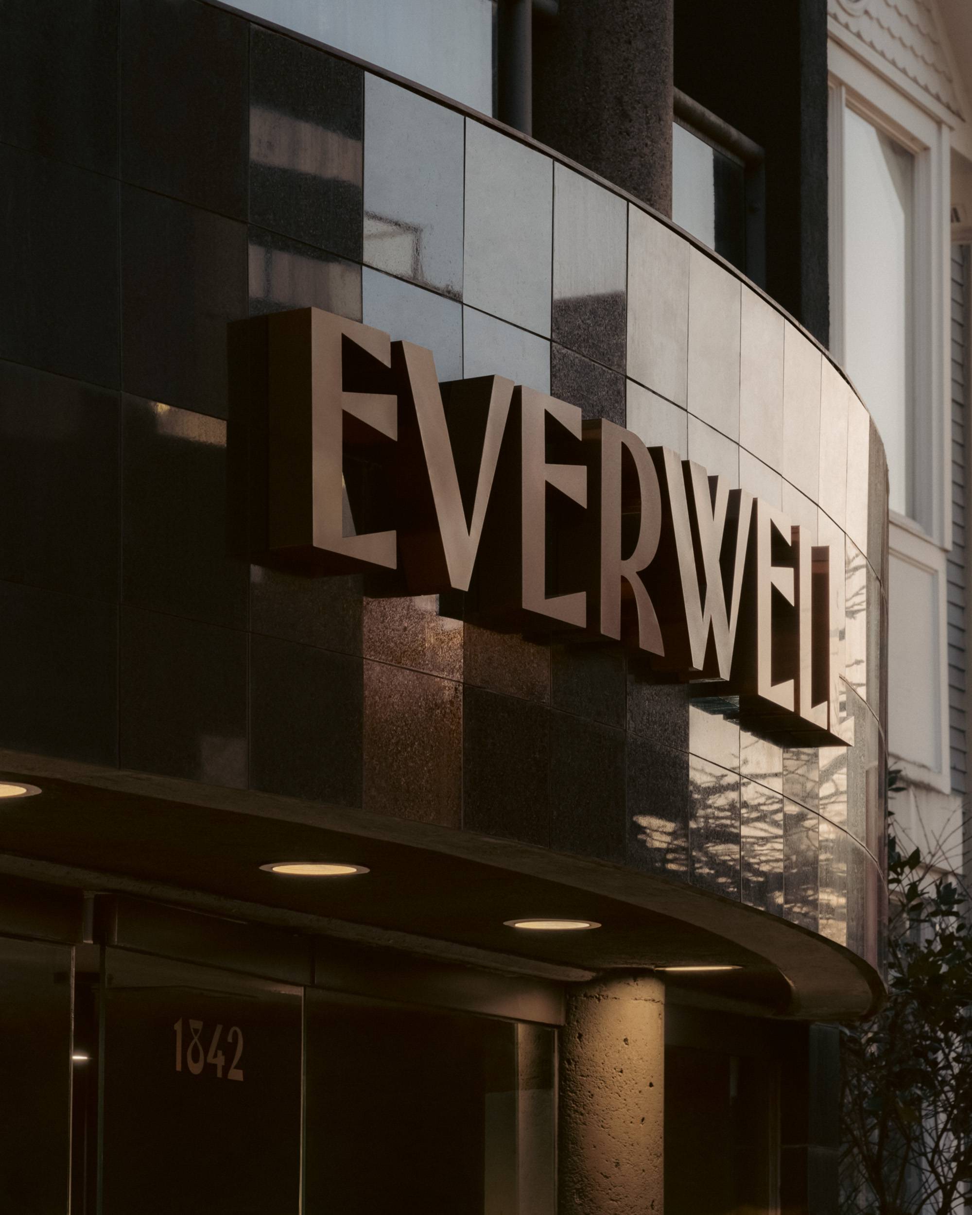
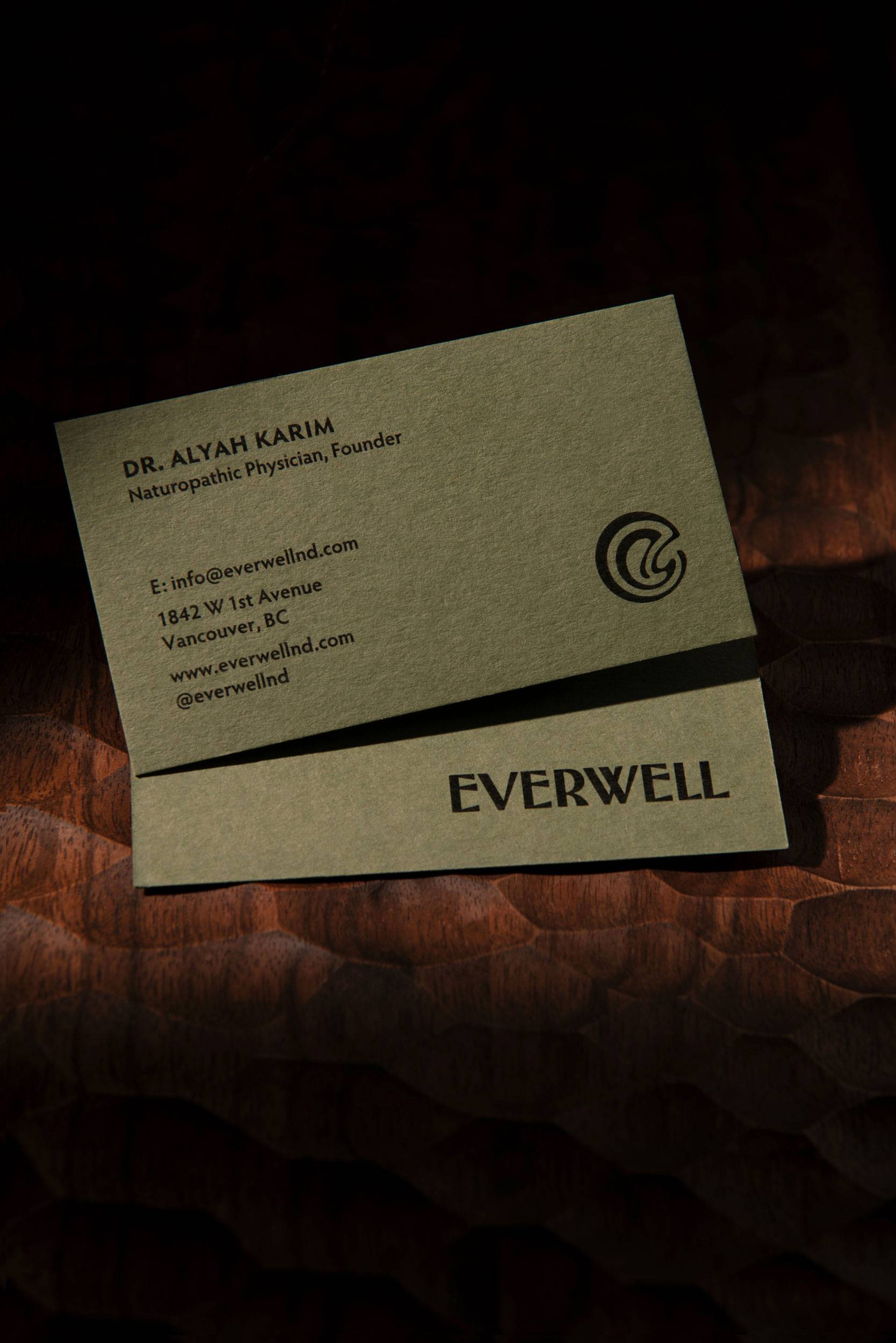
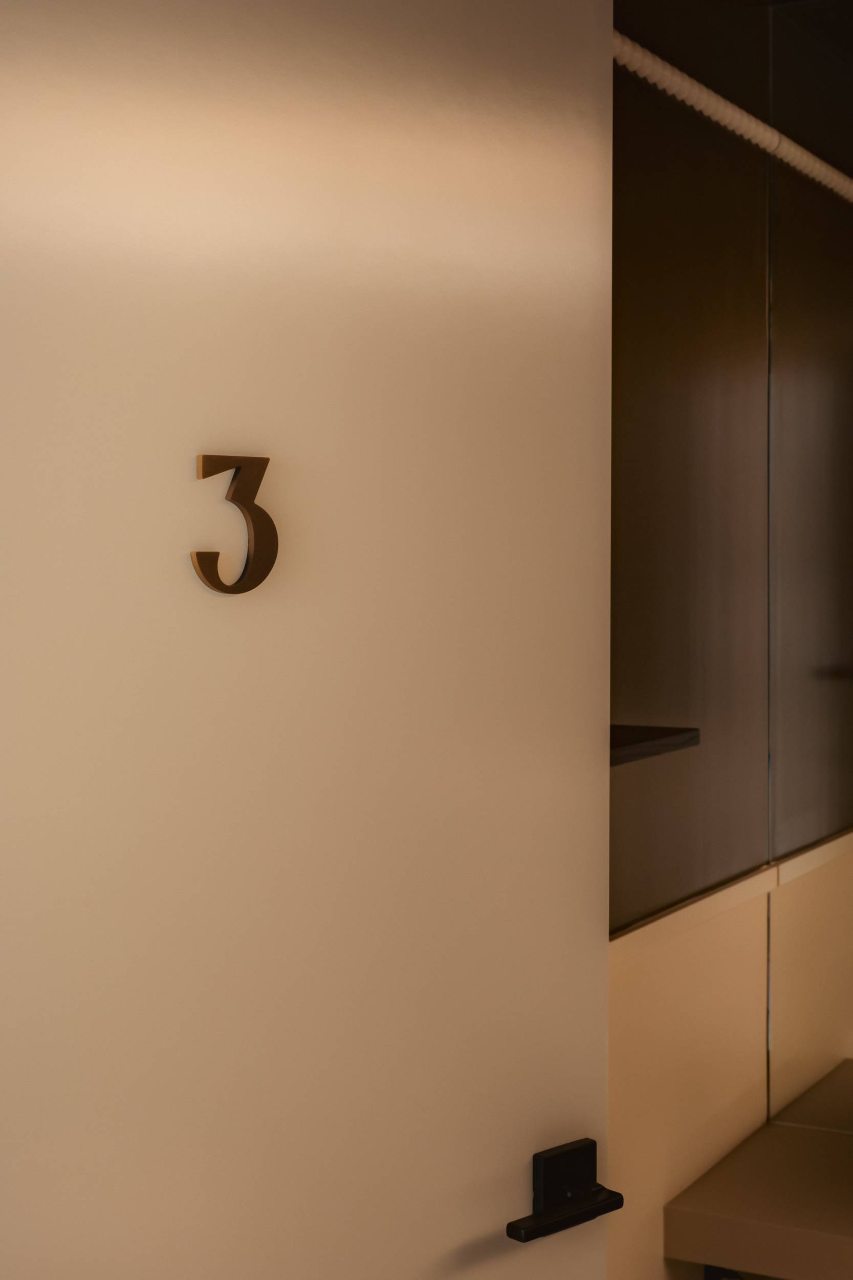
Inspired by the watery, spiral motifs found in many Wiener Werkstätte designs, we developed an icon for Everwell that is an abstraction of a wellspring and evokes health and vitality. The lowercase ‘e’ embedded in the center of the spiral allows the icon to function as a subtle monogram. We drew the custom Everwell wordmark, as well as unique address and treatment door numbers, based on vintage type specimens from the early 20th century. The letterforms possess some organic curves and asymmetry, but also a bold, refined authority. The two logomarks are present in both monumental forms (such as the large bronze facade sign), and smaller moments (green paper practitioner’s cards) throughout the Everwell clinic. The logos were also designed with digital applications in mind: the icon fits into a perfect circle for social media avatars, and the wordmark is legible even at small sizes on a phone screen.
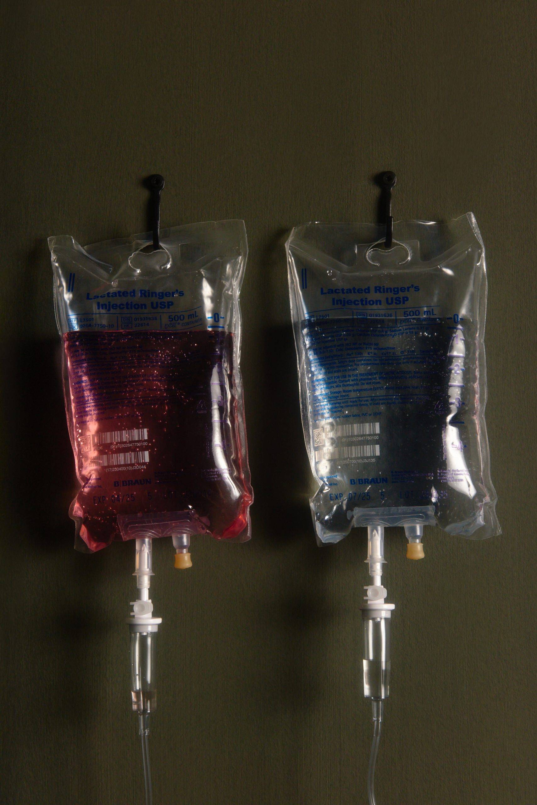
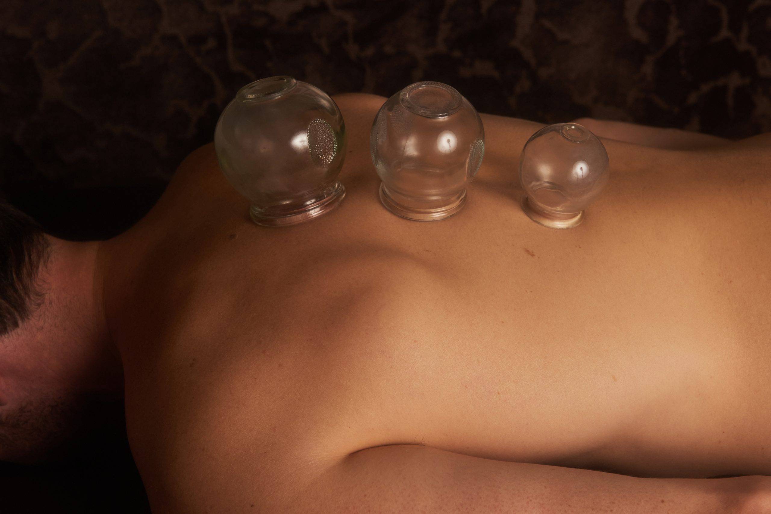
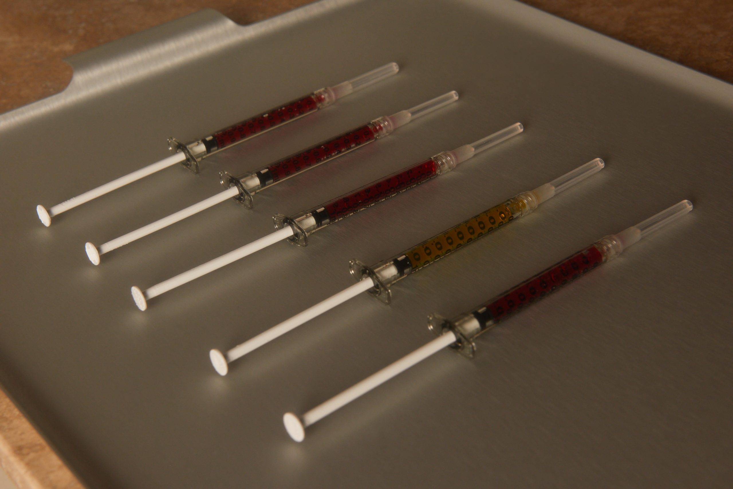
Our brand work included a photoshoot we co-ordinated and art-directed for the Everwell website and social media. The resulting images have the same visual qualities and feelings of the Everwell space and brand.
-
Location—
- Vancouver
-
Year—
- 2024
-
Signage—
- Franklin Sign Company
-
Signage Photographer—
- Conrad Brown
-
Stationery Photographer —
- Jessie Greg-Alabi
-
Website Photographer—
- Lauren Zbarsky
